

DTF Quality Control & Assurance Checklist: Deliver Flawless Prints Every Time

What Is This Article About?
Master DTF quality control—from film inspection to wash-test durability—and ship flawless, color-accurate prints that wow customers and slash reprints.
Quality control (QC) in Direct-to-Film (DTF) printing is about maintaining consistent, high-quality results for every transfer. This instructional module covers systematic approaches to ensure every print meets your standards before it reaches the customer – a cornerstone of successful DTF businesses. We’ll explore practical techniques for visual inspection, color consistency, adhesion and durability testing, and more – along with how to document these checks. By the end, you’ll have a detailed QC checklist and understand how to set up a QA/QC station for immediate implementation in your DTF production space.
Visual Inspection Techniques for DTF Prints
Visual inspection is the first line of defense in catching print flaws. Both the printed DTF film and the final pressed garment should be scrutinized closely under good lighting:
-
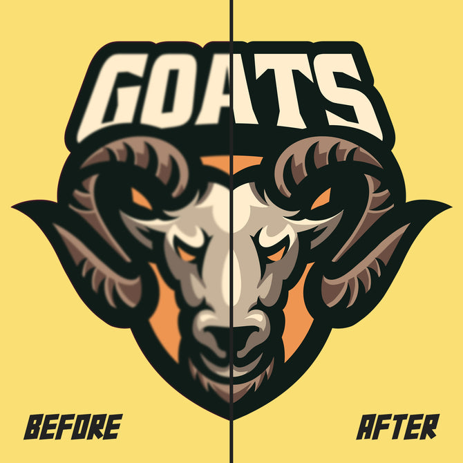
Inspecting the DTF Film (Pre-Transfer): After printing (and curing) the film, check for any visible defects on the film’s surface. Look for banding (horizontal lines or streaks) which can indicate printhead issues, smudges or ink smearing (often from handling before ink cured), ink bleeding beyond design edges, and dust contamination (tiny white specks where ink didn’t adhere due to dust). The printed image on the film should be sharp and clear; fine details like small text or intricate patterns should have crisp edges with no blurriness. Also verify that colors on the film look uniform (no patchy or overly dark/light areas) as uneven coverage can signal a problem with ink flow or film coating.
-
Inspecting the Pressed Garment (Post-Transfer): After heat pressing the film onto the garment, examine the transferred design thoroughly. Ensure the entire design transferred completely – no portions of the image should remain on the film or be missing on the fabric. Check edges and small details (like the dots on “i” or thin lines) to confirm they adhered correctly. There should be no peeling edges or corners lifting off; if you see any lifting, it indicates an adhesion issue that needs correction before shipping. Look for any press marks, unwanted gloss, or other artifacts around the print. Also verify the placement and alignment on the garment matches the order (not skewed or off-center). By comparing the finished shirt to the original artwork and placement specifications, you can catch if a design was pressed crooked or on the wrong location. Finally, assess the print’s visual quality and feel – it should be vibrant and smooth. Any obvious problem (like a big scratch, a wrong color, or a fuzzy image) at this stage means the item should be rejected for reprint rather than sent out.
Practical Tip: Use a magnifier or loupe to inspect fine details and pinpoint defects. For example, a tiny dust speck on the film can cause a small blank dot in the print – under a magnifier, you can distinguish whether a white spot is a dust artifact or part of the design. Train your QC staff to systematically scan each print from top-left to bottom-right so nothing is overlooked. Catching issues at the film stage is critical – there’s little point heat-transferring a print that already has visible defects.
Ensuring Color Consistency Across Prints
Color consistency means that a blue logo printed today should look the same shade of blue on every shirt in the order, and match the blue you printed last month for the same client. Achieving this requires careful color management and evaluation:
-
Printer Calibration and Color Profiles: Regularly calibrate your DTF printer and use proper ICC color profiles for your ink and film combination. Calibration aligns the printer’s output to known color standards, so that you get predictable colors on each run. It’s good practice to print a test chart or color calibration sheet at the start of a large run or when changing any variable (new batch of film, new ink lot, etc.). This chart should include a range of color patches (primary colors, grays, and critical logo colors or Pantones). Evaluate the chart for any color casts or unexpected shifts. If the colors deviate from the expected values, take corrective action (clean printheads, adjust color profile, etc.) before proceeding with production.
-
Pantone or Standard References: Use standardized color references to check your output. For instance, if a client specifies Pantone® 186 C red, keep a Pantone color swatch or a previously approved print for comparison. Print one transfer and visually compare it to the standard under proper lighting. The goal is to catch any noticeable color mismatch early. Consistently printing with the correct color values and using a color standardization system such as Pantone helps avoid misinterpreting the intended color. If a color looks off (too dark, too dull, or shifted in hue), it might indicate an ink issue or a profile mismatch – address this before printing dozens of items.
-
Consistent Settings: Document and consistently use the same print settings for jobs that should match. This includes resolution, print mode (number of passes), and curing temperature/time, as variations here can affect color saturation and appearance. For example, using an 8-pass print for one batch and a 4-pass for another can make colors appear different due to changes in ink laydown. Consistency is key – if changes are necessary, do a test print and compare to previous output.
-
Batch Sampling: In a production run, periodically pull samples (e.g. one print at the beginning, middle, and end of a 100-print run) and compare them side by side. They should look identical in color. If you notice progressive changes (colors getting lighter, etc.), it could indicate an ink is running low or a nozzle starting to clog mid-run, and you should pause to address it. Having a standard lighting environment (next section) for this comparison is crucial to judge color differences accurately.
Using Standard Lighting for Color Evaluation (D50)
Colors can look dramatically different under varying light sources (a phenomenon known as metamerism). To evaluate print quality reliably, you should always inspect color under a standardized lighting condition. In the printing industry, the common reference is D50 lighting, which is a standardized simulation of midday natural daylight at about 5000 Kelvin. Here’s how to implement this:
-
Light Booth or Station Lighting: Set up a color viewing light booth in your QA station or use high-CRI 5000K lighting above the inspection area. A D50 light booth provides a controlled environment – neutral gray walls and consistent illumination – so that you’re seeing the print’s true colors without the yellow tint of incandescent bulbs or the green cast of cheap fluorescents. The consistent use of D50 standardized lighting is indispensable for accurate and consistent color assessments of prints. If you don’t have a professional light booth, even a set of 5000K “daylight” LED tubes with CRI 90+ positioned over the inspection table can serve in a pinch.
-
Avoid Mixed Lighting: Do not evaluate color in areas where multiple light sources mix (e.g., daylight plus overhead fluorescents plus a desk lamp). This can distort perception. Train staff to carry prints to the designated D50-lit area for critical color decisions. For example, a navy blue print might look black under dim light – under D50, you can clearly see the blue tone. Consistent lighting eliminates guesswork and arguments like “it looked fine by my desk lamp.” It also means if you and your client both view the garment under similar standard lighting, you’ll see the same thing.
-
Check for Color Consistency Under Light: In the D50 light, compare prints not just to references but also between themselves. If you have a reorder from a month ago, reviewing a new print next to the old sample under the light booth will quickly show if one is more saturated or different in hue. Standard lighting helps you catch subtle shifts (a slight redness in skin tones, or a cooler vs warmer gray) that might be missed otherwise.
Remember that human vision is most acute to differences when viewed simultaneously. So for quality control, it helps to keep a retained sample from an approved batch which can be placed next to current output under the same light. This way, even a small deviation in color can be spotted and quantified (often leading to a check of printer settings or ink lot if a discrepancy is found).
Adhesion Testing: Ensuring Prints Stay Put
Beyond how prints look initially, a huge part of quality assurance is making sure the print will stay adhered and intact through handling and washing. DTF prints are valued for their durability, and your QC process should verify that durability with tests:
-
Pre-Shipment Rub Test: A rub test (scrub test) simulates friction and wear on the print’s surface. After a transfer is pressed and cooled, use a coarse cloth or even your thumb to rub firmly back and forth over a portion of the print (do this on a test sample rather than the customer’s piece, when possible). You’re looking to see if any ink flakes off, if the printed layer scratches easily, or if edges start to lift when abraded. A properly cured and pressed DTF transfer should withstand a moderate rub with no visible damage. If the rub test causes color to smudge or flake, that print would fail QC – possible causes could be under-curing of the adhesive powder, insufficient press pressure, or a bad film/ink combination. It’s wise to perform a quick rub test on each batch or if you suspect a curing issue. This test gives immediate feedback on adhesion strength in dry conditions (and can catch issues like a powder that didn’t melt fully).
-
Wash Test Protocols: Nothing tests a garment print’s durability quite like repeated laundering. Wash testing is a cornerstone of QC for wearable products. You may not wash every item (which isn’t practical), but you should have a protocol to wash test sample prints from each production run or each new material combination. For example, you might keep one extra print from a big order and subject it to a standard wash cycle (cold or warm water, gentle cycle, tumble dry low) and see how it holds up. Many DTF transfers, when properly done with professional durability standards, can last 45+ washes without significant fading or cracking, and premium ones often endure 50–100 washes. Your internal standard might be, say, no noticeable degradation after 5 wash/dry cycles. In a wash test, observe the following after each wash: Are colors still vibrant or do they noticeably fade? Did any part of the design start peeling or cracking? Is there any bleeding of colors or loss of detail? If a print starts failing after one or two washes in testing, that’s a major red flag – it indicates a process issue (perhaps insufficient curing, wrong powder, or too low press temperature) that must be fixed before fulfilling orders. Record the results of wash tests in your quality log. Some companies even include a washed sample in their records to compare new prints against (a 5x washed print vs new print, to see the difference).
-
Other Durability Checks: Besides washing, consider additional stress tests on a sample transfer. A stretch test can be useful if the garment is stretchable (like a polyester jersey or spandex blend) – gently stretch the fabric and see if the print flexes without cracking. An ironing test (place a pressed transfer under a household iron with parchment as buffer) might reveal if the print will re-melt or smear under high heat (important if end-users might iron the shirt). Also, if you produce items like athletic wear, a sweat or abrasion test could be relevant (e.g., rub the print with a damp cloth to simulate perspiration exposure and ensure no ink dye migration or loss occurs). These additional tests can be done periodically for your own confidence, even if not for every batch.
Finally, remember to communicate recommended wash and care instructions to your customers (e.g., “wash inside-out, cold water, no bleach, low heat dry”) – while not exactly part of QC, it ensures the longevity you’ve tested for is actually realized by the end-user.
Surface and Edge Integrity Checks
DTF printing involves transferring an image from a PET film onto a garment using heat. Quality control must ensure that nothing unwanted transfers and everything that should transfer does. This means paying attention to the integrity of the print’s surface and edges:
-
Film Trimming Precision: Before a printed transfer goes to the heat press, it often needs to be trimmed (if it’s not a whole-sheet transfer). Ensure that this trimming is neat and to specification. Any stray pieces of film or excess clear area beyond the design can potentially press onto the garment as an unwelcome glossy outline or attract lint. Use sharp scissors or a paper cutter to trim close to the design if needed. QC should verify that the cut does not accidentally nip into the design, and that there are no jagged or wavy film edges that could make alignment difficult or peel up during pressing. A neat edge on the film also helps during placement and prevents any flopping corners that might fold under or transfer where they shouldn’t.
-
Clean Surface Before Pressing: If a printed film has been stored for a while, gently dust it off before pressing (use an anti-static brush or compressed air) to remove any lint. A speck of dust on the film can create a defect in the transferred print or even imprint a small bump. Surface integrity includes having a clean, debris-free print surface going into the press.
-
Transfer Completeness (Post-Press): After heat pressing, peel the film slowly and observe how the design releases. Ideally, the film should lift away cleanly, leaving all ink on the fabric and none on the film, with no resistance. Inspect the garment right after peeling: Are all elements of the design on the garment? Check fine details: for example, in a graphic with text, make sure the centers of letters like “O” or “A” transferred and didn’t remain on the film. If you see any part of the design still on the PET film or a ghost of missing detail on the garment, that indicates a transfer failure. Common causes could be insufficient press temperature or time, or a flaw in that particular transfer. Those items should be re-pressed (if possible) or rejected. Also feel the edges of the design – run a finger gently along the edge of the print. The edge should be firmly bonded with no lifting. Parts of the design lifting off or not fully adhering are unacceptable; if caught immediately, sometimes a quick re-press with a cover sheet can fix it, but often it’s safer to reprint the item.
-
Edge Quality: Closely related to transfer completeness is the edge quality of the print. The edges of the printed design should be smooth and well-defined. Look for any powder residue or “halo” around the design edges – this can happen if excess adhesive powder wasn’t shaken off properly, leaving a faint outline of adhesive that melts on the shirt. A good QC check is to inspect the garment under an angle of light; a leftover adhesive halo might be slightly shiny. If found, you may need to revise your powdering technique or wipe the edges of the next prints before pressing. Additionally, ensure no film bits remain stuck on the garment. Sometimes a tiny corner of PET film might tear and remain on the shirt – it’s clear and easy to miss when hot, but as it cools you might hear it crackle or see it reflect light. Peel any such remnants off gently while warm.
In summary, the print on the garment should look like it’s part of the fabric – fully applied with no unwanted artifacts. By inspecting surface and edges, you guarantee the customer won’t receive a shirt with part of the design peeling or a strange outline around it. These checks happen immediately after pressing while any fixes are still possible (it’s hard to correct edge issues after the fact). If problems are consistently noted, adjust your process (e.g., increase press time, ensure even pressure, improve film quality) before the next run.
Recommended Inspection Checkpoints in the Workflow
Quality control isn’t a one-time event; it’s woven into each stage of your DTF production process. Setting up checkpoints ensures that issues are caught early rather than at the end when it’s too late. Here are the key inspection points to implement:
-
Post-Printing (After Film Printing & Curing): As soon as the design is printed on film (and after you apply and melt the adhesive powder if using DTF), inspect the printed film. This is where you perform the visual inspection of the film for print defects (banding, smudges, color accuracy) and also check that the powder adhesive has melted evenly (no stray powder granules clinging to areas they shouldn’t). It’s easier and cheaper to discard a flawed transfer film now than to waste a garment later. If you print in batches, check a sample from each batch. Ensure the film has been properly cured (you might do a quick fingernail scrape on the edge of the design to confirm the powder is set – no adhesive should flake off easily ). This checkpoint prevents issues from moving downstream.
-
Pre-Press Positioning: This is a quick but important check just before actually heat pressing. Once you’ve aligned the printed film on the garment, double-check the placement and orientation. This isn’t about print quality but order accuracy – verify the design is on the correct garment size/color and in the correct location per the order (e.g., 2 inches below the collar, centered). A second pair of eyes or a ruler check at this stage can catch, for example, if a graphic intended for a adult large shirt was accidentally placed on a small shirt or if it’s off-center. It’s easier to re-align or swap before heat is applied.
-
Post-Heat Press (After Transfer): As described in the surface integrity section, right after pressing and peeling, inspect the freshly pressed garment. This checkpoint is to ensure transfer success: no part of design left on film, no new issues introduced like heat press scorch marks or wrinkles in the transfer. It’s also the time to do the adhesion quick-test (gently rub or try to lift an edge) while the print is warm – if something is wrong, sometimes a re-press immediately can save it. If multiple items are being pressed, do this check for each garment or at least each design change.
-
Pre-Packaging Final Check: Before packing the finished product for delivery, perform a final QC review on each garment. This is a last sweep to catch anything that might have slipped through: ensure the correct designs went on the correct garments (match them with the order sheet), look for any defects that might have been missed (sometimes, a defect like a small ink dot or a slight color variance becomes more noticeable after the garment cools completely or under different light). Also verify that the garment is clean (no smudges from handling, no fingerprints from the heat press, etc.). Essentially, you’re viewing the product as the customer will receive it. Many companies use a checklist at this stage to verify each item’s quality and correctness one by one before it goes in the package.
By implementing these checkpoints, you create a multi-layered defense against errors. Each stage has its own focus and can prevent specific problems. For instance, a color issue would be caught at post-printing, a placement issue at pre-press, a transfer issue at post-press, and an order fulfillment issue at pre-packaging. Make these checks part of your standard operating procedure. In fact, use detailed QC checklists that cover pre-press, printing, and post-press processes to ensure nothing is overlooked. An example checklist item might be: “Post-press check – design adhered completely, colors correct, no defects, correct garment size and color, count = 1.” The person responsible can tick off each item. This not only keeps the process systematic but also creates accountability.
Common Quality Metrics and Benchmarking
To continuously improve and maintain high quality, it’s important to measure quality in a concrete way. Relying on just subjective judgment (“this looks okay”) isn’t enough for scaling up operations. Establish some key quality metrics and track them over time. Here are common ones in DTF printing:
-
Color Difference (ΔE): As mentioned earlier, Delta E is a numerical measure of color difference. You can use a spectrophotometer or colorimeter to measure your prints’ colors and compare them to a standard (like a Pantone value or a previously approved print). Record these ΔE values. For example, you might log that “Batch #210 – Red logo ΔE = 1.8 against Pantone 186 standard” which is within your tolerance of 3. If another batch shows ΔE = 5, that’s a flag that something changed (ink density, printer drift, etc.). By keeping a log of color accuracy, you can benchmark consistency. If your average ΔE last quarter was 2.0 and this quarter it’s 1.0, your process is improving. If it worsens, you know to investigate calibration. Many brand clients have strict ΔE tolerances (often 2-3) for critical colors, so measuring and meeting those tolerances is key to customer satisfaction.
-
Defect Rate: This is the percentage of prints that had to be rejected or reworked due to quality issues. Track how many prints out of the total had problems (banding, misprints, etc.). For instance, “Out of 500 prints, 15 had to be reprinted – defect rate = 3%.” Over time, you want that percentage as low as possible. You can break it down by defect type as well (e.g., 2% were due to color issues, 1% due to adhesion issues). This helps pinpoint where improvements are needed most. Documenting defect types and frequencies creates a database you can analyze. You might discover patterns, such as most defects happen during night shift, or most color errors come from one specific design file – insights you can act on.
-
Inspection Scores or Checklist Compliance: If you implement a scoring system during QC inspections (for example, rating each print on a scale or simply pass/fail), you can quantify how many prints “passed on first inspection” versus needed fixes. Some businesses use an internal metric like “First Pass Yield” – the percentage of items that pass all QC checkpoints without rework. A high first-pass yield means your process is running smoothly.
-
Turnaround Time for Corrections: While not a quality metric per se, tracking how quickly quality issues are resolved can be useful operationally. For example, if a batch is halted for a printer calibration, note how long it took to get back on track. This helps in process planning and shows the impact of quality hiccups on production time.
-
Customer Feedback Metrics: Ultimately, quality is judged by the customer. Track returns, complaints, or customer-reported issues related to quality. If you delivered 1000 shirts and 0 came back for quality issues, that’s the real-world quality metric. Conversely, if 5 customers noted that their prints peeled after one wash, that’s critical data. Even if your internal tests were fine, real usage can reveal issues – maybe a particular fabric had poor adherence. Logging these and categorizing (e.g., “complaints about peeling: 0.5% of orders”) gives you an external benchmark for quality.
Using these metrics, create quality reports or dashboards that can be reviewed periodically. This turns QC from just a reactive task (catch the bad prints) into a proactive one (reduce the bad prints). For example, by analyzing defect logs you might notice that every Monday morning the first few prints have banding – which could correlate to the printer needing a weekend maintenance routine. Indeed, recording defects and analyzing the data can reveal underlying root causes or trends, allowing you to address them systematically.
Benchmarking also means setting quality targets. For instance, aim for “<1% reprint rate” or “average ΔE < 2.5 on all colors” and strive to meet those targets each month. If targets are missed, have a review to find out why. This kind of data-driven approach makes your quality assurance robust and continually evolving.
Documentation and QA Record-Keeping Practices
Consistent documentation is the backbone of a good quality assurance system. When you document your QA/QC activities, you ensure that quality checks are repeatable, transparent, and auditable. Here are key documentation practices to implement:
-
Quality Control Checklists: Develop checklists that QC personnel must follow for each job. These checklists itemize all the things to examine, at each checkpoint. For example, a post-press checklist might include: “Verify correct garment style/size, Inspect front print quality (no defects), Check back print (if applicable), Confirm color matches sample, Examine edges for powder residue, Verify placement is per spec, etc.” The act of using a checklist ensures that the inspector doesn’t skip any aspect. The more detailed the checklist, the better, as it guides the QC personnel through a thorough review. Each completed checklist can be attached to the work order as proof of inspection. If an issue is found and corrected, note it on the checklist (e.g., “found small ink smudge, reprinted item”).
-
Quality Logs / Inspection Reports: Maintain a log for each production run or each day’s production that summarizes quality findings. This could be a simple spreadsheet or a form. Key information to record includes: date, printer/operator, job or order number, number of pieces produced, number of pieces failed or reprinted (with reasons), any machine adjustments made, and inspector name. Over time, this log becomes a goldmine of information – you can trace back issues (“We’re seeing adhesion problems today, let’s check if anything changed compared to the log from when it was good”) and also demonstrate quality control to clients if needed. These logs also help in team meetings – e.g., discussing last week’s quality metrics as a group.
-
Issue/Defect Tracking Forms: For recurring or serious issues, use a more detailed form or digital system to track it. Suppose you encountered a “banding on dark blues” issue in a few prints. An issue form would record the description, suspected cause, actions taken (printhead cleaning, etc.), and resolution. It might also include attaching photos of the defect. Tracking issues formally ensures they are followed up. It’s essentially a mini “CAPA” (Corrective and Preventive Action) process: identify the problem, fix it, and prevent it from happening again. If you have a small team, this might be as simple as an email chain or a Slack message thread, but make sure the knowledge gained is captured somewhere retrievable.
-
Customer Feedback and Returns Log: Keep a record of any customer feedback related to quality. This includes returns, complaints, or even comments like “Shirt looked great, but after one wash the color seemed lighter.” Each entry should note what the issue was and what was done (refund, reprint, investigation results). This log will highlight if there are any systemic issues (e.g., multiple complaints about a certain type of garment or a certain batch of transfers). It also closes the QC loop – internal QC might be great, but if customers report an issue, it must be fed back into improving the process. For example, if three customers out of 1000 report a minor cracking after 10 washes, maybe you add an internal 10-wash test for that print type to catch it in the future.
-
Checklists and Forms at the QA Station: To make documentation convenient, keep printed forms or a tablet/computer at the QA station. Inspectors should be able to quickly mark off checklists and input data into logs as they do the checks. If it’s cumbersome (e.g., the log sheet is in an office far from the press), people might skip it. Many shops use plastic sleeves with checklists that can be marked with dry-erase for each item, then transcribed to digital records later, or simply new printed checklists for each order that get filled and filed.
An added benefit of thorough documentation is training and accountability. New staff can be trained using the checklists as a guide to what to look for. And if an issue is missed, you can look back at who inspected it and address any training gaps. For instance, if a shirt with an obvious defect somehow got past final QC, reviewing the checklist that was supposedly completed for it can start a conversation: Was the process rushed? Did we miss something on the checklist? Do we need to add “check inside of garment for ink bleed” as an item?
In short, “if it’s not documented, it didn’t happen.” Good documentation gives you traceability, consistency, and opportunities for continuous improvement. It transforms QC from an informal art to a systematic science.
Packaging Quality Control
Once the prints themselves are confirmed good, quality control extends to how the product is packaged for delivery. Poor packaging can undo a lot of hard work by allowing garments to get dirty, damaged, or mixed up. Here’s what to enforce for packaging QA:
-
Garment Handling and Presentation: Ensure each garment is clean and properly finished before folding. That means no lint, no loose threads, and no residue. For example, sometimes cutting threads or the DTF process might leave a slight powdery feel – give the garment a quick once-over with a lint roller or shake it out. If the print area has any excess heat-press lines (imprint of the press), you can use a steamer or even just let it sit overnight to let those lines relax. Fold the garment neatly, typically with the print facing out (so the customer sees the design when they open it). For dark garments, consider inserting a piece of light tissue paper over the print before folding to prevent any potential sticking or offset (especially if the package might get warm in transit).
-
Protective Packaging: Place finished garments in individual poly bags or protective sleeves. This keeps out moisture and dust, and prevents friction during shipping (multiple shirts rubbing together can cause abrasion). Use appropriately sized bags – too tight and it might crease the print badly; too loose and the shirt can slide around excessively. Sealed packaging is important to protect from moisture and dust, extending the print’s quality during storage and transit. Particularly for DTF, moisture can be an enemy; if a package gets wet and moisture seeps in, it could affect the adhesive or cause mold on the fabric. If you’re shipping to very humid climates or your product might sit in storage, you might include a small desiccant packet in the packaging for extra measure.
-
Labeling and Order Accuracy: Each packaged item should be labeled correctly – typically with product size, color, design, or order number, depending on your system. This can be as simple as a sticker on the outside of the poly bag or a barcode label that corresponds to the order. Double-check that the labeling matches the content (you don’t want a Large shirt in a bag labeled Medium). This is especially crucial when shipping multiple items: proper labels prevent mix-ups. If your workflow prints packing slips, ensure the items and quantities on the slip match what’s in the package. QC at packaging often includes verifying the packing list: correct items, correct counts. There should be no missing or wrong items in the package, and everything should correspond to the customer’s order details.
-
Damage Prevention: Use quality shipping materials – explore comprehensive fulfillment solutions to avoid damage in transit. Shirts generally aren’t fragile, but the print can be damaged if, say, it gets deeply creased or punctured. Use appropriately sized boxes or mailer envelopes – too small can crumple the shirt, too large can cause it to rattle around. If shipping in envelopes, consider cardboard inserts to keep them flat. For large orders, folding and stacking shirts in a box with a plastic liner can protect from any water ingress. If you’re including other items (like a thank-you card or heat press instructions), place them such that they don’t rub on the print (avoid, for example, a heavy card right on a delicate print surface). It’s rare, but if shipping internationally or long distances, extreme heat in shipping containers could slightly stick prints – another reason a slip sheet or parchment between folded printed surfaces can help.
-
Final Outgoing Inspection: Before sealing the box or mailer, do one last quick scan: are all items present? Are they all QC approved? It’s wise to have a second person verify the contents and initial a packing checklist. This can catch human errors like “one shirt was left on the QC table” or “accidentally put two of the same size and missed another size.” It also adds accountability – someone signing off that the package is correct and complete.
Packaging QA might feel like overkill after all the focus on the print itself, but it’s the final impression your product makes. A customer might receive a perfectly printed shirt, but if it’s tossed haphazardly in a bag that got wet and tore, they’ll have a poor experience. Conversely, a neatly folded, clean shirt in a sealed bag with clear labeling screams professionalism. Remember, the product isn’t truly “quality” until it arrives in the customer’s hands in good condition. So treat packaging with the same care as production.
Establishing a QA/QC Station in Your DTF Production Space
To implement all these quality control practices effectively, it helps to have a dedicated QA/QC station in your production area. This station is where all inspections and testing can be performed efficiently. Here’s how to set up and maintain a QA station for DTF operations:
-
Location and Layout: Position the QA station at a logical point in your workflow – typically after printing and pressing, before packaging. It should be a clean, uncluttered area where prints can be laid out flat for inspection. A large table or counter works well; it should be big enough to spread out a full-size T-shirt without it hanging over the edges (to comfortably inspect all parts of the design). The surface should be neutral in color (gray or white) – this avoids any color cast when evaluating print colors and makes it easier to spot lint or defects. If possible, choose a location slightly apart from the main printing area to avoid contamination (for instance, away from where you shake adhesive powder or where fabrics are being cut, as those can generate debris).
-
Lighting: As discussed, equip the station with excellent lighting, ideally standardized (D50) lighting. Overhead light panels or a viewing booth are ideal. Many print shops mount a lighted inspection hood above the QA table, which provides consistent, shadow-free illumination. Ensure the lighting covers the full table without dark corners. Replace bulbs regularly to avoid dimming. A light meter can be used to ensure you have sufficient lux on the table for detailed inspection. If inspecting very fine details, a task lamp with a magnifier can be useful as an adjunct (just ensure its light doesn’t drastically differ in color temperature, or use it only for close-up examination of physical defects, not color).
-
Tools and Equipment: Stock the QA station with all necessary tools:
-
Measuring Devices: A calibrated ruler or T-square for checking graphic placement and dimensions on garments (e.g., design is 2” from collar as specified, etc.). A thickness gauge or caliper for film measurements (as seen earlier) if you test incoming film batches.
-
Magnification: A magnifying glass or loupe (5x or 10x) for inspecting print details, dot patterns, or suspected defects up close. This can help differentiate between a tiny hole in coverage versus a bit of dust that can be brushed off.
-
Color References: Pantone swatch books, color sample print cards, or approved print samples to compare against. Having these at the station avoids needing to recall from memory whether a color is right.
-
Spectrophotometer or Colorimeter (if available): This is more advanced, but if you have one, keep it at the station to take color measurements for Delta E calculations on random samples or when tweaking color profiles.
-
Adhesion Test Supplies: A small laundry washing machine (for sample testing) might be beyond the station (maybe in a utility area), but at least have a sink or tub nearby for hand-wash testing or a spray bottle for water testing. Keep a few clean white cloths for rub tests (test with both dry and slightly damp cloth to simulate sweat rubbing). Also, a heat gun or small iron can be handy to do an accelerated aging test (like heating a part of the print to see if it bubbles – careful with this, though).
-
Miscellaneous: Lint rollers, tweezers (for picking off any small pieces of debris or film), scissors (for trimming defects or loose threads), gloves (cotton or nitrile gloves to handle prints without getting oils on them, especially if inspecting white shirts where fingerprints can show), and spare transfer paper or Teflon sheets (in case a re-press is needed to fix an issue).
-
Documentation Tools: Clipboard with printed QA checklists, pens, or a computer/tablet stationed there with digital forms. Also a camera (even a smartphone dedicated to the station) for taking photos of defects for documentation or for sending to a supplier if needed (e.g., “film coating issue – see photo”).
-
-
Environment Control: If possible, maintain a controlled environment at least around the QA station. This means moderate temperature and humidity – not too hot, not too humid – because high humidity, for example, can cause prints to feel tacky or colors to shift slightly. Keep the area as dust-free as possible: consider an air purifier or at least regular cleaning, since dust on prints is a common quality woe. Some QA stations in print shops even have an overhead air filter or a sticky mat on the floor to catch dust from shoes.
-
Organization: Use shelving or bins to organize what flows into and out of the QA station. For instance, have an “Incoming QA” rack or bin where freshly printed garments wait to be checked. After inspection, have an “Approved” area where they go next (to packaging), and a clearly separate “Reject/Redo” bin for items that failed QC. This prevents mix-ups. Everything in the reject bin should be addressed (either reprinted or fixed) before production on that order is considered complete. Label these areas clearly.
-
Process Integration: Define a standard operating procedure that whenever a batch of prints is completed, they are brought to the QA station and signed off by a QC person before packaging. This could be one and the same person in a small shop, but it’s about the mindset of switching hats: printing mode off, inspecting mode on. If multiple people work, it often helps to have someone other than the printer operator do the QC – a “fresh eye” might catch issues the operator, accustomed to the print, might overlook. However, even solo operators benefit from stepping away and coming back to inspect with a checklist.
-
Continuous Maintenance: The QA station itself should be maintained. Keep it clean – no accumulating piles of misprints or clutter. Ensure forms are updated (revise checklists as you add new quality checkpoints). Calibrate any devices (like spectrophotometers) per their schedule. Also, calibrate the inspectors – occasionally, do a group review of a print and discuss what is acceptable vs not, so that all team members apply standards consistently. One useful practice is to have a reference set of “retain samples”: e.g., one shirt that represents the minimum acceptable quality and one that represents ideal quality. Inspectors can compare borderline cases to these to decide if something passes or not.
Setting up a dedicated QA station underscores the importance of quality in your operation. It sends a message that quality isn’t an afterthought done on a random table – it’s a defined step with its own space and tools. Workers will take QC more seriously in a defined area. Over time, you might even expand capabilities: e.g., use the station to test new materials (print a sample and put it through the wringer there before investing in new film or ink). It becomes a little quality lab for your DTF business.
By implementing the systematic quality control and assurance approaches above, you can significantly reduce errors and ensure a consistent, premium product. From the moment a design is printed on film to the final packaging of a garment, each step has its own QC practices that together form a comprehensive quality system. Adopting these practices will lead to fewer reprints, happier customers, and a stronger reputation for reliability. Quality control is indeed work – it requires time, attention, and discipline – but it pays for itself by preventing costly mistakes and returns. In the world of DTF printing, where a small flaw can mean an unhappy customer, robust QA is your best investment in long-term success – following industry-standard quality control practices. Now, with Topic 29 mastered, you’re equipped to set up your own quality assurance station and checklist. Happy printing – and even happier inspecting!