

Advanced DTF Finishing Techniques: Embossing, Foil & Puff Prints to Elevate Your Apparel
What Is This Article About?
Master embossing, metallic foil and puff additives to give DTF prints premium texture, shine and depth. Step-by-step methods, pitfalls and pro tips inside.
As you've progressed through your DTF printing journey from the fundamentals through Iris Academy training, you've mastered the fundamentals of design preparation, printing, and transfer. Now it's time to explore advanced finishing techniques that will take your prints to the next level. These specialized effects – embossing, foil stamping, puff printing, and more, building upon foundations from DTF production scaling and difficult substrates – can command premium pricing and set your work apart from standard DTF transfers. This module will guide you through the technical aspects, equipment requirements, and creative possibilities of each technique, showing you how to add texture, dimension, and luxury finishes to your DTF prints.
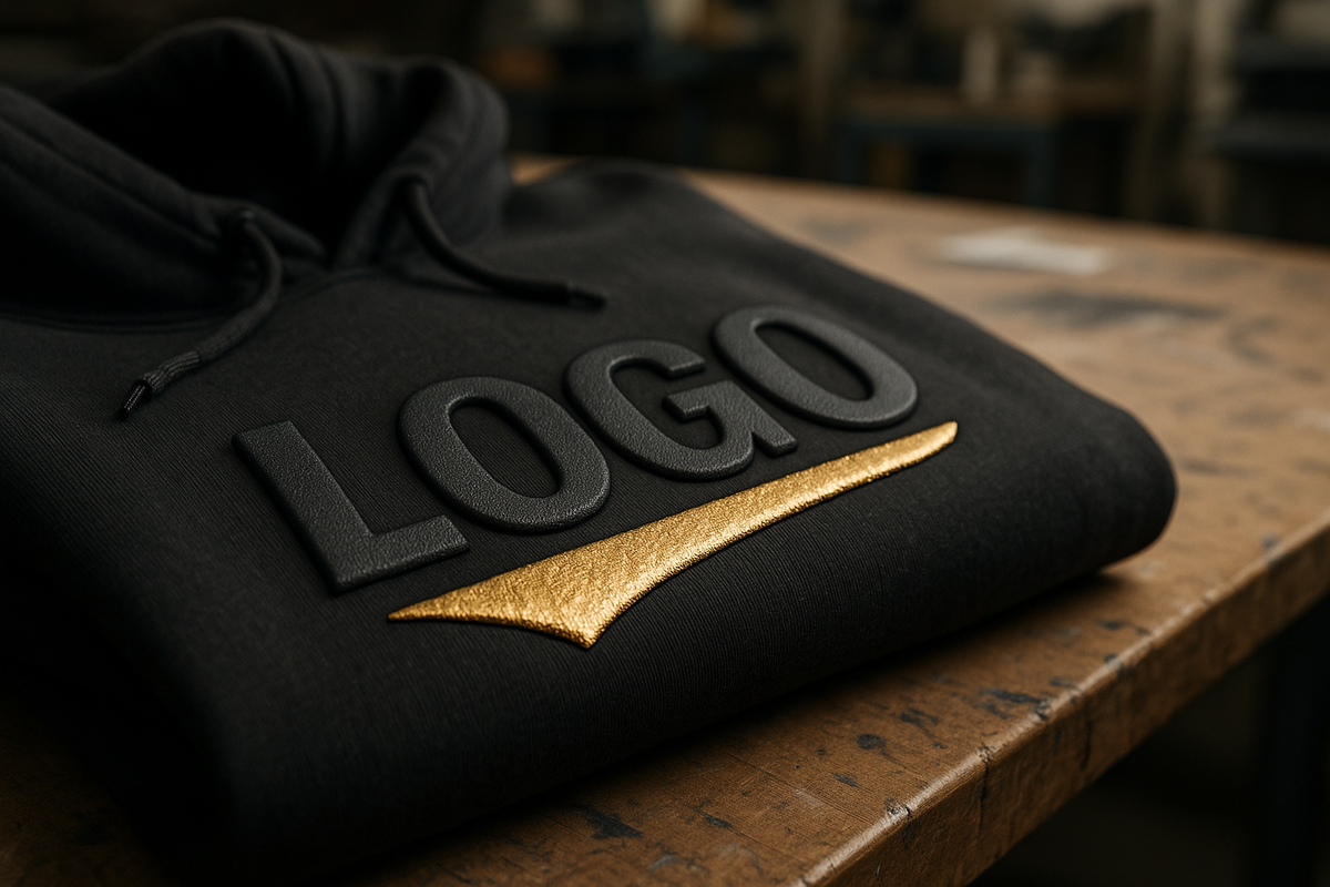
Embossing and Debossing DTF Prints
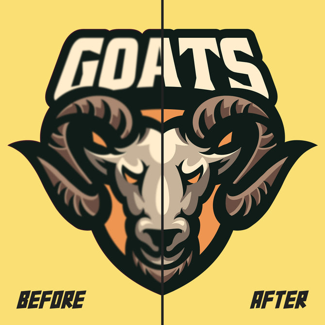
Embossing creates raised areas in your print, while debossing creates depressed or recessed areas. Both techniques add tactile dimension to your DTF designs, transforming flat graphics into textured, premium-feeling prints that invite touch and create visual impact through shadow and highlight effects.
Understanding the Embossing Process
Embossing works by applying controlled pressure and heat to specific areas of the printed transfer while it's still warm and pliable. The key is using specialized tools or heat press accessories to create the desired texture patterns. Unlike traditional embossing in paper printing, DTF embossing takes advantage of the thermoplastic properties of the adhesive powder and transfer film when heated.
Equipment and Tools Needed:
-
Texture Plates or Molds: These are specially designed plates, often manufactured to ASTM specifications with raised or recessed patterns. They can be made from metal, silicone, or heat-resistant polymers. Common patterns include leather grain, wood grain, diamond plate, linen texture, and geometric patterns. Suppliers like Stahls', Chemica, and manufacturers certified by FESPA offer custom texture plates for unique effects.
-
Modified Heat Press Setup: You'll need a heat press capable of high pressure (often 40-60 PSI) and precise temperature control. Some embossing requires specialized pressing equipment with adjustable pressure settings.
-
Timing and Temperature Control: Digital controllers help maintain consistent temperature and timing, which are crucial for achieving uniform embossing effects without damaging the substrate.
Step-by-Step Embossing Process:
-
Design Preparation: Create your DTF design as normal, keeping in mind which areas you want to emboss. Solid color areas typically emboss better than fine details or gradients. Consider how the embossed texture will interact with your colors – lighter colors may show texture more subtly than darker ones.
-
Print and Initial Transfer: Complete the standard DTF printing process – print your design, apply adhesive powder, and cure. Then perform the initial transfer to your garment using standard settings.
-
Prepare for Embossing: While the transfer is still warm and the adhesive is pliable (ideally within 30-60 seconds of the initial press), position your texture plate over the desired area. The warmth helps the material conform to the texture pattern.
-
Embossing Press: Apply high pressure (typically 2-3 times normal pressing pressure) for 10-20 seconds. Temperature should be lower than the initial transfer – around 250-280°F (121-138°C) to avoid scorching while maintaining material plasticity.
-
Cooling and Setting: Allow the embossed area to cool under pressure if possible, or remove and let cool naturally. The texture will set as the adhesive hardens.
Pro Tips for Better Embossing Results:
-
Substrate Selection: Smoother fabrics like cotton twill or poly blends show embossed textures more clearly than heavily textured materials. The fabric's natural texture can interfere with fine embossed details.
-
Ink Coverage: Designs with solid color areas and good white underbase (from your DTF printing process) emboss better than thin ink coverage. The thickness of the transfer film and adhesive provides the material needed to form the texture.
-
Pressure Distribution: Use a pressing pillow or foam pad to ensure even pressure distribution across the entire embossed area. Uneven pressure can create inconsistent texture depth.
-
Temperature Monitoring: Use an infrared thermometer to verify actual platen temperature. Too hot and you risk scorching; too cool and the material won't be pliable enough to take the texture impression.
creative applications and Design Ideas:
-
Logo Enhancement: Add luxury appeal to corporate logos by embossing company names or emblems with leather or linen textures
-
Sports and Team Wear: Create dimensional numbers and names that stand out on jerseys and uniforms
-
Fashion and Streetwear: Use geometric or organic textures to add visual interest to simple designs
-
Branding Elements: Emboss taglines or signatures to create a premium, custom feel
The key to successful embossing is practice and experimentation. Start with simple patterns and single-color areas before attempting complex multi-textured designs. Each combination of DTF materials, fabric type, and texture plate will behave differently, so keep detailed notes of successful settings for future reference.
Foil Transfer Integration with DTF
Foil stamping adds metallic or specialty finishes to specific areas of your DTF prints, creating eye-catching accents that appear to shimmer and shine. This technique is particularly popular for luxury branding, special events, and high-end fashion applications. Foil stamping works by applying metallic or specialty foils to adhesive areas using heat and pressure.
Understanding Foil Transfer Mechanics
Foil transfer relies on a thermally activated adhesive that becomes tacky when heated, allowing metallic or specialty foils to bond to specific areas of your print. In DTF applications, this can be achieved through specialized adhesive powders or by adding foil-receptive areas to your design during the printing process.
Types of Foils Available:
-
Metallic Foils: Gold, silver, copper, and chrome effects are the most popular. These create brilliant metallic finishes that catch and reflect light beautifully.
-
Holographic Foils: Create rainbow, prismatic, or multi-dimensional color effects that shift with viewing angle and lighting.
-
Matte Foils: Provide subtle metallic effects without high shine, perfect for sophisticated or understated designs.
-
Specialty Colors: Non-metallic colored foils in vibrant hues that aren't achievable with standard inks, including fluorescents and special effect colors.
-
Pattern Foils: Pre-textured foils with patterns like brushed metal, carbon fiber, or geometric designs.
Equipment and Materials:
-
Foil Rolls or Sheets: Available in various widths and lengths. Quality varies significantly between suppliers – invest in good foils for professional results.
-
Foil Stamping Machine or Modified Heat Press: Specialized machines provide more precise control, but a high-quality heat press with good pressure control can work for smaller applications.
-
Foil-Receptive Adhesive: Special adhesive powders designed to accept foil, or foil adhesive pens/markers for smaller areas.
-
Registration Tools: Alignment guides or jigs to ensure precise foil placement, especially important for multi-color designs.
Method 1: Integrated Foil DTF Process
This method incorporates foil application into your standard DTF workflow:
-
Design Preparation: In your artwork preparation, create separate layers for areas that will receive foil. These areas need to be treated differently during the powder application phase.
-
Printing: Print your design normally, but ensure areas designated for foil receive appropriate white underbase if needed for opacity.
-
Selective Powder Application: Apply foil-receptive adhesive powder only to the designated foil areas. This requires masking or selective application techniques. Standard DTF powder is applied to the rest of the design.
-
Cure and Transfer: Cure both types of powder simultaneously, then perform the initial garment transfer as normal.
-
Foil Application: While the transfer is still warm, position the foil (metallic side down) over the foil-receptive areas and apply heat and pressure (typically 300-320°F for 8-15 seconds with firm pressure).
-
Foil Removal: Allow to cool slightly, then peel away the foil carrier sheet, leaving the metallic finish bonded to the designated areas.
Method 2: Secondary Foil Application
This approach applies foil to completed DTF transfers:
-
Complete Standard DTF Process: Finish your DTF print and transfer completely using standard methods.
-
Foil Adhesive Application: Using foil adhesive pens, brushes, or stencils, apply foil-receptive adhesive to specific areas of the completed transfer. Allow to dry until tacky (timing varies by adhesive type).
-
Foil Positioning: Carefully position foil sheets over the adhesive areas, ensuring complete coverage and proper alignment.
-
Heat Press Application: Apply heat and pressure according to the foil manufacturer's specifications (typically 280-310°F for 10-20 seconds).
-
Finishing: Cool and peel the foil carrier, revealing the metallic areas.
Troubleshooting Common Foil Issues:
-
Poor Foil Adhesion: Usually caused by insufficient heat, pressure, or dwell time. May also result from contaminated surfaces or expired adhesives.
-
Foil Bleeding Beyond Intended Areas: Excess adhesive or inadequate masking. Ensure clean, precise application of foil-receptive materials.
-
Patchy or Incomplete Foil Coverage: Uneven pressure, contaminated foil, or inadequate adhesive activation. Check pressure distribution and foil quality.
-
Foil Cracking or Peeling: Over-heating, excessive pressure, or incompatible substrate. Reduce temperature/pressure and test substrate compatibility.
Design Considerations for Foil Effects:
-
Contrast: Foil effects work best when they contrast with surrounding colors. Gold foil on dark backgrounds, silver on bright colors, etc.
-
Size and Detail: Very fine details may not foil reliably. Minimum feature size depends on foil type and application method, but generally avoid features smaller than 2-3mm.
-
Typography: Bold, sans-serif fonts typically work better for foiled text than thin or script fonts.
-
Brand Guidelines: Many brands have specific metallic color requirements (Pantone metallic colors, for example) verified through SGS or Intertek testing that may need to be matched with appropriate foil selections.
Foil effects can dramatically increase the perceived value of your DTF prints, justifying premium pricing for special orders, promotional items, or luxury apparel lines. The key is starting with simple applications and building expertise before attempting complex multi-foil designs.
Puff and 3D Printing Effects
Puff printing creates raised, dimensional effects by incorporating special expanding adhesive powders that expand when heated. This technique adds significant tactile and visual dimension to your DTF prints, creating effects ranging from subtle texture to dramatic 3D relief. Puff printing has been used in screen printing for decades and is now being adapted for DTF applications.
Understanding Puff Chemistry and Mechanics
Puff effects rely on thermally activated expanding agents (usually chemical blowing agents) mixed into or applied with the adhesive. When heated to activation temperature (typically 280-320°F), these agents release gas, causing the adhesive mixture to expand and create a raised, foam-like texture. The expansion can range from subtle (1.5-2x original thickness) to dramatic (3-4x expansion).
Types of Puff Effects:
-
High Puff: Maximum expansion for dramatic 3D effects, typically expanding 3-4 times original thickness. Best for bold design elements and logos.
-
Medium Puff: Moderate expansion (2-3x) that provides noticeable dimension without overwhelming fine details. Good for text and medium-sized design elements.
-
Low Puff/Texture: Subtle expansion (1.5-2x) that adds texture and tactile interest without significant height. Ideal for background textures or subtle logo enhancement.
-
Selective Puff: Combining puff and non-puff areas in the same design to create multi-level dimensional effects.
Materials and Equipment:
-
Puff Adhesive Powder: Special formulations containing expanding agents. Available in different expansion rates and colors (white, clear, and some colored options).
-
Mixing Equipment: For combining standard DTF powder with puff additives, if using hybrid approaches.
-
Application Tools: Fine-mesh screens or specialized applicators for precise puff powder placement.
-
Heat Sources: Standard heat press equipment, but with careful temperature monitoring. Some applications may benefit from convection heating for more even expansion.
DTF Puff Application Methods:
Method 1: Full Puff Transfer
-
Design Preparation: Create designs with bold, simple shapes that will showcase the puff effect. Avoid fine details or thin lines that may not expand evenly.
-
Print Phase: Print your design using standard DTF printing methods. Ensure good ink coverage as this will affect the final puff appearance.
-
Puff Powder Application: While ink is still wet, apply puff-enabled adhesive powder over the entire design. Shake off excess and ensure even coverage.
-
Curing Phase: Cure at slightly higher temperature than standard DTF (typically 300-320°F) to activate both adhesive and expanding agents.
-
Transfer: Apply to garment using increased pressure and potentially longer dwell time to account for the thicker puff layer.
Method 2: Selective Puff Areas
-
Design Planning: Create artwork with separate layers indicating which areas should puff and which should remain flat.
-
Masking and Application: After printing, use stencils or masks to apply puff powder only to designated areas. Apply standard powder to remaining areas.
-
Sequential Curing: May require multiple curing steps if different powder types have different activation temperatures.
-
Multi-Level Transfer: Transfer process may need adjustment to accommodate varying thickness levels across the design.
Advanced Puff Techniques:
-
Gradient Puff Effects: Varying powder thickness to create gradual height transitions across design elements.
-
Textured Puff: Using textured application tools or post-expansion texturing to create surface patterns in the puffed areas.
-
Multi-Color Puff: Combining different colored inks under puff powder to create colored dimensional effects.
-
Hybrid Effects: Combining puff with foil or embossing for complex multi-finish designs.
Quality Control and Troubleshooting:
-
Inconsistent Expansion: Usually caused by uneven powder application, temperature variations, or contaminated powder. Ensure even coverage and consistent heating.
-
Over-Expansion: Results in cracking or poor durability. Reduce activation temperature or use lower-expansion powder formulations.
-
Under-Expansion: Insufficient heat or defective expanding agents. Verify activation temperature and powder freshness.
-
Poor Adhesion: The expanded structure may have different adhesion properties than standard transfers. May require modified transfer settings.
-
Wash Durability: Puff prints may be more susceptible to washing damage. Provide care instructions and consider protective topcoats for high-wash applications.
Design Guidelines for Puff Effects:
-
Size Considerations: Minimum feature size for reliable puff effects is typically 5-8mm depending on expansion level.
-
Typography: Bold, wide fonts work best. Avoid thin fonts or small text sizes that may distort during expansion.
-
Image Areas: Photographic or gradient areas generally don't work well with puff effects. Stick to solid colors and simple shapes.
-
Fabric Compatibility: Softer, more flexible fabrics accommodate puff effects better than stiff or heavily textured materials.
Puff effects can create striking visual impact and justify premium pricing, especially for custom apparel, team wear, and special event items. The key to success is understanding the chemistry involved and practicing with different expansion levels and application techniques.
Specialty Finishes and Creative Combinations
Beyond individual effects like embossing, foil, and puff, the real artistry in advanced DTF finishing comes from combining multiple techniques and exploring specialty finishes that create truly unique results. This section covers additional finishing options and strategies for combining effects to create premium, custom looks.
Glitter and Reflective Effects
Glitter Integration: Fine glitter particles can be incorporated into DTF adhesive powders or applied as a secondary finish. The key is using heat-stable glitter that won't degrade during the transfer process.
-
Mixed Powder Method: Blend fine polyester or glass glitter (typically 0.1-0.4mm) directly into adhesive powder. Ratios typically range from 10-30% glitter by weight.
-
Layered Application: Apply glitter over tacky adhesive areas before final curing, similar to foil application techniques.
-
Selective Glitter: Use stencils or masks to apply glitter only to specific design areas for accent effects.
Reflective and Safety Applications: Retroreflective materials can be integrated for both aesthetic and safety applications:
-
Micro-Bead Reflectives: Tiny glass beads that reflect light back to its source, commonly used in safety apparel.
-
Reflective Powder Additives: Mix into standard adhesive for subtle reflective effects that become visible under direct light.
-
Reflective Foil Transfers: Apply reflective foils to specific areas for high-visibility accents.
Texture Combinations and Layered Effects
Multi-Level Texturing: Combining different finishing techniques in a single design:
-
Embossed Foil: Apply foil to embossed areas to create textured metallic effects that catch light from multiple angles.
-
Puff + Emboss: Emboss patterns into puff areas while the material is still expanded and pliable.
-
Gradient Textures: Varying texture depth across a design area to create sophisticated visual flow.
-
Selective Finishing: Different areas of the same design receiving different finish treatments (flat, puff, foil, emboss) for complex visual hierarchy.
Sequential Application Techniques:
-
Base DTF Transfer: Start with standard DTF print and transfer as the foundation.
-
Primary Finishing: Apply the dominant special effect (puff, emboss, or foil).
-
Secondary Effects: Add complementary finishes to specific areas or details.
-
Final Details: Apply final accents like selective glitter or small foil details.
Color-Changing and Interactive Effects
Thermochromic Integration: Temperature-sensitive materials that change color with heat:
-
Thermochromic Powders: Mix into adhesive for areas that change color with body heat or environmental temperature.
-
Application Considerations: Requires careful temperature control during transfer to avoid premature activation.
-
Design Integration: Plan color schemes that work in both "cold" and "warm" states of the thermochromic material.
Photochromic Effects: UV-reactive materials that change appearance in sunlight:
-
UV-Sensitive Additives: Incorporated into specific areas of the design for outdoor-activated effects.
-
Indoor/Outdoor Designs: Create designs that reveal hidden elements or change appearance when worn outside.
Combining Effects: Design Strategy and Execution
Planning Multi-Effect Designs:
-
Effect Hierarchy: Determine which effect should dominate and which should accent. Too many competing effects can create visual chaos.
-
Technical Compatibility: Ensure chosen effects can be applied in sequence without interfering with each other.
-
Cost-Benefit Analysis: More complex finishing significantly increases production time and material costs – ensure pricing reflects this added value.
-
Client Communication: Provide samples or mockups showing combined effects, as these can be difficult to visualize from artwork alone.
Production Workflow for Complex Finishes:
-
Standard DTF Process: Complete base DTF printing and transfer
-
Effect Sequence Planning: Determine optimal order of operations for multiple effects
-
Staging and Alignment: Prepare jigs or registration systems for precise placement of secondary effects
-
Quality Control Checkpoints: Inspect results after each finishing stage before proceeding to the next
-
Final Inspection: Comprehensive check of all effects and overall design integrity
Market Positioning for Advanced Finishes:
-
Premium Pricing: Complex finishes justify 2-5x standard pricing depending on techniques involved
-
Specialty Markets: High-end fashion, corporate gifts, special events, and luxury branding applications
-
Limited Editions: Use advanced finishes to create exclusive product lines with higher perceived value
-
Custom Services: Position as bespoke finishing services for clients wanting truly unique products
Troubleshooting Complex Finishes
Common Issues with Combined Effects:
-
Adhesion Conflicts: Different finishing materials may not bond well to each other. Test compatibility before production runs.
-
Heat Sensitivity Stacking: Multiple heat applications can degrade earlier effects. Plan temperature sequences carefully.
-
Alignment Challenges: Precise registration becomes critical with multiple finishing steps. Invest in proper alignment tools.
-
Durability Concerns: Complex finishes may be more fragile than standard transfers. Adjust care instructions accordingly.
Quality Assurance for Specialty Finishes:
-
Sample Production: Always create samples before committing to large runs, especially with new effect combinations.
-
Wash Testing: Perform accelerated wash tests on samples to verify durability of complex finishes.
-
Documentation: Keep detailed records of successful combinations, settings, and sequences for future reproduction.
-
Client Education: Provide comprehensive care instructions for garments with specialty finishes.
Advanced finishing techniques transform DTF printing from a commodity service into a premium, artisanal offering. The key to success is mastering individual techniques before attempting complex combinations, while incorporating sustainable practices from eco-friendly DTF methods, investing in proper equipment and materials, and developing systematic approaches to quality control and production management. With these advanced skills, you can create truly distinctive products that command premium pricing and set your work apart in the marketplace.
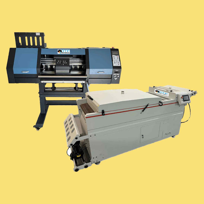
Equipment Setup and Safety Considerations
Advanced finishing techniques require specialized equipment, enhanced safety protocols, and modified workflows compared to standard DTF printing. This section covers essential equipment upgrades, workspace modifications, and safety procedures needed to implement these advanced techniques professionally and safely.
Essential Equipment Upgrades
Heat Press Modifications and Upgrades:
-
High-Pressure Capability: Embossing and some foil applications require pressures of 40-60 PSI, significantly higher than standard DTF pressing (15-25 PSI). Consider upgrading to pneumatic or hydraulic presses for consistent high pressure.
-
Precise Temperature Control: Digital temperature controllers with ±2°F accuracy become essential when working with temperature-sensitive specialty materials. Infrared thermometers help verify actual platen temperatures.
-
Interchangeable Platens: Different finishing techniques may benefit from different platen surfaces – smooth for standard work, textured for embossing, or specialized surfaces for specific applications.
-
Larger Work Areas: 16"×20" or larger presses provide room for complex, multi-element designs and better accommodate specialty finishing tools and accessories.
Specialized Application Tools:
-
Texture Plates and Dies: Professional embossing requires high-quality metal or polymer texture plates. Custom plates can be manufactured for unique branded textures.
-
Foil Handling Equipment: Foil dispensers, cutting tools, and alignment jigs improve efficiency and reduce waste when working with expensive specialty foils.
-
Precision Scales: Accurate measurement becomes critical when mixing specialty powders, glitter, or other additives.
-
Application Brushes and Tools: Various brushes, squeegees, and application tools for precise placement of specialty materials.
Environmental Control Systems:
-
Enhanced Ventilation: Some specialty powders and foils produce different fumes than standard DTF materials. Upgrade ventilation systems to handle increased particulate and chemical loads.
-
Dust Control: Glitter, specialty powders, and embossing materials can create significant dust. Air filtration systems protect both workers and equipment.
-
Temperature and Humidity Control: Some specialty materials are sensitive to environmental conditions. Climate control becomes more important for consistent results.
Workspace Organization for Advanced Techniques
Dedicated Finishing Stations:
-
Specialty Material Storage: Climate-controlled storage for temperature-sensitive materials, organized inventory systems for various foils, powders, and additives.
-
Clean Work Areas: Separate, dust-free zones for precision work like foil application and detail finishing.
-
Quality Control Station: Dedicated area with proper lighting for inspection of finished work, including magnification tools for detail verification.
-
Sample and Reference Library: Organized collection of technique samples, color references, and client approvals for consistency.
Workflow Integration:
-
Sequential Work Flow: Organize workspace to support logical progression from standard DTF processes through various finishing techniques without backtracking.
-
Staging Areas: Designated spaces for work-in-progress items between finishing stages, with clear labeling systems.
-
Tool Organization: Shadow boards, labeled storage, and easy access to frequently used specialty tools and materials.
Safety Protocols and Considerations
Personal Protective Equipment (PPE):
-
Respiratory Protection: N95 or better masks when working with fine particles like glitter or specialty powders. Some applications may require supplied-air respirators.
-
Eye Protection: Safety glasses or face shields, especially important when working with pressurized equipment or handling metallic particles.
-
Heat Protection: Heat-resistant gloves rated for higher temperatures than standard DTF work, arm guards for extended exposure periods.
-
Chemical Protection: Chemical-resistant gloves when handling specialty adhesives, solvents, or cleaning agents.
Equipment Safety Procedures:
-
High-Pressure Operations: Proper training for pneumatic/hydraulic press operation, regular pressure system maintenance, emergency release procedures.
-
Temperature Safety: Burn prevention protocols for higher-temperature operations, proper handling of heated materials and tools.
-
Electrical Safety: Upgraded electrical systems to handle increased power demands, proper grounding for all equipment, GFI protection in moisture-prone areas.
Material Safety Data Sheets (MSDS) Management:
-
Comprehensive Documentation: Maintain current MSDS sheets for all specialty materials, including additives and cleaning agents.
-
Worker Training: Ensure all staff understand hazards associated with specialty materials and proper handling procedures.
-
Emergency Procedures: Clear protocols for spills, exposure incidents, and equipment malfunctions specific to advanced finishing materials.
Environmental and Waste Management:
-
Waste Classification: Some specialty materials may require hazardous waste disposal procedures. Understand local regulations and classification requirements.
-
Contamination Prevention: Procedures to prevent cross-contamination between different specialty materials and standard DTF supplies.
-
Spill Response: Appropriate cleanup materials and procedures for different types of specialty materials.
Quality Control Systems for Advanced Techniques
Process Documentation:
-
Technique Specification Sheets: Detailed documentation of successful parameter combinations for different effect types and substrate combinations.
-
Batch Records: Tracking systems for material lots, environmental conditions, and process variations that might affect results.
-
Client Approval Systems: Formal processes for obtaining and documenting client approval of complex finishing work before full production.
Testing and Validation:
-
Sample Production: Standardized sample-making procedures for new effect combinations or client presentations.
-
Durability Testing: Accelerated wash and wear testing protocols for specialty finishes to verify performance claims.
-
Color and Effect Consistency: Regular calibration checks for equipment and materials to maintain consistent results across production runs.
Continuous Improvement:
-
Technique Development: Systematic experimentation with new materials and methods, documented for future reference.
-
Failure Analysis: Root cause analysis procedures for understanding and preventing quality issues in advanced finishing work.
-
Staff Training Programs: Ongoing education in new techniques, safety procedures, and quality standards.
Implementing advanced finishing techniques successfully requires significant investment in equipment, training, and process development. However, the ability to offer these premium services can differentiate your DTF business in a competitive market and justify premium pricing. The key is building capabilities systematically, starting with simpler techniques and gradually adding complexity as expertise and equipment capabilities grow.
Conclusion
Advanced finishing techniques represent the next level of DTF printing mastery, transforming basic transfers into premium, tactile experiences that command attention and justify premium pricing. Throughout this comprehensive guide, we've explored the technical aspects, creative possibilities, and business implications of embossing, foil stamping, puff effects, and specialty finishes.
The journey from standard DTF transfers to advanced finishing requires significant investment – in equipment, materials, training, and process development. However, this investment opens doors to new market segments, premium pricing opportunities, and creative satisfaction that comes from producing truly unique, artisanal work. The techniques covered here – from basic embossing to complex multi-effect combinations – provide the foundation for developing a distinctive brand position in the competitive custom apparel market.
Success with advanced finishing techniques depends on several critical factors: thorough understanding of the underlying chemistry and physics of each process, systematic skill development starting with simpler applications, investment in appropriate equipment and safety systems, and development of robust quality control procedures. Most importantly, it requires a commitment to continuous learning and experimentation, as the field of specialty finishing continues to evolve with new materials and technologies.
As you implement these techniques in your DTF operation, remember that each substrate, design, and client requirement may demand unique approaches and solutions. The principles and procedures outlined in this guide provide the framework, but mastery comes through hands-on experience and careful attention to the subtle interactions between materials, processes, and creative vision.
The future of DTF printing lies not just in faster, more efficient basic production, but in the ability to create distinctive, high-value products that showcase the full potential of this versatile technology. By mastering advanced finishing techniques alongside sustainable practices and emerging technologies, you position yourself at the forefront of this evolution, ready to meet the growing demand for premium, customized products that go far beyond what traditional printing methods can achieve.