
Mastering DTF Color Accuracy: ICC Profiles, Spot Colors, Complex Designs
What Is This Article About?
Master advanced DTF printing: build custom ICC profiles, use spot colors, and prepare complex artwork for precise, repeatable color on every garment.
Mastering Color Accuracy & Complex Designs is an expert-level module focusing on advanced color management and print file techniques in DTF (Direct-to-Film) printing. After covering the fundamentals in earlier courses, you're now prepared to tackle custom color profiling, spot color workflows, complex multi-layer artwork preparation, and maintaining consistency in production. Achieving precise color reproduction and handling intricate designs are crucial skills for producing professional, predictable results in DTF printing. This module provides in-depth guidance — from creating custom ICC profiles for your printer to controlling every color channel in complex artwork — all presented in a practical, step-by-step manner for the experienced DTF practitioner.
Custom ICC Profiling for DTF Workflows
Accurate color starts with proper ICC profiles. An ICC (International Color Consortium) profile is essentially a color translation file that ensures your devices (monitor, printer, etc.) speak the same "color language." In DTF printing, ICC profiles bridge the gap between the colors you see on screen and the DTF inks printed on film. Many desktop DTF printers come with a generic profile for standard ink and film, but for true color fidelity, custom ICC profiling is the gold standard. Custom profiles are tailored to your specific printer model, DTF ink set, and transfer film, which significantly improves accuracy and consistency across prints.
Why ICC Profiles Matter: A properly tuned ICC profile ensures that the vibrant design on your monitor is reproduced faithfully on the garment. It accounts for your printer's exact color capabilities (gamut) and ink behavior, resulting in predictable output. For example, without the right profile, a bright red on screen might print as a dull burgundy; with a correct profile, such surprises are minimized. In short, ICC profiles give you confidence that what you see is what you get when printing, and they help maintain consistency across multiple prints and runs.
Obtaining or Creating ICC Profiles: For DTF, you have a few options:
-
Use Supplier-Provided Profiles: Many DTF ink or film manufacturers provide ICC profiles optimized for their products and specific printer models. This is often the easiest starting point – check your supplier's website or support materials for a profile that matches your printer/ink/film combination. These profiles are tested for that exact setup, offering plug-and-play color accuracy.
-
Professional Custom Profiling Services: If off-the-shelf profiles don't meet your needs, consider using a service or RIP software add-on that creates a custom profile. Professional services can calibrate a profile to your exact printer, ink, film, and even specific garment fabric, yielding optimal results. The service will have the specialized equipment to do this accurately.
-
DIY ICC Profile Creation: As an expert user, you can create your own ICC profiles if you have access to a spectrophotometer and profiling software. (Note: This process is advanced and was likely only mentioned briefly in earlier courses. Here we cover it in more detail.) Creating a profile involves printing a test color chart and measuring it to characterize how your printer produces each color. The general steps are:
-
Device Calibration: Ensure your DTF printer is in a standard state – perform any necessary maintenance, nozzle checks, and linearization so it prints consistently. Calibrate your monitor as well, so what you see during design is reliable.
-
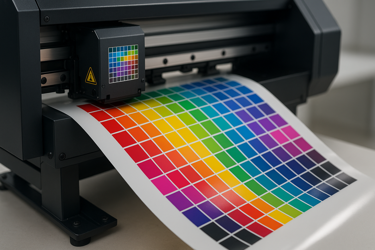
Print a Test Chart: Using your RIP or profiling software, print an ICC test target (a file with many color patches). This chart must be printed with color management turned off or using a neutral "linear" setting, so that the raw output of the printer is measured.
-
Measure the Chart: Use a spectrophotometer to read the color patches on the printed chart. This captures the actual color values your printer produced for each patch.
-
Generate the Profile: Import those measurements into profiling software. The software compares the measured colors to the expected reference values and builds correction curves – this data is saved as a new ICC profile for your printer.
-
Apply and Test: Install the new ICC profile and configure your RIP to use it for prints on that specific film/ink combination. Print a few test images (including known color swatches or photographs with difficult colors) and verify the results. If certain colors are still off, iterative adjustments can be made (some profiling workflows allow tweaking and re-measuring to refine accuracy).
-
Creating custom profiles requires technical know-how and specialized tools, so it's generally not recommended for beginners. However, at this stage in your DTF journey, you might invest in this process to squeeze the absolute best color accuracy from your setup. Even a difference of a few Delta E (color difference units) can be crucial when matching a client's brand colors.
Maintaining ICC Profile Accuracy: Once you have a good profile, maintain its accuracy over time. If you change any component of your workflow – for example, switching to a new batch or brand of DTF ink, a different film type, or even if your printer's performance changes as printheads age – you may need to update your ICC profile. Color output can drift with environmental changes as well. It's wise to periodically print a standard test image or color swatch chart to check if the colors still align. If you notice shifts (e.g prints getting a bit darker or a color cast over time), it might be time to recalibrate or remake the profile. Keeping profiles up to date ensures your painstaking work in profile creation continues to pay off with consistent results.
Spot Color Separation for Precise Color Matching
While ICC profiles handle the conversion of colors within the usual CMYK process gamut, there are cases when using spot colors is a better approach for color accuracy. Spot color separation means treating certain colors in your design as specific, named colors (like Pantone® swatches or custom colors) rather than letting them derive from standard CMYK blending. In traditional printing, a spot color would be loaded as a separate ink. In DTF (an inkjet process), we don't swap inks for different jobs, but we can still define spot colors in the artwork/RIP so the software gives those colors special treatment for more exact output.
What Are Spot Colors? In printing terms, a spot color is a premixed ink designated to print a specific hue, instead of simulating that hue by overlapping tiny dots of C, M, Y, K inks. Spot colors are used to hit shades that CMYK alone cannot faithfully produce (for example, metallic inks, fluorescents, or exact corporate logo colors). The Pantone Matching System is a famous collection of such spot formulations. The key feature is accuracy – each spot color is consistent and opaque, providing a hue that standard four-color mixing might struggle with. In practice, an enormous range of colors (especially vivid oranges, greens, blues, etc.) cannot be achieved with CMYK inks alone. By using spot colors (or expanded ink sets), a printer can reproduce a wider color gamut and ensure critical colors come out right.
Spot Colors in DTF Printing: Most DTF printers use CMYK inks (plus white). You likely don't have actual Pantone ink cartridges to swap in. However, advanced RIP software allows you to map a spot color to a particular CMYK recipe. Essentially, when you designate a color in your design as a spot (and name it appropriately), the RIP recognizes it and can either use a pre-defined CMYK formula for that named color or let you adjust the formula manually. For example, if you have a company logo with Pantone 186 C (a certain red), you can mark that in Illustrator/Photoshop as a spot color swatch. In the RIP's spot color library, Pantone 186 C might be mapped to a specific combination of your inks (maybe 97% Magenta, 90% Yellow, 10% Black, as an example) to best approximate that red on your printer. The advantage is consistency: every time that spot appears, it will print with that same ink formula. This bypasses some of the ICC color management, essentially locking in the recipe for that color.
Preparing Artwork with Spot Colors: To leverage this, set up your design files correctly:
-
Use Design Software Swatches: In vector programs like Adobe Illustrator or CorelDRAW, assign important colors (like brand logos, team colors, etc.) as spot color swatches (Pantone or custom-named spot). In Photoshop, you can create spot channels for specific elements (e.g. for white ink or specific colors), or use solid color layers with spot definitions if your workflow supports it. Keep these elements separate from the regular CMYK layers.
-
File Formats: Save or export the design in a format that retains spot color information. PDF is ideal for preserving spot colors. EPS or AI files also retain spot data. Some RIPs can import PSD files with spot channels (for example, a channel for White underbase, or other colors) – this is another method if supported.
-
White Ink as a Spot: Note that in DTF printing, white ink itself is often treated as a spot color by the RIP (since white isn't part of CMYK). You might already be familiar with generating a white underbase automatically. In complex designs, some users create a manual white layer in Photoshop as a spot channel named "White" for precise control. We will discuss underbase control more in the next section, but remember white is managed separately from CMYK.
Once your artwork has spot colors defined, import it into your RIP. Verify that the RIP recognizes the spot (most will list detected spot colors in a job preview or a separations list). You can then adjust how each spot prints. RIP spot color mapping allows fine-tuning – for instance, if the first test print of a Pantone blue is a bit off (maybe too purplish), you can tweak the CMYK values the RIP uses for that spot and print again until it's as close as possible. High-end RIPs even let you measure the spot with a spectrophotometer and automatically refine the recipe to minimize Delta E from the Pantone reference.
When to Use Spot Colors (vs. CMYK Blending):
-
Brand or Logo Colors: If you are printing logos or artwork where exact color matches are required (e.g. a university's specific shade of green or a company's trademarked orange), using spot colors is often better. Relying purely on ICC conversion could yield slight variances or duller results. By treating it as a spot, you essentially tell the printer "print this area with exactly these ink amounts to hit that color". For instance, Pantone spot matching is a common requirement in pro printing; achieving Pantone matches on a DTF printer requires careful profiling and sometimes iterative tweaking.
-
Out-of-Gamut Colors: As mentioned, some colors are outside the range CMYK can reliably produce. Bright reds, violets, or teals might never look right if you only use process mixing. If you identify such a color in your design, you can try a spot approach to push your printer as far as it can go for that one color. In some cases, shops might even use special ink (like swapping one channel to orange or green for a particular job) – that's an extreme approach, but it underlines the point that standard inks have limits.
-
Solid Areas and Flat Colors: If your design has large areas of a single flat color, a spot color can ensure those areas print smoothly without the dot pattern of CMYK halftones. You get a uniform fill, which can look cleaner. In DTF, you'll still technically be laying down tiny dots of ink, but if it's one color channel primarily, it can reduce the visual noise. For example, solid black text or shapes: many RIPs treat 100% K (black) as a special case, but defining a rich black spot (with a custom mix or just 100K) could guarantee a dense, neutral black without a mix of CMY. This avoids any chance of a slight color cast in black or muddy look from too much ink.
-
Specialty Inks: If you have an unusual DTF setup with additional inks (like orange, violet, or even fluorescent channels), spot separation is essential to utilize them. Some advanced DTF printers now offer expanded gamuts (as used by some commercial providers who add orange or neon inks to hit colors standard CMYK can't ). In the RIP, those extra inks are addressed via spot color assignments or extended ICC profiles. While most users won't have this, it's worth noting for completeness.
In summary, use spot color separation when color precision overrides simplicity. A real-world example: a print shop needed to output a client's logo with a very specific blue. Through normal CMYK, the blue always printed with a slight purple tint. So they defined that logo blue as a spot color in the file and measured a few test prints, adjusting the ink mix until it matched the Pantone swatch closely. Once satisfied, they saved that formula as a custom spot in their RIP's library. Now, every time they print that client's jobs, the RIP knows exactly how to produce the blue, ensuring consistent results in each run. This approach can be the difference between "close enough" color and a perfect match that impresses your client.
(Keep in mind that using spot colors requires discipline in file prep and sometimes more test printing. If a job has many different colors (like a photograph), you obviously can't make each color a spot – process printing is suitable there. Spot color workflows shine for designs with a limited palette of important colors.)
Managing Complex Multi-Color and Layered Artworks
DTF printing isn't limited to simple graphics; you can produce very complex, multi-layered designs with dozens of colors, gradients, and fine details. However, the more complex the artwork, the more carefully you must prepare and manage your files to ensure everything prints correctly. In this section, we explore strategies for handling complex multi-color or layered artworks, including file preparation best practices, controlling color channels, and using your RIP software for precise layering and ink management.
File Preparation for Complex Designs: Start with how you set up your artwork:
-
Work in the Right Color Space: Typically you'll design in RGB for a broad color range and then let the RIP convert to CMYK using the ICC profile. Since you have a custom ICC profile (from the previous section), use it to soft-proof your design in Photoshop or other software (e.g., view a CMYK simulation for your DTF profile) to catch any out-of-gamut colors. For vector artwork, use CMYK or spot definitions for solid colors as needed. Maintaining consistent color definitions in your file avoids surprises at print time.
-
Flatten or Simplify Layers if Needed: If your design has many layers with blending modes or transparency effects (common in Photoshop compositions), be cautious. Not all RIPs handle complex blending the same way as your design software. A best practice is to flatten artwork to a TIFF/PNG with transparency only if you are confident in how the transparency should appear over the shirt color (or over the white underbase). If unsure, test a small sample. Overly complex layered effects can sometimes yield unpredictable results in printing – flattening can bake in the intended appearance. Keep a master file with layers intact, but print from a flattened copy to reduce RIP processing errors.
-
Use High Resolution: For raster images, work at a high resolution (at least 300 DPI at the final print size, sometimes higher for very fine details or large prints). Complex designs often have fine details (textures, small text, etc.), and a higher resolution ensures those details print sharply. Check that any imported graphics (logos, etc.) in your design are also high-res. Pixelation or blur will ruin an otherwise great design.
-
Layer Order & Overprints: In vector design for print, pay attention to which objects are set to overprint or knock out. For instance, if you have black text on top of a complex background, you might intentionally set it to overprint the background in design so that the RIP doesn't knock a hole in the background for the text. In DTF, overprint vs. knockout affects how the white underbase is generated too. (If something is set to overprint, it means the bottom layer will still have white and color and the top object will print on top without its own white underbase.) Use overprint for things like thin black outlines or small text to avoid registration issues. Conversely, ensure objects that shouldn't mix have knockout (so the bottom color doesn't show through). These classic printing techniques apply to DTF's digital process as well – your RIP will generally honor those settings.
-
Explicit White Layers (if needed): As an advanced user, you might sometimes prepare a white ink layer manually for tricky designs. For example, say you have a semi-transparent drop shadow in your design. The RIP's automatic white underbase might either underbase it fully (making it look too opaque) or not enough. In such cases, you could create a custom white layer in Photoshop: paint the desired opacity of white behind that drop shadow. This is essentially creating a spot white channel by hand for fine control. Not everyone does this (RIP algorithms are usually sufficient), but it's a technique to keep in mind for exceptional cases. If you do this, you'll import the file as e.g. a PSD with an alpha channel or a TIFF with layers, depending on what your RIP supports, and configure the RIP to use your custom white channel instead of generating one automatically.
Color Channel Control & Ink Management: Complex designs often push your printer to its limits in terms of color range and ink coverage. Here are strategies to control the output at the channel level:
-
Total Ink Limit: Ensure that the total amount of ink being printed in any area is within safe limits. If you have an area where 100% C, 100% M, 100% Y, 100% K would all lay on top (which can happen in rich blacks or dense images), that could be too much ink, leading to bleeding or longer drying times. Your ICC profile or RIP print mode usually has a Total Ink Limit set (often around 250-300% for fabric printing). For very complex artworks (like high contrast photographs), double-check this. You might need to tweak levels or curves in the image to reduce extremely saturated dark areas. Using your RIP's ink limiting controls during profile creation or in the print dialog helps ensure no single spot gets more ink than the film can handle.
-
Channel-Specific Adjustments: Advanced RIPs allow adjusting individual channels. For example, if you notice your particular printer tends to oversaturate reds (too much magenta maybe), you can lower that channel a touch in the RIP calibration. Or use GCR/UCR (Gray Component Replacement / Undercolor Removal) settings: these control how much black ink is used versus combinations of CMY to produce dark tones. Increasing GCR uses more black and less CMY in neutrals, which can improve stability (since black ink is often cheaper and prints consistently, whereas heavy CMY mixing can shift). Tweaking these requires expertise, but it can be beneficial in complex images to maintain neutral grays and prevent color casts in shadows or highlights.
-
White Underbase Control: Perhaps the most important "extra channel" in DTF is the white underbase. Complex designs with many colors need a solid foundation of white when transferring onto dark garments. However, you don't always want 100% white under everything. Fine details and edges can suffer if the white layer peeks out. This is where the choke setting comes in. Choking the white underbase means slightly reducing the size of the white layer relative to the color layer on top, so that no white sticks out from the sides of a colored area. A common practice is to choke (shrink) the white by a small offset, e.g. 1–3 pixels inward. Even a 0.5 mm choke can prevent those tiny white halos around dark-colored elements. Most RIP software has a "choke" or "bleed" adjustment for underbase – use it. A typical recommendation is a choke value in the 2–5 pixel range, but this can depend on your print resolution. Test with some text or shapes on a dark background to dial in the ideal choke: you want full white coverage under colors, but no visible white sticking out.
-
Varying Underbase Opacity: Not every part of a design needs a solid white backing. For instance, if you have a lens flare or a very light smoke effect in your image, a fully opaque white beneath it will make it pop brightly – but maybe you intended it to be subtle. Some RIPs let you underbase colored areas proportionally to their luminosity (so lighter colors get less white). Alternatively, you can rasterize those effects into your file with transparency and let the RIP handle it. For advanced control, you might intentionally fade your white layer in certain zones. Example: printing a neon glow – you might give the glow a soft white underbase while the area further out has none, to allow the shirt color to show through for a realistic dimming effect. This is a creative technique, but it demonstrates understanding that underbase doesn't have to be all-or-nothing. Experiment with underbase strength on different colors; for some garments, using (say) 90% white under mid-tones can reduce the ink feel without much visible difference in color. It's a balancing act between vibrancy and hand-feel.
-
Knockouts and Trapping: In multi-layer artwork (for example, a yellow object on top of a blue object), if you rely solely on the RIP, it will generally knock out the lower layer (no color or white under the top object). That's good. But if registration between layers isn't perfect, you might get tiny gaps. Professionals solve this with trapping: slightly expanding one object's color into the other to overlap. In digital printing, you can add a small stroke of the underlying color underneath the top object (spread the bottom or choke the top) to ensure no gaps. This is sometimes needed if you see hairline gaps between colors in a print. It's more common in screen printing, but it can apply if your RIP or printer has slight misalignment. Most of the time, proper choke on the white layer and high resolution renders will suffice in DTF.
-
Halftones for Smooth Blends: If your complex design includes gradients or shading (especially in the white underbase or in spot colors), know that the RIP will typically convert those to a halftone or dither pattern. Mastering halftone settings can elevate print quality. For example, a gradient that goes to zero might produce a harsh transition if not enough resolution or if dot size is large. By choosing a finer dot pattern or using stochastic dithering, you can achieve smoother fades. Some advanced users even incorporate halftone patterns creatively (e.g. a comic book-style dot shading in the design itself) to ensure a particular look. The takeaway is: leverage your RIP's screening options. For photorealistic prints, use error-diffusion or high-frequency dithering for smooth results; for vector art with few colors, a classical round dot halftone might give crisp edges. These technical settings greatly influence how layered colors appear, so don't ignore them in advanced work.
Using RIP Software for Precise Layering: A good RIP is your best friend for complex prints. We've already touched on many RIP features (spot color mapping, ink limiting, white underbase control, etc.). Here are a few more tips specific to layering and complex jobs:
-
Preview Separations: Always use the RIP's preview to check the separations (CMYK channels and White) for your job. Many RIPs can display the white underbase it will print as a grayscale preview. Scan over the preview for any unexpected behavior: e.g., see if any area has no white under it (unless it's supposed to be that way for a transparent effect) or if small details are getting a full underbase that might cause issues. Some RIPs allow you to exclude white under certain colors above a threshold (for instance, don't print white under black areas to keep black looking darker and save ink). Adjust these settings as needed per job.
-
Layer Order and Print Mode: DTF printers often lay down colored inks and then white ink in one pass (especially if it's a single-carriage system printing CMYK and White together). If using a two-pass system (some printers print color first, then feed back to print white on top), ensure the timing is right so colors don't dry excessively before white is applied (or vice versa). Your RIP will control this, but it's worth noting: precise layering means the color and white layers align perfectly. Perform calibration if your color-to-white alignment is off (you might have seen prints where the white layer is slightly shifted, causing a fuzzy look – calibrate those offsets in the RIP). Mechanical precision is part of mastering layered prints.
-
Curing and Post-Processing: While not exactly a RIP setting, how you cure the print (melting the adhesive powder) can affect appearance in complex designs. For example, curing at too high a temperature or too long can slightly dull colors or cause bleeding for very ink-heavy designs. Follow recommended curing settings and be consistent. If you have very large solid areas of ink, you might cure a bit longer to fully melt the powder in the middle. Conversely, very fine detail might need a bit less heat to preserve crispness. Consistency here affects final color and detail.
Example – Complex Artwork Workflow: Imagine you're printing a detailed graphic: it has a photographic background (with dozens of colors), a large title text in solid bright green with a subtle black outline, and some semi-transparent flame effects in orange. To get this right, you would:
-
Soft-proof and possibly tweak the photo colors so they fit your printer's gamut (maybe reduce an overly vibrant teal that your printer can't hit).
-
Define the title text green as a spot color named "Brand Green" if it's critical to match (and adjust it in RIP to print nicely). The black outline you set to overprint, so it just prints on top of everything (with no white under it, since black usually covers well).
-
In the RIP, check the white underbase preview: you apply a choke so the white underbase sits just under the green letters and doesn't stick out around the black outline. You also see the flame graphics in the preview – they are semi-transparent, so the RIP automatically gave them a halftoned white underbase (lighter in the outer areas). You might increase the white under those flames slightly if you want them a bit more opaque, or leave as-is for a realistic transparent look.
-
Print a small test. You notice maybe the flame's orange isn't as bright as you hoped. So you go back and designate that flame orange as a spot, and push more saturation by adjusting its output values or even printing two layers (if your printer/RIP can do an extra pass for a spot color). You test again – now the flames pop. The green title is perfect, and the photo looks great because your profile is doing its job. No white edges appear because your choke was set well. Success – the complex design is printed with all elements in harmony.
The key to complex designs is attention to detail at every stage: file setup, color management, and print configuration. By combining these strategies, even the most complicated artwork can be executed faithfully on a DTF printer.
Maintaining Color Consistency Across Long Runs & Multiple Printers
Achieving one perfect print is great – but in professional production you need that same quality over hundreds of prints and across different machines. This final section covers practical techniques to maintain color consistency during long print runs and when using multiple printers. Consistency is the hallmark of a mastered process: the first shirt and the last shirt in an order should look identical in color; an order reprinted six months later should match the original; jobs printed on two different DTF printers should be indistinguishable to the customer. Here's how to reach that level of consistency.
Challenges in Long Print Runs: When printing dozens or hundreds of DTF transfers in one go, you may encounter subtle shifts over time. Common factors include: printhead temperature (as the printer runs, the heads can get warmer, potentially affecting ink flow), ink agitation (pigments, especially white ink, might settle or behave differently over a long run), and microclimate changes (if your printer's surrounding temperature or humidity changes from morning to afternoon). Even the curing process – if your heat press or oven drifts in temperature – can cause later prints to look slightly different (over-cured prints might appear a tad more matte or colors less vibrant). To combat these issues:
-
Run Calibration Prints Periodically: Some advanced users include a small color calibration strip at the edge of a large batch print or after a certain count of prints. This could be a row of color patches that you later compare (visually or with an instrument) to an earlier one. If you notice a shift, you can pause to let the printer rest or adjust settings. While not everyone goes this far, it's a technique borrowed from industrial printing for quality control.
-
Consistent Printer Maintenance: Before a long run, make sure your printer is in top condition. Perform all routine maintenance (head cleaning, nozzle checks, alignments). A partially clogged nozzle can gradually worsen during a run and cause color banding or a shift (e.g., if the cyan nozzle clogs mid-run, all your prints after that might look warmer). It's easier to maintain consistency than to fix a problem after 50 prints are wasted. Some users even do a quick nozzle check every set number of prints to catch issues immediately.
-
Watch Ink Levels: Ensure you have enough ink (and powder) for the entire run. Running low on ink can introduce air in lines or pressure changes that definitely affect color output (you might get a lighter color if ink supply is starving). Top up ink in advance or have cartridges ready to swap without letting the printer run dry. If you must replace a cartridge mid-run, print a test immediately after to confirm the color hasn't changed (different batches of ink can have slight variations). Ideally, use the same batch of ink for a single large order.
-
Environment Control: Maintain a stable environment in your print room, especially for big jobs. Fluctuations in temperature or humidity can change how ink droplets behave on the film. For instance, high humidity might slow down drying, causing more dot gain (slightly muddling colors), whereas very low humidity might lead to static or faster drying (which could affect color vividness or cause clogging). Aim to keep the room in a moderate range (around 20–22°C / 68–72°F and 40–60% humidity is a commonly recommended range for digital printing). Use air conditioning, humidifiers/dehumidifiers as needed, and avoid direct drafts on the printer. Consistency in environment = consistency in output.
-
Curing Consistency: If you're curing transfers in batches (say on a heat press or conveyor dryer), use consistent settings and timing for each batch. If you notice that transfers cured later look different, double-check your temperature with an IR thermometer or pyrometer – the heating element might be fluctuating. Keep a log of time and temp for big runs to ensure uniform treatment.
Multiple Printers Consistency: Many print businesses operate two or more DTF printers to meet demand. Getting two printers to produce the same result is tricky but achievable:
-
Use Identical Settings and Profiles: Calibrate each printer individually and create an ICC profile for each if needed. Even two units of the same model can behave differently. One might need slightly more ink to reach the same density. By profiling each, you account for those differences. The goal is that a file printed on Printer A with Profile A looks like the same file on Printer B with Profile B. If both profiles were made to the same standard (e.g., using the same target and conditions), they should yield very close results. It's important to also use the same rendering intents and settings in the RIP for both. Essentially, minimize any configuration differences.
-
Match Materials: Always use the same ink brand and type in all printers if you want matching output. Different ink formulations have distinct color (one brand's "cyan" might be a bit more greenish than another's). The film or powder should also be the same, as glossiness or powder melt can influence the perceived color. If one printer is older and using older ink, flush and sync them up with fresh ink from the same lot if possible when critical consistency is required.
-
Synchronize Maintenance: If one printer has a slightly clogged head, its colors will differ. Try to maintain both (or all) machines in parallel – e.g., if you replace a printhead on one, consider aligning or at least checking the other for any wear that might make its output diverge. Some shops even rotate jobs between printers regularly to catch if one drifts (if print #1 from printer A and print #2 from printer B are compared and they differ, you'll spot it immediately).
-
Environmental Uniformity: House the printers in the same room or in rooms with similar conditions. If one is in a cooler corner, it might output color a bit differently than one in a warmer spot. Also, ensure both printers use the same type of RIP and RIP version if possible. Different RIP engines or versions can have slight output differences.
-
Visual Comparison & Iteration: When starting a multi-printer production, always do a side-by-side test. Print the same small image or color swatch on all machines and compare. If you have a spectrophotometer, even better – measure key colors. If Printer B consistently has, say, a Delta E of 3 higher in the orange tones compared to Printer A, you might adjust Printer B's profile or tweak its color bias in the RIP. Keep adjusting until they align within an acceptable tolerance (a very tight tolerance is a Delta E <2 for most colors – practically indistinguishable to the human eye). While this level of calibration might seem extreme, it's what high-end print operations do to guarantee that no matter which machine produces the job, the client gets the same product. Using such color calibration tools and profiles across devices ensures uniform output.
-
Consistent Workflows: Make sure both printers follow the same workflow each time. For instance, if you print one-pass bidirectional on one, don't use two-pass unidirectional on the other for the same job – those settings can affect color slightly. Standardize your print mode and resolution.
Real-World Consistency Example: A printing business has two DTF printers to handle large orders. Initially, they found that prints from Printer 1 looked a bit cooler (bluish) compared to prints from Printer 2, even with the same ICC profile. To solve this, they created separate custom ICC profiles for each printer, effectively "teaching" each device to hit the desired color target. They also calibrated both on the same day in the same environment. The result was that a gradient print split between the two machines showed no visible difference at the hand-off point. Later, when scaling up production, they implemented daily nozzle checks and monthly re-calibration. They kept notes of the ambient conditions and noticed one summer that high humidity was causing minor color shifts; dehumidifiers were installed to keep conditions stable. Another practice they adopted is keeping a printed reference from the start of a big job and comparing it to the end of the job – if there's any noticeable change, they stop and troubleshoot (rather than delivering a batch with inconsistent prints). Through these measures, they achieved a reputation for rock-solid consistency. In fact, one provider emphasizes using calibrated profiles, consistent processes, and quality control so that colors "look right and stay that way" across all prints – this level of professionalism is what you're aiming for as an expert.
Key Takeaways for Consistency:
-
Use consistent color profiles and calibrations on all devices and media for uniform results.
-
Control your printing environment – keep temperature and humidity within a narrow range for every print run.
-
Perform regular maintenance and checks to catch issues early (clogged nozzles, low ink, etc., which can cause color drift).
-
Standardize your workflow and document settings for re-use. If you achieve a great result today, record the profile, RIP settings, print mode, curing method, etc., so you can replicate it later exactly.
-
When using multiple printers, profile each machine and fine-tune so that each hits the same color targets. Make test prints on all and compare until they match within acceptable tolerance.
-
High-quality consumables (inks, films) pay off in consistency; cheap or mixed supplies often result in variability.
By implementing these strategies, you ensure that your hard-won color accuracy isn't a one-off fluke but rather a dependable characteristic of your DTF production. Whether you're printing 1 shirt or 1000, on one printer or several, the colors and quality remain steady. This reliability is what sets apart true DTF printing masters.
Conclusion
In this "Mastering Color Accuracy & Complex Designs" module, we've covered the advanced techniques that transform you from a competent DTF printer into an expert artisan of the craft. You learned how to create and use custom ICC profiles to achieve color accuracy tailored to your specific setup (and why that matters for every print you produce). We explored the use of spot colors for those critical hues that demand extra precision, ensuring even challenging colors can be reproduced faithfully on film. We delved into handling complex artworks – from prepping files with multiple layers to controlling each ink channel and the all-important white underbase – giving you the tools to tackle any intricate design a client throws at you. Finally, we emphasized practical methods to maintain consistency, so that your first print and your last print (whether from one printer or many) are indistinguishable in quality.
By applying these techniques in your DTF workflow, you'll significantly reduce trial-and-error and elevate the professionalism of your output. Real-world DTF production is full of variables, but now you have a deep understanding of how to manage them: color will stay consistent, designs with dozens of layers will print correctly, and customers will come to trust the reliability of your results. As you implement custom profiling, spot color matching, and rigorous process control, you are truly mastering color accuracy and complex design printing. This expertise will not only save you time and money (through fewer reprints and rejects) but also open up new possibilities – like taking on high-profile jobs where exact color matching is non-negotiable or printing artwork that others might deem "too difficult" to get right.
With this knowledge, continue to experiment and refine your workflow. Every printer, design, and environment can teach you something new. But the foundation you've built in this module will guide you to solve problems and continuously achieve top-tier results. Happy printing, and may your colors always be spot-on!