

DTF Color Management Guide: Advanced Artwork, ICC Profiles & Spot-Color Matching

What Is This Article About?
Master DTF color management with advanced artwork preparation, custom ICC profiles, precise monitor and printer calibration, and foolproof spot-color matching for brand-perfect prints every time.
Mastering color in Direct-to-Film (DTF) printing requires understanding the complex interplay between artwork preparation, ICC profiles, RIP software settings, and the physical properties of your materials. Whether you're achieving perfect spot colors for corporate branding or managing complex photographic artwork, this guide provides the advanced techniques needed to deliver consistently accurate DTF transfers that match client expectations every time.
Understanding DTF Color Management Fundamentals
Color management in DTF printing is more complex than traditional CMYK printing because of the unique white ink underbase, adhesive powder interaction, and film substrate properties. The key to success lies in establishing a controlled, predictable color workflow from design to finished transfer.
The DTF Color Workflow
A proper DTF color workflow follows these critical steps:
- Design Creation: Artwork should be created in appropriate color spaces (sRGB for screen viewing, Adobe RGB for print production)
- Profile Assignment: Apply correct printer ICC profiles based on your specific DTF printer and film combination
- RIP Processing: Configure your RIP software to handle white ink generation and color separation properly
- Output Verification: Use color swatches and proofing methods to verify accuracy before production runs
- Production Monitoring: Implement quality control checks during printing to maintain consistency
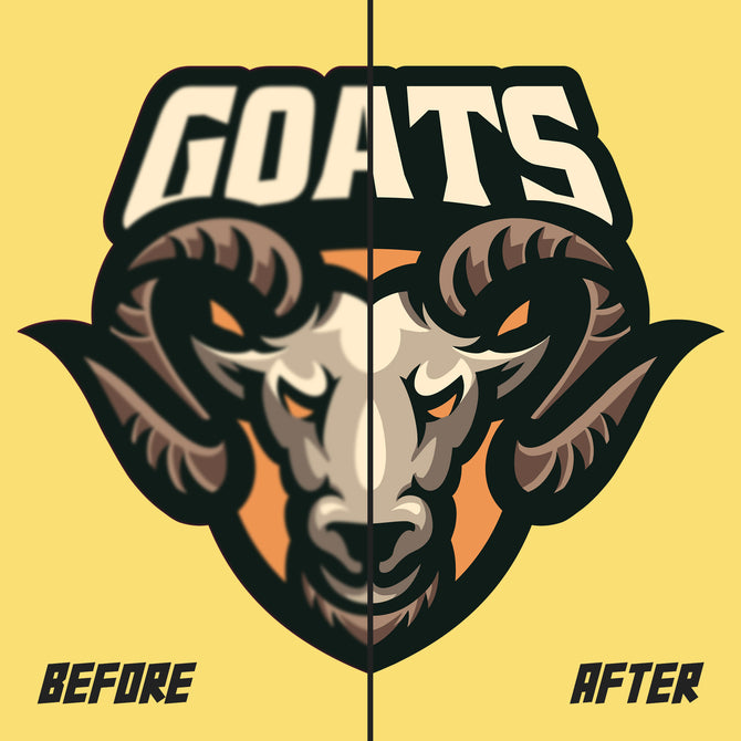
White Ink's Impact on Color
The white ink underbase in DTF printing dramatically affects color appearance, especially when printing on dark garments. Understanding white ink behavior is crucial for consistent color output:
- Opacity Control: White ink density affects color vibrancy – too little creates washed-out colors, too much creates thick transfers
- Edge Definition: White ink boundaries must align perfectly with color areas to prevent halos or color bleeding
- Layering Strategy: Some colors benefit from multiple white ink passes, while others perform better with single-pass coverage
ICC Profiles and Color Spaces
ICC (International Color Consortium) profiles are mathematical descriptions that define how your DTF printer reproduces colors. Using correct profiles is essential for predictable color management in DTF printing workflows.
Creating Custom ICC Profiles
For precise color control, create custom profiles for your specific printer, ink, and film combinations:
- Profiling Equipment: Use a spectrophotometer like the X-Rite i1Basic Pro 2 or testing equipment certified by SGS for accurate color measurement
- Test Chart Creation: Print IT8.7/4 or custom color charts on your specific DTF film and ink combination
- Measurement Process: Measure printed charts after complete curing and cooling to ensure accurate readings
- Profile Generation: Use profiling software to create ICC profiles from measurement data
- Profile Validation: Test profiles with known color standards before implementing in production
Working with Vendor-Supplied Profiles
Many DTF ink manufacturers provide ICC profiles for their products. While convenient, these generic profiles may require fine-tuning:
- Profile Testing: Always test vendor profiles with your specific setup before using in production
- Environmental Factors: Profiles may need adjustment for your specific humidity and temperature conditions
- Substrate Variations: Different DTF film brands may require profile modifications even with the same inks
Advanced Artwork Preparation for Color Accuracy
Preparing artwork for optimal DTF color reproduction requires specific techniques that differ from traditional print methods.
Color Mode Selection
Choose the appropriate color mode for your DTF artwork based on the intended output:
- CMYK Mode: Best for designs intended for print reproduction, provides better control over color separations
- RGB Mode: Suitable for designs with vibrant colors that extend beyond CMYK gamut, requires careful profile management
- Spot Color Integration: Use named spot colors for brand-critical colors that must match exactly
Black Ink Strategy
Managing black in DTF printing requires understanding the interaction between process black (built from CMYK) and true black ink:
- Rich Black Creation: Use C40-M40-Y40-K100 for deep, rich blacks that won't appear washed out
- Registration Black: Reserve C100-M100-Y100-K100 only for registration marks, never for design elements
- Gray Balance: Achieve neutral grays using balanced CMY values with appropriate black support
Color Gamut Considerations
Understanding your DTF system's color gamut helps set realistic expectations and optimize designs:
- Gamut Mapping: Use Photoshop's gamut warning or professional software like Caldera RIP to identify out-of-gamut colors during design
- Saturation Management: Highly saturated colors may require adjustment for accurate DTF reproduction
- Fluorescent Integration: Consider equipment from manufacturers like Epson or Mimaki, and plan for specialty fluorescent inks when standard gamut cannot achieve desired vibrancy
Spot Color Matching and Brand Consistency
Achieving precise spot color matches for corporate branding and logo reproduction requires systematic approaches and quality control measures.
Pantone Color Matching
Converting Pantone colors to DTF CMYK equivalents while maintaining brand integrity:
- Pantone Bridge References: Use Pantone Bridge guides and color standards from ASTM International to see how spot colors translate to process printing
- Color Build Formulas: Document successful CMYK recipes for commonly used brand colors
- Client Approval Process: Always provide color proofs for client approval before production runs
- Lighting Conditions: Evaluate color matches under standard D65 lighting conditions for consistency
Creating Color Matching Systems
Develop standardized approaches for consistent color reproduction:
- Color Library Development: Build libraries of successfully matched colors with documented settings
- Swatch Book Creation: Print physical swatch books showing your DTF system's color capabilities
- Delta E Tolerances: Establish acceptable color difference thresholds (typically ΔE < 2.0 for critical matches)
- Batch Consistency: Implement controls to ensure color consistency across multiple production runs
RIP Software Configuration for Color Management
Your RIP (Raster Image Processor) software is the command center for DTF color management. Proper configuration ensures consistent, predictable color output.
Essential RIP Settings
Configure these critical settings for optimal DTF color management:
- Color Management Engine: Choose between Adobe CMM, ICC standard engine, or proprietary engines based on your workflow
- Rendering Intents: Select perceptual rendering for photographs, relative colorimetric for logos and spot colors
- Black Point Compensation: Enable to preserve shadow detail in dark areas
- White Ink Generation: Configure automatic white ink generation based on substrate color and transparency
Print Mode Optimization
Different print modes affect color output and should be selected based on quality requirements:
- High Quality Modes: Use for critical color matching and photographic reproduction
- Production Modes: Balance quality and speed for standard commercial work
- Draft Modes: Reserve for proofing and test prints only
- Custom Settings: Develop custom print modes optimized for specific job types
Environmental Factors Affecting Color
Environmental conditions significantly impact DTF color consistency and must be controlled for optimal results.
Temperature and Humidity Control
Maintain optimal conditions for consistent DTF printing:
- Temperature Range: Maintain 68-72°F (20-22°C) for optimal ink viscosity and film handling
- Humidity Control: Keep relative humidity between 40-50% to prevent film static and ink behavior changes
- Air Circulation: Provide gentle air circulation without direct drafts on the printer
- Monitoring Systems: Use data loggers to track environmental conditions over time
Lighting for Color Evaluation
Proper lighting is essential for accurate color assessment during production:
- Standard Illumination: Use D65 lighting (6500K) certified by ISO standards for color evaluation and matching
- Consistent Viewing: Evaluate colors in the same lighting conditions throughout the process
- Metamerism Checks: Test color matches under multiple light sources to identify potential issues
Quality Control and Color Consistency
Implementing systematic quality control measures ensures consistent color output across production runs and over time.
Color Control Strips
Use control strips to monitor and maintain DTF print quality:
- Daily Monitoring: Print control strips with each job to verify color consistency
- Density Measurements: Measure solid ink densities to ensure consistent ink laydown
- Color Patch Analysis: Include primary and secondary color patches for comprehensive monitoring
- Trend Analysis: Track measurements over time to identify drift before it affects production
Calibration Schedules
Establish regular calibration routines to maintain color accuracy:
- Daily Checks: Verify nozzle function and basic color output
- Weekly Calibration: Perform color calibration and profile verification
- Monthly Profiling: Create new profiles if significant drift is detected
- Consumable Changes: Recalibrate whenever changing ink lots, film stocks, or adhesive powder suppliers
Troubleshooting Color Issues
When color problems arise, systematic troubleshooting helps identify root causes and implement effective solutions.
Common Color Problems
Recognize and address these frequent DTF color issues:
- Color Shift: Gradual changes in color output over time, usually indicating profile drift or ink issues
- Inconsistent Color: Variations within single prints or between prints, often related to mechanical or environmental issues
- Metamerism: Colors that match under one light source but not another, requiring careful ink formulation
- Bronzing: Unwanted metallic sheen in dark areas, typically caused by excessive ink density
Diagnostic Procedures
Follow systematic approaches to identify color problems:
- Nozzle Check Patterns: Verify all colors are firing properly before investigating color accuracy
- Step-by-Step Testing: Isolate variables by testing individual colors, print modes, and materials
- Reference Standards: Compare current output to established reference prints and color standards
- Documentation: Record settings, conditions, and results for future reference
Advanced Color Techniques
Master these advanced techniques to achieve exceptional color results in specialized applications.
Multi-Pass Color Building
Use multiple print passes to achieve enhanced color depth and vibrancy:
- Double-Strike Printing: Print identical layers for increased density and color saturation
- Graduated Layering: Use varying ink densities in multiple passes for smooth color transitions
- White Ink Optimization: Print multiple white ink passes for maximum opacity on dark substrates
Color Gamut Extension
Expand your effective color gamut through strategic techniques:
- Specialty Ink Integration: Incorporate metallic and fluorescent inks for colors beyond standard CMYK
- Undercolor Removal: Use advanced UCR techniques to improve color saturation and ink economy
- Gray Component Replacement: Implement GCR strategies for better gray balance and reduced ink consumption
Workflow Integration and Automation
Integrate color management into your broader DTF production workflow for maximum efficiency and consistency.
Automated Color Correction
Implement systems that reduce manual color adjustment requirements:
- Hot Folder Processing: Set up automated workflows that apply appropriate profiles and settings
- Batch Processing: Process multiple files simultaneously with consistent color management
- Quality Monitoring: Integrate spectrophotometers with RIP software for real-time color verification
Color Database Management
Organize color information for efficient production management:
- Customer Color Libraries: Maintain libraries of approved colors for repeat customers
- Recipe Documentation: Document successful color formulations for future reproduction
- Version Control: Track profile versions and color standard updates
- Backup Systems: Maintain secure backups of all color profiles and settings
Cost Considerations and ROI
Understanding the business impact of color management helps justify investment in proper tools and procedures.
Investment Analysis
Calculate the return on investment for color management systems:
- Waste Reduction: Proper color management reduces reprints and material waste
- Time Savings: Consistent color reduces setup time and color correction efforts
- Customer Satisfaction: Accurate colors reduce complaints and build customer loyalty
- Premium Pricing: Superior color quality justifies higher pricing for quality-conscious clients
Efficiency Improvements
Color management improvements that enhance operational efficiency:
- First-Time-Right Production: Reduce the need for color corrections and reprints
- Standardized Workflows: Enable less experienced operators to achieve consistent results
- Predictable Scheduling: Reliable color output enables more accurate production planning
- Customer Communication: Clear color capabilities enable better expectation management
Future Trends in DTF Color Management
Stay ahead of industry developments in DTF color technology and techniques.
Emerging Technologies
Monitor these developing technologies that will impact DTF color management:
- AI-Powered Color Matching: Machine learning systems that automatically optimize color profiles, featured in publications like Printwear Magazine
- Spectral Color Management: Advanced systems using full spectrum color data rather than traditional colorimetry
- Inline Color Monitoring: Real-time color measurement and adjustment during printing
- Cloud-Based Profiling: Shared color databases and remote profile optimization
Industry Standards Evolution
Prepare for evolving industry standards in DTF color technology:
- Enhanced Color Spaces: Wider gamut color spaces for improved color reproduction, as researched by the Fashion Institute of Technology
- Sustainability Standards: Environmental considerations in color management workflows
- Automation Standards: Industry standards for automated color management systems
- Quality Metrics: New standards for measuring and reporting color quality in DTF printing
Master DTF Color Management Today
Achieving mastery in DTF color management requires dedication to systematic approaches, continuous learning, and investment in proper tools and techniques. By implementing the strategies outlined in this guide, you'll develop the skills and systems necessary to deliver consistently excellent color results that exceed client expectations and set your work apart in the competitive DTF printing market.
Key Takeaways:
- Proper color management requires understanding the entire workflow from design to finished product
- ICC profiles and RIP software configuration are critical for consistent color output
- Environmental control and quality monitoring ensure long-term consistency
- Investment in color management tools and training pays dividends in quality and efficiency
- Systematic troubleshooting approaches resolve color issues quickly and effectively