

Mastering Specialty Inks & Finishes in DTF Printing — Metallic, Neon, Glow-in-the-Dark & Puff Techniques
What Is This Article About?
Elevate your Direct-to-Film workflow with specialty inks and finishes. Learn how metallic, fluorescent neon, glow-in-the-dark, pearlescent, and puff effects behave during printing, powdering, and curing; discover machine settings, troubleshooting, and marketing strategies that let you charge premium prices for eye-catching, high-value apparel.
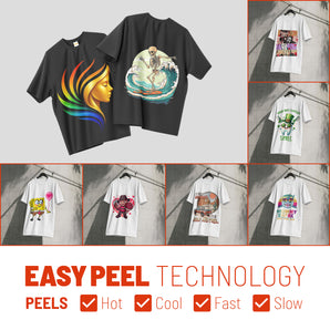
Direct-to-Film (DTF) printing is already valued for its versatility and vibrant results, but adding specialty inks and finishes can elevate your prints to a new level. Specialty inks – such as metallic, fluorescent (neon), glow-in-the-dark, pearlescent, and puff inks – introduce unique visual and tactile effects not achievable with standard CMYK inks alone. In this module, we'll explore the role of each of these specialty inks in DTF, how they differ in formulation, and the stunning impact they can have on finished garments. We'll also dive into how these inks behave during printing, powdering, and curing, and provide specific techniques, machine settings, and troubleshooting tips to use them effectively. Finally, we'll discuss storage and handling best practices, compatible substrates, and how to market these specialty prints to customers for added value.
Overview: Specialty Inks & Finishes in DTF
Specialty inks contain special pigments or additives that produce effects like shine, brightness under UV, luminescence in the dark, or raised textures. Incorporating these into your DTF workflow allows you to create eye-catching designs that stand out and command higher perceived value. While standard DTF inks produce vibrant, full-color prints, specialty inks and finishes bring extra "sizzle" – from metallic sheens to neon pops and 3D textures. These effects are popular in fashion and promotional trends, enabling decorators to set themselves apart from the ordinary.
DTF's core advantage is that it works on a wide range of fabrics (cotton, polyester, blends, etc.) with excellent detail and durability. Introducing specialty inks generally does not change this compatibility – you can still transfer onto the usual substrates – but it does require some adjustments in your process. Below, we break down each type of specialty ink/finish and explain how to work with them.
Metallic Inks in DTF Printing
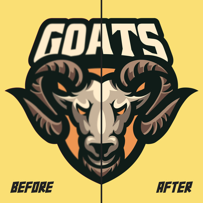
Formulation & Visual Impact: Metallic DTF inks are infused with tiny reflective metal particles (such as aluminum or bronze). These particles catch and reflect light, giving prints a shiny, foil-like metallic sheen. Common metallic ink shades include gold, silver, bronze, and copper. The visual impact is a luxurious, high-end look – great for premium logos, accent text, or celebratory designs (e.g. gold for a 50th anniversary shirt). Metallic finishes are dynamic; the shine appears most pronounced under direct light and shifts as the viewing angle changes. When used strategically (for example, to make a logo or specific element "pop"), metallic inks immediately draw attention to the design.
Behavior in Printing Process: Metallic pigments are heavier and tend to settle, similar to white ink. They require frequent agitation to stay suspended – many DTF printers from manufacturers like Epson and Brother have a white ink circulation system that can also be used for metallic ink, or you may need to manually gently shake cartridges/tanks daily. During printing, you might need to use a slightly higher printhead height to prevent any metal particles from scraping the head. Print at a moderate speed with sufficient pass count so that the metallic particles are laid down evenly without clogging. It's wise to run a nozzle check and mix the ink well before a metallic print run to ensure consistent shine. Maintenance is key: metallic particles can clog printhead nozzles if left sitting. Regular cleaning and using filters on the ink lines can help prevent clogs. If your printer is not specifically designed for metallic inks, check with the manufacturer – some standard Epson-based DTF heads can handle fine metallic pigment, but running inks with large flake sizes may void warranties or shorten head life.
Powdering & Curing: After printing, you'll apply hot-melt adhesive powder as usual. Metallic prints don't generally need a different powder; standard TPU powder works, adhering to the ink and forming the bond to fabric. However, inspect that the powder coats all printed areas evenly – the glossy surface of metallic ink can sometimes be a bit less "sticky" when wet, so ensure a thorough powder application. During curing (melting the powder and drying the ink), note that metallic particles reflect heat. This means metallic prints can take slightly longer to reach full cure in the oven or heat press. In practice, you may need to increase the dwell time or temperature slightly to ensure the ink and adhesive fully cure. Always perform a wash test on a metallic print: if you see any premature fading or flaking, it might be a sign the cure was insufficient (the fix is usually to cure a bit longer or hotter). Once properly cured and transferred, metallic DTF prints are quite durable and wash-resistant, but it's good to advise end-users to wash garments inside-out and avoid direct ironing on the print to maintain maximum shine.
Application Techniques: When designing for metallic inks, less can be more. Use metallic elements to accentuate parts of the design – e.g. a gold slogan on a shirt, or silver highlights on a graphic – rather than flooding large areas. This not only preserves the special effect for where it counts, but also avoids overly heavy ink deposits. Because metallic inks are somewhat opaque (especially silver and gold), they work well on both light and dark fabrics. On dark garments, you will typically still print a white underbase behind the metallic ink (DTF prints white behind all colored areas by default on dark fabrics). The white underbase can increase contrast, but note that a thick white layer might slightly reduce the metallic reflectance. For maximum shine on a black shirt, some printers intentionally omit the white underbase under the metallic areas – the metallic ink alone (if opaque enough) and adhesive will bind to the fabric. This yields a purer metallic look, but you must ensure the ink layer is thick and the adhesive bond is strong if you try this. Tip: Always test your specific ink – some metallic inks are vibrant enough on their own, while others might need that white backing for opacity. You can also combine metallic ink with regular colors (e.g., a design that is mostly standard CMYK but with a metallic gold outline or element). Just be sure your RIP software knows which parts to print in metallic (this is often set up as a spot color swatch in the design).
Limitations: Metallic inks come in a limited range of colors – primarily the metal tones. You can't print every color in a metallic finish (for example, there's no "metallic blue" ink in DTF; such effects are usually achieved with pearlescent or foil techniques). Also, extremely fine details might not show off the metallic effect well – tiny metallic text or thin outlines can appear less shiny because there are fewer particles to catch light. For best results, use metallic ink for medium to bold design elements. The hand feel of metallic prints is slightly different: because of the metal flakes, a metallic DTF print may feel a bit stiffer or thicker on the fabric than a regular print. This is normal, but something to be aware of (a very large solid gold chest print will be more noticeable to the touch than a normal print). In terms of fabric compatibility, metallic DTF transfers adhere to all the same fabrics as standard transfers. They work especially well on smooth fabrics – a smooth surface allows the metallic shine to appear more uniform. Very textured fabrics (like ribbed knits) might cause the metallic reflection to look uneven due to the print conforming to the texture. Finally, keep in mind that metallic inks are typically more expensive than standard inks, and the metallic particles can be abrasive to printheads over time – factor in a bit of extra cost for ink and maintenance when pricing jobs with heavy metallic coverage.
Use Cases & Examples: Metallic DTF prints are excellent for logos, emblems, and special-edition merchandise. For instance, a limited-run fashion t-shirt might feature a gold metallic logo to signal exclusivity. Sports and streetwear brands use metallic prints for championship or celebratory designs (imagine a gold medal graphic or a shiny silver football helmet in a design). Promotional products for luxury brands often incorporate metallic elements to add a premium feel. According to the National Institute of Standards and Technology (NIST), metallic finishes in textile printing have become increasingly standardized for quality control. Real-world example: Custom transfer suppliers like Supacolor have even introduced metallic heat transfers, showing the demand for shiny finishes in apparel printing (Supacolor's metallic transfers allow printers without metallic ink capability to achieve a similar effect). Overall, whenever you want a design to exude luxury, glamour, or high value, metallic inks are a go-to choice in DTF.
Fluorescent (Neon) Inks in DTF
Formulation & Visual Impact: Fluorescent inks (often called neon inks ) are formulated with special fluorescent pigments or dyes. These pigments contain fluorescent agents that absorb ultraviolet light (from sunlight or blacklights) and re-emit it, resulting in extremely bright, glowing colors. In normal lighting, fluorescent colors appear super-bright – far more vibrant than standard inks – and under UV or "black light," they will fluoresce, appearing to glow as if lit from within. Common fluorescent DTF ink colors include neon yellow, neon green, neon orange, and neon pink/magenta (some systems also offer neon blue or purple). These inks greatly expand the color gamut of what you can print, allowing for hues that standard CMYK cannot achieve. For example, a safety orange or a highlighter yellow printed with neon ink will be much more luminous than one simulated with normal inks. Visually, neon prints are eye-catching and almost "electric" in their intensity – perfect for designs that need high visibility or a fun, energetic vibe.
Printer Setup & Color Management: Working with fluorescent inks often means configuring your printer for additional ink channels or swapping out some inks. Most DTF printers from Roland and Mimaki come standard with CMYK and White. To print true fluorescent colors, you need actual neon ink cartridges. Some advanced DTF printers have 6 to 8 channels, allowing you to load fluorescent yellow and fluorescent magenta inks in addition to the normal CMYK and white. For example, companies like Siser and Stahls' have introduced advanced DTF systems that can print with fluorescent yellow and pink without removing the regular inks, by dedicating extra channels to these spot colors. On such a system, the RIP software can intelligently mix the neon inks with CMYK to hit specific bright tones, or print them pure. If your setup doesn't have extra slots, another approach is to swap out the regular inks for neon inks when needed (e.g. put neon yellow ink in place of standard yellow for a print run). This yields intense neon colors but comes at the cost of losing the normal color in that channel (so it's only practical if the entire design or batch is meant to be fluorescent-toned). In any case, printing with neon inks requires careful color management: you may need to designate certain design elements as spot colors so the RIP knows to use the neon ink instead of trying to simulate it with CMYK. Some RIPs come with presets or profiles for common neon colors. It's highly recommended to print a color chart or swatch test with your fluorescent inks to see the output, since what you see on-screen (which is RGB and not able to display true neon) will differ from the printed result. For instance, a particular RGB value for "neon green" in your graphics software might map to a mix of neon yellow and regular blue on a 6-color printer. Printing charts helps ensure color accuracy and consistency.
Behavior in Printing, Powdering, Curing: In terms of mechanics, fluorescent inks are usually water-based just like standard DTF inks, and they jet in a similar way. They might have slightly different viscosity or particle makeup (especially if they are pigment-based fluorescents), but most users won't notice much difference in how the printer lays them down. You should, of course, perform the usual maintenance – whites and fluorescents both benefit from gentle agitation and regular nozzle checks (though fluorescent pigment is often not as heavy as white, so clogging is typically less of an issue than with white or metallic). Powdering and curing are the same as normal DTF: apply the adhesive powder evenly and melt it at the recommended temperature. Neon inks do not require special powder or curing conditions. One thing to note: some fluorescent colors (particularly neon pinks and purples) can be slightly less stable at high heat, meaning if you grossly over-cure or press too long, you might see a slight color shift or dulling. But when you stick to normal curing temps (around 100-120°C in the oven, then 160-170°C when heat pressing to the garment), the colors should remain vibrant. As always, test prints are your friend – verify that the neon colors stay poppy after curing and pressing. If you ever notice a neon color looking "dirty" or less bright, check that your white underbase isn't contaminating it (e.g. in the RIP, ensure you're not printing too heavy of a white layer that could show through a semi-transparent neon ink).
Design & Application Techniques: Neon inks are best used when you want maximum brightness. They are extremely effective for designs that need to attract attention or evoke a high-energy mood. Here are some application tips:
-
Use on the Right Background: Fluorescent prints work on both light and dark fabrics, but their appearance will differ. On a white or light garment, you can print neon ink without a white underbase (if the garment color itself is light). This can make the neon color even more intense and the print very soft to the touch. On dark garments, you'll print the usual white layer beneath – the neon ink will cover it and still appear bright (the white underbase just makes sure the neon color isn't dulled by the dark fabric). The white underbase might slightly lighten the neon effect, but generally neon pigments are so strong that the result is still glowing. If possible, for absolute brightest results on dark fabric, some users print an extra flash of the neon on top of the white (essentially two layers of neon ink) to get more pigment down – but this depends on your printer's ability and registration accuracy.
-
Combining with Other Colors: You can print a full-color design that mixes neon and regular inks. For example, a design could have a neon-green monster character on a full-color background. If your printer has neon channels, the RIP will blend as needed. If not (and you swapped inks), then your whole design will have a neon cast if you try to mix (not ideal). Many shops instead create designs that isolate the neon usage – e.g. text in neon orange over a grayscale image. This way, you can print the grayscale with CMYK, pause the job, swap in neon orange for yellow, and print the text. This is advanced and time-consuming though. If you anticipate a lot of neon printing, it's better to invest in a multi-channel printer or bulk system for fluorescents.
-
Color Fading: Be aware that fluorescent pigments, by their nature, are not as lightfast as regular pigments. Extended exposure to direct sunlight will cause neon prints to fade faster than standard prints. This is usually not a major issue for T-shirts (as they're not left in the sun for months like a sign might be), but if you're doing, say, neon printed flags or outdoor event banners with DTF, mention to the client that the vibrancy may diminish after long UV exposure. For apparel, just advise to avoid leaving the shirt to dry in the sun for hours, etc. According to the Wikipedia article on fluorescent paint, UV exposure causes gradual degradation of fluorescent pigments over time.
Limitations: Fluorescent inks produce amazing brightness, but they cannot be color-mixed to achieve all hues. They are generally used in pure form or in limited combinations. For instance, you usually have a neon yellow and a neon pink ink – those can make a fiery neon red or orange when blended, but you won't achieve a deep non-fluorescent navy or burgundy from them. In other words, the neon palette is somewhat limited to "highlighter" colors. Designs should be planned with that in mind. Another limitation is accurate proofing: because monitors and standard print proofs can't display neon, you might have to show clients a printed sample or a color chart to set expectations. Also, if your workflow requires frequent switching between standard and neon inks, you'll have downtime for flushing inks (to avoid contaminating standard colors with neon residue and vice versa). This can be mitigated by dedicating a printer to neon work or using a modular ink system like STS's where both sets are loaded and switchable via software. Finally, remember that under normal room light, neon inks are simply very bright – they don't "glow in total darkness" (that's the job of phosphorescent inks covered next). They do glow under UV blacklight, which is a fun bonus for parties, clubs, and concerts, but customers should not confuse neon prints with true glow-in-the-dark which works without UV light.
Use Cases & Examples: Neon DTF inks are most effective for fashion-forward and high-visibility applications. The streetwear and festival scene loves neon – think of the bold, fluorescent graphics at EDM concerts or on rave outfits. Sportswear is another arena: for example, running gear or cycling jerseys often incorporate neon colors for visibility; a custom sports team shirt with neon green accents will stand out on the field. Children's apparel and accessories also benefit (kids love bright, candy colors). Safety and workwear printing is a practical domain – while safety vests themselves are made of neon fabric, you might print a company logo in a fluorescent ink to ensure it's just as high-viz as the vest material. In marketing terms, you can pitch neon prints as "ultra-bright, day or night." A real-world example: concert merchandise often uses neon ink for designs that will glow under stage UV lights – band t-shirts that suddenly illuminate under blacklight at the show, creating a wow factor for fans. By using fluorescent DTF inks, you can cater to these niches and charge a premium for the specialized look.
Glow-in-the-Dark Inks in DTF Printing
Formulation & How They Work: Glow-in-the-dark inks contain phosphorescent pigments that make prints literally glow when the lights go out. These pigments (commonly based on compounds like strontium aluminate) have the ability to absorb and store light energy, then slowly release it as visible light in the dark. In practical terms, you print with a glow-in-the-dark ink, "charge" the printed design under a bright light source, then later in a dark environment the print will emit a greenish or pale colored glow. The glow effect can last for several minutes to hours, gradually dimming until recharged with light. Typically, glow-in-the-dark ink appears as an off-white or light pale green color in daylight. It's not very vivid in normal light (unless combined with other pigments), so many designs use glow ink in specific areas rather than for colorful daytime graphics. The magic is in the dark: once charged, those areas will luminesce with an eerie neon-green glow (some specialty pigments glow blue or aqua, but green is most common and brightest). Learn more about phosphorescent materials from the EPA's information on luminous materials.
Printing Considerations: In DTF, glow-in-the-dark ink would usually be used in the place of white or as an overlay. Some DTF ink manufacturers have developed a dedicated glow ink that you can load into a channel (for instance, replacing one of the white channels in a dual-white setup). The STS DTF system notes that DTF can use a lot less glow pigment than DTG to achieve effects, likely by efficiently layering it. If you don't have a commercially-made glow DTF ink, anecdotally some users experiment by mixing glow-in-the-dark pigment powder into their DTF white ink. Caution: doing so can be risky for clogging printheads, as glow pigment particles are fairly large and abrasive. It's safer to obtain an ink specifically formulated for inkjet use. Assuming you have a proper glow ink: treat it similarly to white ink. It's thick with particles that settle, so keep it stirred. Use a printhead that can handle particulate matter (the same ones for white are fine). When printing, you might print the glow ink in areas where you want the effect. There are two main strategies:
-
Pure Glow Areas: Print the design in glow ink only (with or without an outline). For example, printing a glow-in-the-dark skull graphic: in daylight it'll look like a pale white outline, but in darkness it glows bright green. For this, you'd likely print a layer of glow ink (which also acts as your white layer for opacity). On dark fabric, you'd still back it with adhesive powder as usual. The result on a black shirt in daylight is a subtle off-white skull, and in the dark it's a glowing green skull.
-
Combined with Colored Design: You can have a design that is colorful in daylight and also glows in the dark. This typically requires two layers of printing – one with your normal CMYK inks, and one with glow ink. In screen printing, they achieve this by printing a glow ink on top of colors or under them. In DTF, one way is to print the color image first (with its white underbase), then run the film through again to print a layer of glow ink on top of certain areas (using a separate white/glow channel). Registration has to be perfect. Some advanced RIPs or printer setups let you incorporate an extra "glow" layer in one pass if you have an extra channel. For example, you could assign a spot color named "Glow" in your artwork wherever you want glow effect; the RIP would print that with the glow ink channel on top of whatever colors are there. This way, say you have a normal printed moon graphic but you also print glow ink over the moon – in daylight the moon looks normal, but in darkness it glows. Keep in mind that mixing glow with other colors will affect the daylight color (it tends to lighten it and add a slight haze). Often, glow designs are either covert (only visible in dark) or dual-purpose (one appearance in light, another in dark).
Powdering & Curing: Glow-in-the-dark ink itself doesn't drastically change the powder adhesive step. The powder will stick to the printed areas of glow ink and any other ink just as it does normally. Make sure to apply an even layer and shake off excess – glow prints sometimes involve larger solid areas (to maximize glow), so watch out for any pinholes or gaps in powder coverage. During curing, treat it like a white ink layer: proper melting of the adhesive and drying of the ink is important. Glow pigments can be a bit heat-sensitive if the temperature is extremely high, but standard curing temps (110-120°C in oven) are fine. One thing: glow layers can be thick, so ensure they are fully cured through – do a gentle rub test after curing to verify the ink doesn't smudge. After transferring to the garment with a heat press, immediately check the glow by charging and turning off the light. It's easier to catch any issues (like an area that didn't transfer fully or an uneven glow) right away. If a glow print looks spotty in the dark, it could mean the glow ink coverage was uneven or too thin in those spots.
Application Techniques & Tips:
-
"Charge" Before Delivery: A fun tip for demonstration – when you present a glow-in-the-dark printed shirt to a customer, "charge" it under a bright light or sunlight first. Then take them to a dark area to show the effect. This ensures they see the full intensity. Some may not realize they need to charge it, so explaining that is part of marketing these prints (e.g. include a small card: "For best results, expose this print to bright light for a few minutes, then watch it glow!" ).
-
Designing for Glow: Designs that work well in glow are often bold and simple. Since glow-in-the-dark emits a greenish light, fine details or color nuances aren't really visible in the dark – what you see is the shape of the glowing area. Thus, silhouettes, outlines, or chunky shapes make the most impact. For example, stars, ghosts, skeletons, or simple text like "BOO!" will be very legible when glowing. Intricate full-color images can glow too, but you mostly see the glow layer, which might just be an overall blob of light if not planned carefully. Some designers incorporate hidden messages: e.g. a daytime design says "Day Mode", and at night an additional glow text appears that says "Night Mode" – this kind of creativity delights customers.
-
Fabric Color Consideration: Glow-in-the-dark prints tend to show up best on darker fabric when glowing, because of contrast (a glow on a white shirt in a dark room still glows, but since the shirt is light-colored, the visual contrast is lower). However, in normal light, printing a pale glow ink on a very dark fabric might not look great (it might have a slight milky appearance). A workaround: incorporate the glow element into a light-colored design element. For instance, print a white graphic on a black shirt and use glow ink in that white – in daylight it's a white graphic (which looks fine on black), and in the dark it glows. On white or light shirts, glow prints will be nearly invisible in daylight (which could be a cool "secret pattern" effect). It all depends on the look you're going for.
-
Combine with Reflective for Safety: While glow-in-the-dark is fun, it's not the same as reflective (which shines back light from headlights, etc.). If you're doing safety garments, you might use reflective transfers. But for novelty safety (like a Halloween trick-or-treat bag that glows), glow ink is great. Some products actually mix phosphorescent and reflective, but that's beyond our scope.
Limitations: Glow-in-the-dark effects require a recharge – the glow will be brightest right after light exposure and then fade. If someone walks in the dark for a long time, eventually the glow dims out until recharged. Also, the color of the glow is usually limited to pale green. Other colors (aqua, blue, violet) exist but are typically weaker glows. So design expectations should be set: you can't have a bright red glow; it will all be greenish in the dark. In daylight, the color of the print is a very light pastel tone (unless tinted). Wash durability for glow prints is generally on par with other DTF prints, but avoid strong detergents or bleach, as those chemicals can reduce the phosphorescent properties. Over many wash cycles, it's possible the glow might slowly diminish (phosphorescent compounds can degrade a bit over time, especially if frequently washed in hot water). To mitigate, advise gentle care (cold wash, inside-out). Another limitation is resolution: while you can print detailed shapes in glow ink (since DTF can do high detail), extremely fine lines might not be very visible in darkness because the emitted light is faint. It's different from seeing a dark line on a light background; here the line itself is the light. So make important glowing elements a bit thicker if possible.
Use Cases & Examples: Glow-in-the-dark prints are popular in novelty and thematic apparel. A classic use is for Halloween: e.g. a t-shirt with a glow-in-the-dark skeleton or a ghost that only appears at night. Children's pajamas and t-shirts often feature glow elements (what kid doesn't love a shirt that glows at bedtime?). For instance, pajamas with stars that glow to "keep monsters away" are a selling point. Glow prints are also used in party and event merchandise – think of a nightclub event shirt that has a club logo glowing on the dance floor, or a charity night run (5K run) shirt with glow text for fun. Some sports or outdoor brands might use a small glow accent (like a logo) purely for novelty or mild after-dark visibility. When marketing glow-in-the-dark capabilities to customers, emphasize the fun and surprise factor: "Lights on, it's a normal print; lights off, it comes alive!" This appeals especially for promotional items (imagine a company giving away glow-in-dark logo tees for a night-time festival). Real-world example: a promotional campaign for a movie release distributed DTF-printed shirts where the title glows in the dark, creating buzz when fans wear them to the theater. By integrating glow-in-the-dark inks into your DTF workflow, you can tap into these niche markets and create products with a playful, interactive quality.
Pearlescent (Pearl & Iridescent) Inks and Finishes
What Are Pearlescent Finishes? Pearlescent inks contain special mica or pearl pigments that give a shimmering, iridescent sheen to the print. Unlike metallic inks (which have a solid reflective metal look), pearlescent effects are more subtle and color-shifting – similar to the lustrous finish of a pearl or the shimmer on a seashell. Depending on the pigment, the effect might be a soft silvery-white shine or even a hint of a color that changes at different angles (for example, a pearl pigment that shimmers pinkish when viewed from one side and greenish from another). In screen printing, pearlescent additives are often mixed into clear or light inks to create a translucent shimmer layer.
Pearlescent in DTF – Ink vs. Film: In the current DTF landscape, true pearlescent ink sets are not very common (because, like metallic, the particles could clog heads and are tricky to formulate). However, there are pearlescent DTF films and powders emerging as solutions. One approach is a specialty film that has a pearlescent coating. For example, some vendors offer a "Metallic Pearl" DTF film that, when you transfer your print, leaves a pearly finish over the printed areas. This film might impart a soft shimmer, say a slight blue or rainbow tint, to whatever is printed. Another approach is using a clear pearlescent ink or varnish: if you had a compatible printer (one with a varnish or extra channel), you could print a clear coat containing pearl pigment on top of a design.
For the purpose of this module, we'll assume you either have a pearlescent ink or are using a pearlescent film. If you have a pearlescent ink (perhaps a pearl white ink), it will behave similarly to metallic: heavy pigment requiring stirring, and best printed through coarser printheads. You might load it in place of white for certain jobs (printing a "pearl white" design) or in an extra channel if available. If using a pearlescent film, your process is slightly different – you print your design in the usual way (likely just in white ink, or CMYK + white), onto that special film. The pearlescent coating on the film then becomes part of the transferred design, giving it that sheen. Always follow the manufacturer's instructions for specialty films (some require longer press times or specific handling).
Visual Effect: A pearlescent finish is generally softer and more subtle than metallic. It won't have a mirror shine; instead it gives a glint when light hits, often with a "milky" or opal-like quality. For instance, a pearlescent white print on a black shirt might appear as a silvery-white in normal view, but as you move it, you catch a soft rainbow sheen. If the pearl pigment is colored (say a pearl blue), it could make the print look slightly pastel blue on certain angles. This effect is great for elegant or delicate designs – think bridal, dance, or high-end corporate logos where a garish metallic might be too much, but a pearl adds just the right touch of sophistication.
Printing & Curing Considerations: If printing with pearlescent ink, much of the guidance for metallic applies: keep it mixed, ensure an even deposit of the pearl particles, and consider a higher ink load or multiple passes to really show the effect. Because pearlescent pigments are a bit transparent (often they're in a clear base), the effect shows best over a light background. In screen printing it's common to print a pearlescent ink over a white base to make it pop. In DTF, if you're printing pearl onto a clear film, you'll usually have a white layer behind it by default (for dark shirt transfers). On light shirts, you could just transfer a pearl ink without backing. Experimentation is key – for example, printing a solid patch of pearl ink and pressing it onto black vs white fabric will give very different looks (the black might show a very subtle colored glimmer, the white will show a brighter pearlescent area). When curing a pearl ink print, remember the note about reflective particles reflecting heat – some pearl pigments (which are often mica) also reflect heat like metallics do. So be sure the print gets enough time or temp to cure fully.
Application Techniques:
-
Pearlescent Overlays: One cool use of pearlescent effect is to create an overlay over existing prints. For example, you could print a normal color design, then print a second layer (on a separate film) that is just a pearlescent pattern (like a translucent swirl or an abstract shape) and heat press it on top of the first print. This is somewhat experimental with DTF – alignment and multiple presses can be tricky – but it can yield a unique multi-layer effect. Alternatively, use a single film that has the pearl coating: then your entire design gets a pearly sheen in one go.
-
Mixing with Colors: If you mix pearlescent pigment with colored ink (again, more a screen print concept but worth noting), the color will become more pastel and shimmery. Too much regular pigment can hide the pearl effect, so the balance is important. In DTF, you might not be hand-mixing inks, but you could achieve a similar effect by printing a colored shape and then printing a pearlescent layer on top. The result: a colored pearlescent spot. For example, a pink pearl heart shape – looks pink with a soft shine. Without a dedicated printer setup, this could be achieved by print->cure->reprint process. If that's not feasible, consider designing with the pearlescent film in mind: e.g., using half-tones or patterns to let the pearlescent background show through your colors.
Limitations: The pearlescent effect is delicate. If a client is expecting a blinding mirror shine, pearl is not the answer – that's metallic. Also, photographs and online images don't do justice to pearl finishes, which can make selling it via e-commerce tricky. It's something best appreciated in person as the light moves. From a production standpoint, if you don't have a proper pearl ink, using pearlescent film means stocking that specific film and switching it out for normal film when you want the effect, which could slow down workflow for one-off jobs. Another limitation: color accuracy can shift; the pearlescent coating might slightly tint the colors of your print. For instance, a pearlescent film with a blue shimmer could make a yellow printed logo look a bit greenish when it shines. Generally, pearlescent usage is most impactful in either monochromatic designs (all white print with pearl, etc.) or as an overprint on black where it can show its subtle color flash. It's less effective for multi-color detailed artworks where it might just make everything a bit shiny without distinction.
Use Cases & Examples: Pearlescent finishes are often used in fashion and premium branding. Think of a couture brand's logo on a tote bag printed with a pearlescent white – it's a classy tone-on-tone look that reveals itself in sunlight. Dancewear and cheer apparel sometimes use pearlescent prints to add glam without full glitter (a pearl print can give a satin-like sheen on uniforms). Children's boutique clothing might use a pearlescent print of, say, a unicorn or mermaid, giving a magical sparkle without going full glitter. Also, any design invoking themes of water, iridescence, or elegance – e.g., a yoga brand named "Moonlight" might love a pearlescent moon graphic on their shirts. Real example: Some DTF suppliers offer pearlescent white film specifically targeting wedding and event merch printers – the pitch is that a bride and groom monogram on a hoodie can have a pearly sheen, perfect for wedding party gifts. By adding pearlescent capabilities, you can attract clients looking for a subtle "premium gloss" effect that's distinct from blingy metallic.
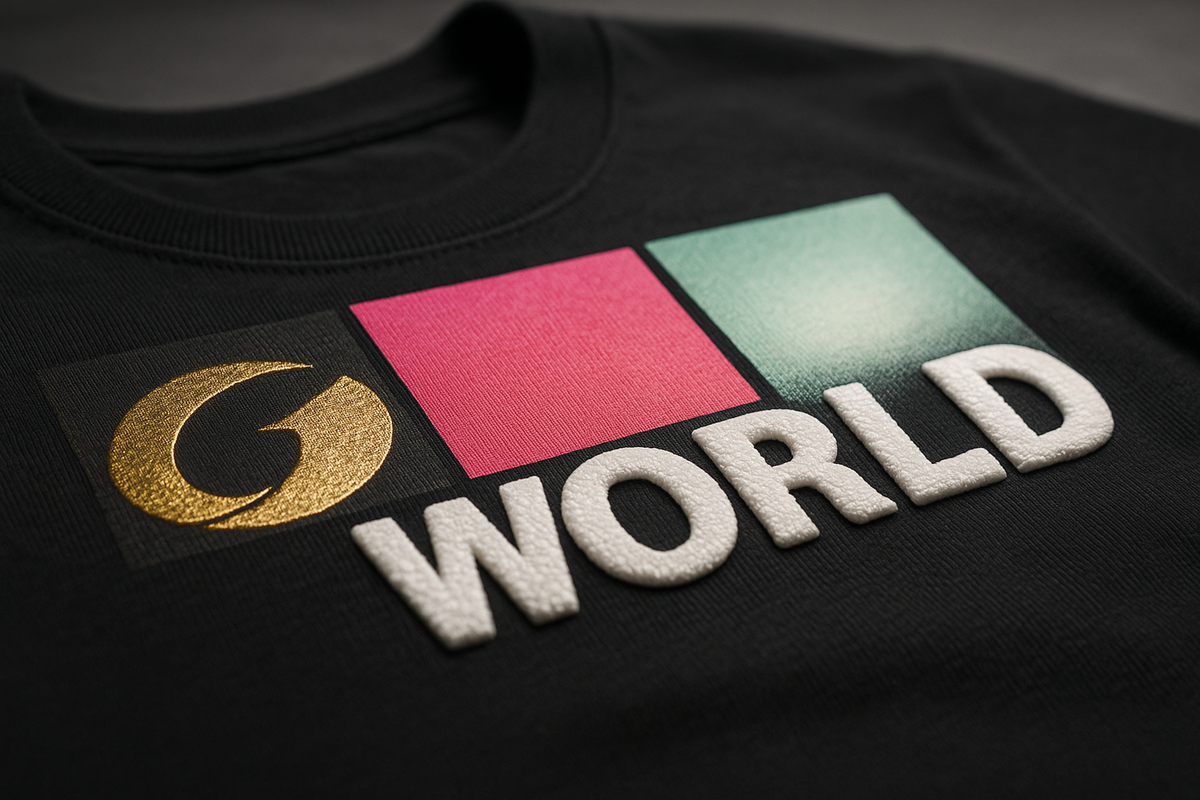
Puff Ink Effects (3D Raised Prints) in DTF
What is Puff? Puff printing refers to creating a raised, textured print that expands off the fabric, giving a three-dimensional look and a soft, puffy feel. Traditionally, puff effects are done in screen printing by mixing a puff additive into the ink; upon heating, the ink expands (like bread rising) and forms a smooth, rounded, raised print. The result is a design that you can see and feel as a raised element, adding tactile interest. It's great for bold text or simple shapes – the effect literally "rises above" the flat print surface. Learn more about advanced finishing techniques including puff.
Can DTF Do Puff? This is a bit of a crossover between technologies. Standard DTF printers use water-based inks that are not formulated to puff. However, the finish can be achieved by hybrid techniques. One method that has emerged is using a special puff powder or film in the DTF process. For example, there are hot-melt adhesive powders advertised as giving a "puff effect" – these contain a blowing agent. According to the Journal of The Textile Institute's research on 3D textile printing, foam-based expansion techniques have shown promise in digital textile printing applications. During the heat press step (when you apply the transfer to fabric), the powder foams up, causing the whole transferred ink layer to rise slightly. This effectively gives a low-profile puff effect to a DTF print. It may not be as tall and rounded as a traditional screen puff, but it's noticeable. Another method is to create screen printed puff transfers and combine them with DTF prints. Some companies (like Ninja Transfers) offer puff transfers that you can press just like DTF. These are essentially screen-printed designs with puff additive on transfer paper. You could press a DTF print and a puff transfer on the same garment to get multicolor and 3D parts combined.
If a manufacturer specifically provides a puff ink for DTF, it would involve mixing an expanding agent into the ink – so far, that's not common, as it'd likely clog printheads or require a very custom setup. So, we'll focus on what you can do: using puff-effect powders or pre-made puff transfers in tandem with DTF.
Process with Puff Powder: Suppose you have a "puff" DTF powder. The printing step remains the same (with normal DTF inks). After printing, instead of the regular powder, you apply the puff powder to the wet ink. You cure it (perhaps at a slightly lower temp or shorter time – you want it to stick to the ink and partially melt, but likely not fully expand yet). Then you transfer to the garment with a heat press at the recommended temp (often 160-170°C). When that high heat hits, the powder's agent causes the adhesive (and the ink layer above it) to bubble up, creating a raised, spongy texture. The film is peeled off and you have a puffed print. This technique is fairly new, so if you try it, definitely test small samples to dial in the parameters. Key things to watch: expansion uniformity (does it puff evenly?), detail retention (fine lines may blur when puffed), and wash durability (the foam structure could be slightly less robust, so test wash).
Design Considerations for Puff: Simplicity is best. As with screen printing puff, small text or thin lines will tend to round out or even disappear as the material expands. Bold shapes, block letters, and logos are ideal. Also, leave some space between elements in the design – puff ink expands outward as well as upward, so if elements are too close, they may merge or touch after puffing. A common style is retro 3D letters (think '90s style puff print sweatshirts with bubble letters). You can achieve that look with DTF puff by designing with generous stroke widths. Another tip: avoid large solid fills if you want a very uniform puff – extremely large areas can sometimes puff with a slightly dimpled texture. It might be better to break a large area into a pattern or have a subtle texture in the design which will not be noticeable as a flaw if the puff isn't perfectly even.
Machine Settings & Application: If using a puff powder, check the supplier's specs. Many puff additives activate at around the same temperature as normal presses but might require a longer press time or higher pressure. The heat press step is where the magic happens – usually you'll press 10-15 seconds at medium pressure and when you open the press, the design is puffed. Too little time and it might not fully expand; too much and you could over-expand and collapse it or scorch it. It's a narrow window, so find the sweet spot. Some users do a two-step press: first press to transfer and puff it, peel the film, then a second very light press (with parchment paper over it) for 2-3 seconds just to smooth the surface. Be careful though – a second press can also flatten the puff if done with high pressure. When done correctly, puff prints should have a smooth, slightly rounded top and almost no visible grain of powder.
Limitations: Puff effects are arguably the most limited in terms of design complexity and color. If you want multi-color puff, you typically have to layer different puff transfers or use separate screens in screen printing. With DTF, a puff powder would likely puff the whole printed area uniformly, so multi-color designs would all puff together (which is fine if you want that). But if you wanted, say, only the outline of a text to puff and the inside to stay flat, that would require a two-step process (print the inside flat first, then overlay a puff outline). Not impossible, but complicated. Also, puff DTF prints might not puff as high as the puff you've seen from screen printing – manage expectations that it could be a bit more subtle 3D effect. Durability: Raised prints can be more susceptible to abrasion; over many washes, the very top of the puff might get a little frayed or flattened. However, many people treat puff-decorated garments with care (since they feel special). Advise washing inside-out on gentle. Another limitation: if the garment is very stretchy (like spandex or swimwear), a puff print has low stretch and could crack if the fabric is stretched significantly. It's best on cottons, poly, hoodies, etc., which don't stretch a lot when worn. For difficult substrates, you may need to adjust your approach.
Use Cases & Examples: Puff prints have a strong nostalgic and trendy appeal. Streetwear brands use puff for bold logos on hoodies, giving a throwback feel to 90s fashion which is very in style. A single-color white puff print on a black hoodie can look incredibly stylish and premium. Brands can charge more due to the unique texture (customers perceive it as more crafted or high-end). Puff is also popular for youth and urban apparel: big bubbly letters, cartoon outlines, etc., come alive with puff. From a business perspective, adding puff options allows you to offer "3D prints" that not many competitors have – it's a differentiator. Example: A small clothing line might release a special edition shirt where their normal printed logo is replaced with a puff print logo – driving hype among fans for that tactile difference. On the production side, companies like Ninja Transfers explicitly combine DTF and puff by producing full-color DTF transfers and separate one-color puff transfers, then instruct layering them for a mixed-media result. This shows the demand for marrying DTF's detail and puff's dimension. As a DTF printer, even if you can't digitally print a puff ink, you can integrate puff finishes via these powders or hybrid methods to expand your product offerings.
Printer Settings & Workflow Adjustments for Specialty Inks
Integrating specialty inks into DTF printing requires some fine-tuning of your equipment and process. Here are key machine settings and adjustments to consider for each stage of production:
-
Printer Configuration: Ensure your printer's firmware/RIP is configured for any additional channels (like fluorescent or glow). Define spot colors in your RIP for metallic, neon, or glow inks so that the software knows when to use those channels or special ink mixes. If you have an 8-channel printer, for example, you might set channel 5 and 6 as "Fluorescent Yellow" and "Fluorescent Magenta." Use a spot color mapping technique: in your design file, objects filled with the exact spot name (e.g. "Neon Yellow") will be printed with that ink. This avoids the RIP trying to simulate neon with CMYK.
-
Printhead Height and Passes: For inks with particles (metallic, pearlescent, glow), raise the head a notch to prevent any chance of scraping over thicker ink deposits or undissolved pigment. You may also consider increasing the number of passes (printing in high quality mode) to ensure smooth coverage without banding. Slower print speeds can help heavy inks dry a bit during printing, reducing smears. Some printers allow you to adjust the vacuum or platen temperature – a slightly warmer platen can help inks start drying faster, which might be useful for heavy prints (but be cautious not to dry the ink before powder can stick).
-
Dryer/Shaker Settings: If you use an automatic shaker unit, monitor its temperature and speed when running specialty jobs. For instance, a metallic-heavy print might reflect heat and need an extra few seconds in the curing section. If your shaker has an adjustable dwell time, slow it down a bit for metallic or thick ink prints to ensure full melt. Also, check the powdering: some automatic shakers can adjust the amount of powder dispensed. Specialty prints that are very large solid areas might need a tad more powder to fully cover, whereas extremely fine neon details might be overwhelmed by too much powder (causing specks). Adjust the powder flow or manually add powder to tricky prints for complete, even coverage.
-
Heat Press Adjustments: When transferring to the garment, specialty finishes might benefit from tweaks in press settings:
-
Metallic prints often do fine at standard 160°C for 15 seconds. But to preserve maximum shine, you might use a lower pressure if possible (too high pressure can embed the metallic particles deeper, slightly dulling the sparkle). A medium, even pressure is sufficient to bond it.
-
For fluorescent and glow, standard time/temp/pressure is fine (around 160°C, 10-15 sec, medium pressure). One thing to watch: if using a teflon sheet on top, it can sometimes imprint a slight texture on very smooth prints – not usually an issue, but for glow prints you want them smooth (so they glow evenly). Consider using parchment paper or a silicone sheet for the final press to avoid unwanted texture.
-
Puff transfers require the specific settings as discussed (often higher pressure, and do not use a teflon cover sheet on the first puff press – it may restrict expansion; let it expand freely or cover with parchment which can lift as it puffs).
-
If using pearlescent film, check if it's cold peel or hot peel. "Metallic/pearl" films are often cold peel, meaning you should let the print cool completely before removing the film to ensure the special coating stays on the garment.
-
-
Color Profiling: When adding new inks, ideally you should create or obtain ICC profiles for them. For example, if you add neon inks to your printer, profile the printer in "CMYK+Neon" mode so the colors are accurate and you know how bright they can get. Without profiling, you might still get great results by manually tweaking, but consistency could suffer. Some RIPs allow you to simply use neon inks as replacement for parts of the CMYK gamut (like that Ricoh device that incorporated neon into the profile automatically ). Regardless, always print test charts after any ink change to check that you're hitting the expected colors.
-
Software Tricks: Use features like "choke/spread" in your RIP for white underbase adjustments when dealing with specialty top colors. Example: If you want a metallic gold print on a black shirt, you might not want any white underbase peeking out at the edges (white peeking would reduce the metallic shine on edges). You can choke (shrink) the white underbase layer slightly so it sits just under the gold, avoiding a halo. Similarly, if printing neon on black, you usually keep full white underbase, but if you felt it reduced vibrancy, you could experiment with a lighter underbase (like 70% white instead of 100%). These are advanced tweaks – keep notes on what settings you use so you can replicate successful results.
Storage and Handling of Specialty Inks & Materials
Proper storage and handling of your specialty inks and powders will ensure they perform optimally and have a long shelf life:
-
Shelf Life: Most DTF inks, including specialty ones, have a shelf life in the range of 8-12 months once opened (check manufacturer data). Fluorescent inks and glow inks should be used within a year for best results – the fluorescent dyes can degrade over time, leading to duller colors if expired. Always write the open date on your ink bottles and try to use older stock first (FIFO: first in, first out).
-
Temperature & Environment: Store inks in a cool, dry place, away from direct sunlight. Sunlight can prematurely cure or break down certain ink components (especially true for glow and fluorescent inks which react to light). Aim for a stable room temperature (15-25°C / 60-77°F). Avoid freezing temperatures (which can cause pigment separation) and very high heat (which can spoil the ink or cause evaporation of liquid components). Do not expose glow-in-the-dark ink bottles to long periods of UV light, as the phosphorescent pigment could lose potency. Similarly, keep fluorescent inks in opaque containers (most come in dark bottles) to protect from light. The OSHA guidelines for chemical storage provide good general principles for safe handling.
-
Mixing & Agitation: Before every print session, gently shake or roll your ink cartridges/bottles. Important: White, metallic, pearlescent, and glow inks absolutely need this – their heavy particles settle at the bottom. If using bulk tanks, stir them with a clean stirrer or use the built-in agitation system. Avoid creating bubbles (don't violently shake to the point of foaming). A gentle 1-2 minute agitation is usually enough. For fluorescent inks, the pigment is lighter but still give them a quick shake because pigment can settle or stratify in storage.
-
Preventing Contamination: Use separate siphons, funnels, or syringes for each type of ink when refilling cartridges. You do not want to accidentally introduce, say, some metallic particles into your cyan ink bottle. Keep your ink workspace clean. Even a tiny amount of silicone from some pearlescent additives or the metal from metallics can affect other inks. Also, never mix different brands or batches of specialty ink unless the supplier says it's compatible – formulations can differ (for example, one white ink might not play nicely with another brand's white or glow additive).
-
Powders and Films: Store hot-melt adhesive powders (regular and specialty like puff powder) in airtight containers to avoid moisture. Moisture can cause clumping, which leads to uneven application. If you live in a humid area, consider storing powder with desiccant packs. Break up any clumps by sieving the powder before use if needed. Keep specialty films (like metallic or pearlescent films) in their plastic bags and in a flat, cool area. Too much heat can cause them to curl or the coating to degrade. Also protect films from dust – any dust on a pearlescent film could create blemishes in the transferred print.
-
Handling Safety: While DTF inks are generally water-based and less hazardous than, say, solvent inks, you should still wear gloves when handling them, as some specialty additives can cause skin irritation with prolonged contact. Metallic inks, for instance, contain metal flakes – not something you want embedded in your skin or eyes. When shaking bottles, make sure the cap is secure (to avoid a neon ink splatter decorating your room!). If you're working with glow-in-the-dark powder pigment (for mixing or any other reason), wear a dust mask; inhaling fine phosphorescent powder isn't healthy. Always refer to SDS (Safety Data Sheets) if provided for any new specialty product to understand if there are any additional precautions.
-
Printer Downtime: If you know you won't use the printer for a while (more than a week), it might be wise to flush specialty inks out of the lines and put cleaning solution or regular ink in. White, metallic, and glow inks left sitting in lines and heads can settle and cause clogs. Some printers can idle for a week if you shake the inks daily and do a nozzle check, but use judgment. For long shutdowns, flush them. Alternatively, schedule a small "purge print" daily – a little print that uses those inks to keep them flowing. This can be as simple as a colored stripe or a test pattern that includes each channel.
-
Label and Segregate: Clearly label your cartridges or tanks (e.g. "Fluorescent Magenta", "Glow White", "Metallic Silver") to avoid confusion. It sounds obvious, but when you have multiple white-looking liquids (standard white, glow ink which might also look white, pearl ink which might be a white shimmer), a mix-up could be bad. Some shops even color-code the cartridge caps or use marker on the lines. Keeping specialty inks physically separated from standard ones on your storage shelf can prevent accidental use of the wrong ink in a refill.
Good storage and handling practices will save you from a lot of headaches like clogged heads, inconsistent color, or ruined batches of ink. It also ensures that when you go to use that pricey liter of neon pink you bought, it's as vibrant as it should be.
Common Problems and Troubleshooting Tips
Working with specialty inks can introduce new challenges. Here are some common problems you might encounter, along with troubleshooting tips from our comprehensive troubleshooting guide:
-
Clogged or Missing Nozzles: This is the perennial issue with DTF, especially with heavy pigments like white, metallic, and glow. If you start seeing missing lines in test prints or fuzzy edges:
-
Prevention: Regularly agitate inks and perform maintenance cleanings. Use a nozzle check pattern daily – if it's a little off, do a light cleaning before it clogs completely.
-
If Clogged: Do a head cleaning cycle focused on the affected channel. You can also manually clean the capping station and wiper blade to ensure proper sealing (dried specialty ink on the cap can prevent good suction). For metallic clogs, a cleaning solution soak might be needed (consult your printer manual). Avoid letting the printer sit idle with metallic/glow ink in it for long; a quick print each day keeps things flowing. Never ignore early signs of clogging, as metallic flakes can compound and harden if not cleared.
-
-
Ink Separation or Settling: You may notice, for example, your white or metallic ink has separated in the bottle (layers or sediment at bottom).
-
Solution: Thoroughly mix the ink. If in a cartridge, remove it and gently rock it. If the sediment is very thick and won't mix, the ink may be old – consider filtering it or replacing it. For bulk tanks, install stirring mechanisms if possible. Always check expiration dates; using in-date, well-shaken ink prevents this.
-
-
Uneven Metallic Shine: Perhaps your metallic gold print looks dull in some spots and shiny in others.
-
Causes: This could be due to uneven powder application (differing adhesive thickness can affect reflectivity) or inconsistent ink laydown.
-
Solution: Make sure you're powdering evenly – tapping off excess and not leaving clumps. Also verify that your print mode put enough metallic ink down; you might need to increase ink limit or do a double-print for very large fill areas. Check curing – an under-cured metallic might look matte (if the adhesive isn't fully melted, it obscures the flakes). A quick re-press with a finishing sheet can sometimes brighten a metallic print by smoothing it, but test carefully.
-
For more specialty ink troubleshooting, review quality control best practices and maintain consistent processes.
Applications, Perceived Value, and Marketing of Specialty Prints
One of the biggest reasons to use specialty inks and finishes is the perceived value they add to the final product. Customers see these prints as unique, premium, and custom – and are often willing to pay a higher price for them. Let's discuss how you can leverage that:
Elevating Product Value: Specialty prints literally stand out – either visually (neons, metallics, glitters) or physically (puff). This uniqueness creates a sense of higher value. For example, a plain printed tee might sell for $20, but a tee with a shiny metallic gold emblem or a 3D puff slogan can easily fetch more due to the perceived increase in quality and exclusivity. In marketing terms, you're not just selling a shirt, you're selling a feature or experience (the shine, the glow, the texture). Highlighting these features in your product descriptions or sales pitch is key. Use descriptive language: "This design is printed with real metallic gold ink for a brilliant luster," or "Features a glow-in-the-dark motif – charge it under light and watch it light up at night!" Such details justify a higher price point by framing the print as a premium enhancement. Learn more about building a premium brand for your DTF business.
Marketing Materials & Demonstrations:
-
Sample Kits: Prepare a set of sample swatches or mini-transfers showing each effect. A small black fabric square with a gold metallic print, one with a neon, one with glow, one with puff, etc. Send this "specialty ink sample kit" to potential B2B customers (like apparel brands, print brokers, or event planners) so they can see and feel the differences. It's much easier to sell someone on a puff print once they touch it and say "oh wow, that's cool."
-
Photos and Videos: On your website or social media, showcase these effects. Videos work wonderfully: a short clip moving a metallic print under light, or a before/after lights off for a glow print, will capture attention. Use close-up shots to show texture for puff or glitter. Create a compelling portfolio showcasing your specialty capabilities.
Branding and Positioning: If you as a print provider can do these effects reliably, make it part of your brand. Advertise that you have these cutting-edge capabilities. Not all competitors do DTF specialty inks (some might only do basic CMYK). Position yourself as an innovator in custom printing. That can attract higher-end clients and allow you to grow in a niche market. Keep an eye on future trends too – the module touched on how holographic and other advanced techniques are on the horizon, so being knowledgeable now sets you up to adopt new finishes later. Stay updated with emerging DTF technologies.
Best Practices for Integrating Specialty Inks into Your Workflow
Introducing specialty inks into an existing DTF workflow can be seamless if done methodically. Here are best practices to maintain color accuracy, consistency, and efficiency while doing so:
-
Start Small, Then Scale: Don't overhaul your whole production line overnight. Begin with one specialty at a time. For instance, add fluorescent inks to your setup and do a series of test prints and a small client job with them. Refine your process for neon printing (profiles, curing, etc.). Once comfortable, then consider introducing metallic inks, and so on. This staged approach means you can isolate and solve issues without juggling too many variables. Consider scaling your production gradually.
-
Workflow Management: Time management is a bit different with specialties. Some effects might slow you down (like waiting for a cold peel, or doing two presses, etc.). Build that into your workflow scheduling. Allow for a bit of extra curing time on metallic jobs, etc., so you don't bottleneck. If an effect requires a second heat press step (like some puff or foil combos do), plan a station for that so it doesn't interfere with the main pressing line. Essentially, treat specialty jobs as requiring special handling – give them the time and attention needed rather than trying to rush them through a standard pipeline. Quality is more important here because a failure (like a messed up puff) stands out more than a minor color shift in a plain print. For efficient workflow, explore automation and ERP integration.
-
Training and SOPs: Train any team members on the nuances. Your operators should know that white ink needs stirring – likewise, instruct them that metallic ink needs stirring even more. Create a checklist for "end of day" or "start of print run" that includes specialty tasks (e.g., "shake neon cartridges, check for sediment in metallic ink lines, verify powder type in hopper matches job," etc.). Make sure everyone understands the peeling differences (hot vs cold peel) for special films, so no one accidentally yanks a cold-peel film off a metallic print while it's hot and ruins it. Develop comprehensive staff training programs for specialty techniques.
Conclusion
Working with specialty inks and finishes in DTF printing opens up a world of creative possibilities. By understanding the unique properties of metallic, fluorescent (neon), glow-in-the-dark, pearlescent, and puff inks, you can harness their strengths and mitigate their challenges. We've explored how each type behaves through the printing process – from the reflective sparkle of metallics to the expanding foam of puff – and provided techniques to apply them successfully. Remember that preparation and testing are key: dial in your machine settings, maintain your inks carefully, and always run samples for new effects.
When executed well, specialty prints can transform ordinary products into extraordinary ones, allowing you to offer clients truly distinctive apparel. They add not just visual appeal but also perceived value that can command premium pricing. Whether it's a neon print lighting up a music festival, a glow logo adding fun to kids' pajamas, or a metallic monogram elevating a corporate gift, these finishes help products stand out in the market. Use this to your advantage in marketing – showcase those brilliant and glowing results, and educate customers on the impact these special inks can have on their designs.
Finally, integrate these new tools into your workflow with the same care and consistency you apply to standard DTF printing. With practice, you'll develop a reliable process for each specialty, ensuring that color accuracy stays on point and quality remains consistent across every print run. Keep innovating and refining – as the DTF industry evolves with even more effects (holographic foils, heat-reactive inks, and beyond ), you'll be well-equipped to stay ahead of the curve. Consider joining industry events and trade shows to stay current with the latest innovations.
By mastering "Working with Specialty Inks & Finishes," you're adding valuable skills to your DTF arsenal. Embrace the creativity and technical nuance that come with these inks. They not only enhance your current projects but also inspire new ideas and opportunities. Happy printing – may your future DTF prints shine, glow, and puff their way to success!
Continue Your DTF Education
Explore more advanced techniques and stay current with industry innovations at Iris Academy:
- DTF Color Management: Advanced Artwork & ICC Profiles
- Mastering DTF Adhesive Powder: Complete Application & Curing Guide
- DTF Printer Maintenance: Essential Troubleshooting Guide
- DTF Heat Press Guide: Mastering Pressure, Temperature & Time Settings
- Common DTF Pitfalls: Ultimate Troubleshooting Solutions
Connect with industry professionals through FESPA, Printing Industries of America, and stay informed through publications like Impressions Magazine and Printwear Magazine. Quality testing by SGS and Intertek ensures specialty supplies from Coldenhove, Chemica, and Mutoh meet industry standards.