
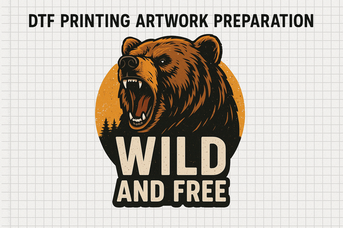
Artwork Preparation for DTF: How Should You Prepare Your DTF Prints?
What Is This Article About?
Master DTF artwork prep with this step‑by‑step guide: discover ideal file formats (PNG, TIFF, PDF), why 300 DPI matters, when to switch from RGB to CMYK, and how to keep transparent backgrounds crisp in Photoshop, Illustrator, CorelDRAW, GIMP, and Affinity for flawless Direct‑to‑Film transfers.
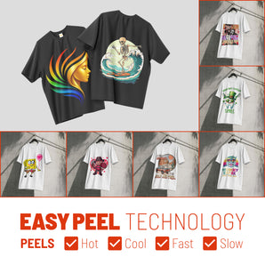
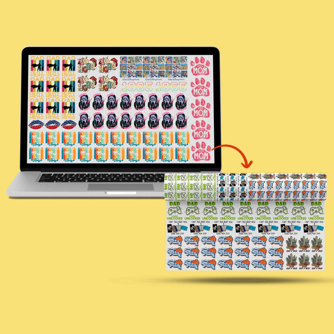
Direct-to-Film (DTF) printing is a process that prints designs onto a special film, which is then transferred onto fabric. To get vibrant and crisp results, preparing your digital artwork correctly is essential. If you're new to DTF, start with our complete beginner's guide to DTF printing and explore Iris Academy for comprehensive training. This guide covers the foundational design principles and technical requirements for DTF artwork preparation. We'll explore the best file formats, proper resolution, color mode considerations, transparency handling, layering basics, vector vs. raster graphics, and common pitfalls. We'll also provide software-specific tips for Adobe Photoshop, Illustrator, CorelDRAW, GIMP, and Affinity Designer. By following these guidelines, you can ensure your designs print beautifully on film and fabric.
Choosing the Right File Format
Selecting an appropriate file format for your artwork is crucial for quality DTF transfers. Different formats offer various benefits in terms of image quality, scalability, and transparency support. The right format works hand-in-hand with proper DTF films and consumables for optimal results:
- PNG (Portable Network Graphics) – Recommended: PNG files support transparency and use lossless compression, preserving image quality. This makes PNG ideal for DTF printing where you often need clear, background-free designs. PNG handles intricate details and crisp edges well.
- TIFF (Tagged Image File Format) – TIFF is a high-quality raster format that retains all image details without compression losses. It supports transparency and can store layers. TIFF files are larger in size, but they are excellent when maximum quality is needed for complex or detailed artwork.
- PSD (Photoshop Document) – PSD is Adobe Photoshop's native format, which preserves all layers, effects, and transparency. It's useful as a working file or when sharing with a printer who can handle PSDs. PSD ensures you can edit the design later, but it's typically not used as the final print file unless the printer specifically accepts it.
- AI/EPS (Adobe Illustrator / Encapsulated PostScript) – These are vector file formats ideal for logos, text, and illustrations. They contain mathematical curves instead of pixels, allowing infinite scaling without losing quality. EPS is widely used in the printing industry and preserves vector artwork clarity. AI is Illustrator's native format, editable and great for complex vector designs. Designs saved as AI or EPS will remain sharp at any size, which is perfect for DTF transfers that might be printed at various dimensions.
- PDF (Portable Document Format) – PDF can store both vector and high-resolution raster content. It's often used for delivering print-ready artwork because it embeds fonts, images, and transparency reliably. PDFs maintain clarity and can be opened in many design programs and RIP software.
- SVG (Scalable Vector Graphics) – An XML-based vector format. SVG is great for web and design, and while not a typical print submission format, it can be converted to EPS/PDF or imported into print software if needed.
Avoid JPEG for final artwork! JPEG uses lossy compression and does not support transparency. Using a JPEG may introduce compression artifacts and unwanted backgrounds. Only use JPEG if no transparency is needed and ensure it's high resolution if you do (e.g., for photographic prints), but PNG or TIFF are generally better choices for DTF.
Tip: Many DTF providers prefer PNG files with transparent backgrounds for their balance of quality and file size. If your design is vector-based, consider sending an AI or EPS in addition to or instead of a raster image – this ensures the printer can scale your design without loss of quality. Always check which formats your print shop or RIP software accepts, and choose the one that preserves quality and required features (like transparency).
Working with High Resolution (DPI)
Resolution is measured in dots per inch (DPI) and determines the sharpness and detail of your print. For DTF printing, high resolution is key to prevent blurry or pixelated outcomes. This is especially important when using advanced color management techniques. Follow these guidelines:
- Design at 300 DPI or higher: 300 DPI is the industry standard for professional-quality prints. At 300 DPI, your artwork will retain crisp lines and details when printed on fabric. Using a lower DPI (like 72 or 150) risks a noticeable loss of clarity – edges may look jagged or soft. Always set your document resolution to at least 300 DPI before you start designing or when scanning/creating raster images.
- Use Actual Print Size: Create or scale your artwork to the actual size it will be printed. For example, if the design will be 10×8 inches on the shirt, set your canvas to 10×8 inches at 300 DPI (which would be 3000×2400 pixels). Designing at print size ensures that you're not surprised by quality loss later. Avoid significantly enlarging a small image for print – this will stretch pixels and cause blur. If you must enlarge, consider remaking the image at higher resolution or converting it to vector if possible.
- Vector Graphics and DPI: If your artwork is vector (Illustrator, CorelDRAW, SVG, etc.), it isn't restricted by DPI for the vector elements – they can scale to any size. However, any raster images placed within a vector file (e.g., an imported photo in an Illustrator design) should be high resolution as well. Ensure linked images are 300 DPI at the size used, or embed high-res images in the file. It's also wise to set the output DPI when exporting a vector design to a raster format like PNG.
- 150 DPI for Very Large Prints: In some cases of extremely large prints (like a full adult shirt design or banner), 150 DPI might be acceptable if viewed from a distance. But for DTF on garments, which are seen up close, sticking to 300 DPI is recommended for best results. Lower resolutions may be used only if you absolutely cannot get 300 DPI, and typically for larger-format prints where detail is less critical.
- Check DPI of Sources: If you use images from the internet or scans, verify their resolution. An image that is 72 DPI and small dimensions will not print well on a garment. You may need to find a higher-res version or recreate the graphic to meet print specs. Simply increasing the DPI in software without improving detail (upsampling) won't truly sharpen the image – you cannot magically add detail that isn't there, except by redesigning or using a vector trace for logos/line art.
In summary, print clarity is directly tied to resolution. Always aim for 300 DPI at final size for DTF artwork. This will ensure your printed transfers have clean, sharp lines and detailed imagery, taking full advantage of DTF technology's capabilities.
Color Modes: RGB vs. CMYK
Color mode refers to the color space in which your artwork is created. The two primary modes to consider are RGB (Red, Green, Blue) and CMYK (Cyan, Magenta, Yellow, Black). Understanding their differences is crucial for accurate color in DTF printing, especially when working with advanced color accuracy techniques:
- RGB (for Screens): RGB is an additive color model used for digital displays (monitors, phones, etc.). It has a wide color gamut – meaning it can represent very vivid, bright colors on screen. Design software working in RGB (especially with the sRGB profile) is ideal for on-screen accuracy and is often the default for many programs. However, DTF printers do not print in RGB – any RGB artwork will be converted to CMYK at print time.
- CMYK (for Print): CMYK is a subtractive color model used by virtually all printers (including DTF printers). It mixes cyan, magenta, yellow, and black inks to produce colors. CMYK has a smaller color gamut than RGB. Some very bright or neon colors you see on screen (RGB) cannot be perfectly reproduced in CMYK – they may print duller or shifted. However, CMYK is more accurate for predicting printed color, since it reflects the actual inks used.
- Designing in CMYK vs RGB: Many experts advise designing in CMYK mode for print-focused projects so that you are "working within the print's limits" from the start. When you choose CMYK in Photoshop or Illustrator, the colors you pick are already constrained to printable ones, reducing surprises later. On the other hand, some designers prefer to work in RGB (with a standard profile like sRGB) and then convert to CMYK at the end or let the print software handle the conversion. In fact, some DTF print services specifically request sRGB files for consistency with their workflow. For example, Printful recommends using the sRGB IEC61966-2.1 profile for DTF designs, noting that extremely bright colors will naturally be toned down in print.
- Converting and Soft Proofing: If you design in RGB, it's important to preview your colors in CMYK before printing. Use your software's soft proofing feature if available, or convert a copy of your file to CMYK to see if any colors shift drastically. Adjust any problem colors in CMYK mode (e.g. make that neon green a bit darker so it prints closer to your intent). If you design in CMYK from the start, you're already seeing a representation of print colors, though they may look slightly less vibrant on screen compared to an RGB design.
- Best Practice: Check with your printer or service on their preference. Most DTF printers ultimately require CMYK data for output. If you're sending final artwork, providing a CMYK file can ensure the color conversion is under your control. For instance, one guide notes that "DTF printers require files to use the CMYK color model, not RGB" for accurate color on fabric. However, if a service asks for RGB/sRGB, provide that, and trust their color management pipeline. Either way, be aware that what you see on a backlit screen will not exactly match printed color due to the RGB-to-CMYK gamut differences.
Avoiding Color Surprises: Extremely saturated RGB colors (bright teals, neon pinks, electric blues) will likely print less saturated. Consider using a Pantone or CMYK reference if critical colors are needed (though advanced color matching is beyond this basic scope). Also, remember DTF involves a white layer under your colors on dark fabrics, so colors usually print opaquely. If possible, do a small test print of key colors or swatches to see how they translate to DTF output. This is especially helpful if exact brand colors are on the line.
In summary, use RGB for convenience and vibrant design, but always convert or proof in CMYK to ensure print accuracy. You want your final garment to look as close as possible to your digital design. By understanding RGB vs. CMYK now, you can avoid the common frustration of prints "not matching the screen" later.
Transparency and Background Removal
One major advantage of DTF printing is the ability to print designs without a visible background – you can transfer floating text or graphics cleanly onto a garment. To achieve this, you must manage transparency in your artwork properly. This is particularly important when working with different DTF film types:
- Use Transparent Backgrounds: When creating your artwork file, set the background as transparent (no fill) if the design isn't meant to be a full rectangle. For example, in Photoshop's New Document dialog you can choose a transparent background, or in tools like Illustrator/CorelDRAW simply don't include a background shape. If your design was created on a solid background, remove or hide that background layer before exporting. The design should appear with a checkerboard (transparent) background in your editor. Any area that remains opaque in your file will print – so if you leave a white box behind your logo, that white will be printed on the film (and then transferred to the shirt).
- File Formats that Preserve Transparency: As mentioned, PNG and TIFF support transparency; JPEG does not. Ensure you export to a format that keeps alpha channel data. For example, exporting to PNG from Photoshop will maintain transparent pixels (just make sure "Transparency" is checked if using certain export tools). If you save as TIFF, choose to save transparency or layers. PDF/EPS can handle transparency as well, but some older print workflows might flatten them – generally modern RIP software can interpret PDF transparency.
- Clean Edge Transitions: Pay attention to the edges of your transparent areas. If you've removed a background from a raster image, ensure there are no unwanted halo effects or semi-transparent pixels at the edges, which can cause a faint outline when printed. It often helps to contract a selection by a pixel or two before deleting a background, or manually clean the edges on a zoomed-in view.
- Avoid Semi-Transparent Elements: DTF printing has trouble with elements that fade out to transparency or use very low opacity. Small dots of ink in a half-transparent gradient might not adhere well with the adhesive powder and can result in a rough, speckled edge. It's recommended to use solid shapes and colors rather than gradual fades to zero opacity. If you need a faded look, you might be better off adding a subtle halftone or stippling effect rather than true transparency. Soft shadows or glows can be tricky too – they may appear as a fine mist of ink, which might not transfer cleanly. If you use such effects, consider rasterizing and checking that the effect isn't too light to print. Printful explicitly warns that gradient transitions from solid to transparent don't work well for DTF. Wherever possible, design with fully opaque colors and intentional transparent cut-outs.
- Intended Transparency (Knockouts): On the flip side, do include transparency where you want no ink. Many great DTF designs incorporate the garment color as part of the design by leaving areas transparent (e.g., text with knock-out holes or distress patterns). This also makes prints softer and more breathable by not laying down large swaths of ink. Ensure these areas are truly transparent in your file (check by putting a temporary colored layer behind to see if any ghost pixels show). This tells the printer not to print any color (and often not to lay white either) in those parts.
- No Invisible Objects: Sometimes a design file might have stray objects or layers that are invisible or out of canvas. Clean up your file by removing hidden layers or empty objects. An "empty" white layer can be misinterpreted by some RIP software and create unwanted artifacts or outlines. Keep your final artwork file tidy with only the layers that contribute to the design.
By managing transparency carefully, you ensure that when your design is printed to film, only the intended areas get ink and adhesive. The result will be a transfer that, once pressed, looks clean and professional on the garment with no unwelcome background boxes or fuzzy edges.
Layering Principles for DTF Artwork
Most design software allows you to build artwork in multiple layers (for example, having text on one layer and an image on another). Effective use of layers can help in editing and designing, but when preparing for DTF output, there are a few considerations. For proper application techniques, see our guide on how to apply DTF transfers:
- Keep Editable Layers, But Flatten for Export: It's wise to keep an original source file with all layers (e.g., a PSD or .AI file) so you can tweak your design in the future. However, when exporting to a print-ready format (like PNG), flatten or merge the layers as needed so the final file is one cohesive image. Flattening helps avoid any unexpected results in the merged output (for instance, certain blend modes or effects can change appearance when flattened if not handled). If you send a layered file to a print provider (like a Photoshop PSD), ensure you've either flattened it or confirmed they can handle the specific layers/effects you used.
- Layer Order Matters: In your working file, double-check that all visible layers are in the correct stacking order. What's on top in your file will print on top (though since all ink goes onto the film, "on top" just means foremost in the artwork – all colors will ultimately transfer together). This mainly matters for design composition (so you don't accidentally have a background element covering part of the foreground).
- Use Layers for Complexity, But Simplify for Print: Layers are useful for creating complex designs (drop shadows, textures, etc.), but by print time you typically want a simplified structure. For example, if you have a shadow effect on a separate layer, consider merging it down to the object it shadows once you're satisfied. This reduces the chance of the shadow layer accidentally getting dropped or misinterpreted. The print should see your artwork as one integrated image (with transparency where appropriate).
- White Underbase Consideration: A unique aspect of DTF is the white ink underbase. DTF printers usually print a layer of white ink behind your colored design (on the back of the film) to ensure opacity on dark garments. You typically do not need to create this white layer manually – the RIP software will generate it from your artwork's shape (wherever there is any color or opacity, it will put white behind; wherever there is transparency, it will leave no white). However, it's good to be aware of this. In some advanced cases, you might have a say in how the white is handled (for example, not putting white under certain areas for a softer feel). But for basic artwork prep, simply know that any visible part of your design will get a white layer beneath it automatically. Conversely, any transparent parts will have no ink at all (no color, no white). So you don't need to add a "white background" for your design to show on a black shirt – in fact, you should not, or it might print as a white box. The printer will take care of backing your design appropriately.
- Maintaining Separate Elements: If your design has separate components that you want to remain separate on the transfer (for example, left chest logo and a back design on the same sheet), keep them on different parts of the canvas (or different layers/group) and do not merge them together if you plan to cut them apart later. This is more about layout than layering, but it means you might submit a gang sheet where multiple designs are side by side on one image. In that case, you can keep each design as a group of layers, but ultimately it will still be one flattened image when printed on the film.
- Use Layers to Your Advantage When Designing: For design workflow: keep text editable on its own layer until final (makes edits easy), keep adjustments or color tweaks on separate adjustment layers, and use layer masks for non-destructive erasing of backgrounds. These practices make it easier to refine your art. Just remember to output a final flattened image (or well-documented vector file) so the printer sees the exact intended result.
In short, structure your file with layers for ease of design, but simplify before print. The final artwork file for DTF should effectively look like how you want it printed, with no extra construction lines or hidden surprises. And trust the DTF printing process to add the necessary white layer and glue – your job is to provide clean artwork.
Text and Vector vs. Raster Artwork
DTF printing can work with both vector and raster graphics, but each has its role. It's important to understand how text and artwork type (vector or bitmap) affect print quality. When working with specialty materials, consult our guide for difficult substrates:
- Vector Artwork (and Text as Vector): Vector graphics (created in Illustrator, CorelDRAW, Affinity Designer's vector mode, etc.) are composed of paths and curves. This means they can be scaled to any size without losing clarity. For elements like logos, shapes, and text, vector is ideal because it produces sharp, clean edges on the transfer. If you create text in a vector program or as a text layer in Photoshop, it is initially vector-defined, resulting in crisp outlines. Always convert text to outlines/curves in vector software before sending the file out. Converting to outlines (also called "creating curves" or "expand text") means the font is no longer needed to render the text – the text becomes vector shapes. This avoids any font substitution issues and preserves your typography exactly. Small text in vector form will print sharper than if it were a low-res image. As a rule, use vector format for solid-color graphics, line art, and typography whenever possible. Many DTF providers actually recommend vector files for best results, since they guarantee the cleanest print edges.
- Raster Artwork: Raster images are made of pixels, such as photographs or digital paintings. They are handled in software like Photoshop or GIMP. Rasters are necessary for full-color photos or very complex artwork with continuous tones. They print beautifully with DTF as long as the resolution is high (again, 300 DPI at size). If you supply raster art, ensure it's in a print-ready format (PNG/TIFF) and large enough. Do not upsize a small raster dramatically – it's better to recreate or use a vector trace for simpler designs if you only have a tiny source. When printing raster art, any blurriness or pixelation in the file will show up on the transfer (DTF is quite high-fidelity). So inspect your image at 100% zoom (or even print it on paper) to check quality.
- Combining Vector and Raster: It's common to have a design that mixes both – e.g., a raster illustration with added vector text or logo on top. That's fine! Just make sure the final file you send preserves sufficient quality for both elements. In a program like Illustrator, you might place a high-res Photoshop image and add vector text. When exporting, using PDF can keep the vector parts as vector and raster parts as pixels. Or exporting as a 300 DPI PNG will rasterize everything at high quality. Ensure any placed image in a vector file is embedded or included so it doesn't get lost.
- Text Size and Detail: Pay attention to the size of text and thin lines. Avoid very small text if possible. Tiny letters below ~6 points in size may not transfer cleanly or be legible on fabric. Similarly, ultra-thin lines or tiny details can be problematic – they might print, but they have less adhesive area and can more easily flake or peel over time. If your design has fine detail (like thin outlines or filigree), consider thickening those lines a bit for durability. A common recommendation is to keep line weights at least ~1 pt thick and ensure small text is bold enough. DTF can capture detail well, but the adhesive and film step mean super fine, isolated bits of ink might not hold up.
- Raster Effects on Vector: If you apply effects to vector art (like a drop shadow, glow, or texture), remember that those effects may be raster elements. It might be okay, but check their resolution. For instance, Illustrator's drop shadow effect will have a resolution setting (usually 300 DPI by default for high quality). Keep it at high quality so the shadow doesn't appear blocky.
- When to Use Each: Summarizing, use vector formats for geometric shapes, solid-color designs, and text – they are more flexible and ensure optimal clarity. Use raster for photos, gradients, or painted artwork, but make sure to meet resolution requirements. If you have a choice (e.g., you have a logo available in both JPEG and vector form), always choose the vector file for printing. And if you only have a raster image (like a sketch), see if it can be vectorized (either manually or via a tool) for a cleaner result, especially if it's a simple graphic.
By understanding vector vs. raster, you can decide the best way to create or output your artwork for DTF. Often the answer is a hybrid: create text and logos in Illustrator (vector) and incorporate high-res images as needed. The goal is an end result that is sharp where it needs to be, and detailed where it needs to be.
Common Artwork Preparation Mistakes to Avoid
Even experienced designers sometimes make mistakes when prepping files for DTF. Here are some common pitfalls and how to avoid them. For a comprehensive troubleshooting resource, check our DTF troubleshooting guide:
- Low-Resolution Images: Using an image that's too small or low-res is the number one mistake. It leads to blurry, pixelated prints and uneven edges. Avoidance: Always start with high-resolution artwork (300 DPI). If an image looks just okay on screen at zoom, it will likely look worse in print. Never assume the printer can "fix" a low-res image – they cannot add detail that isn't there. Re-create or upscale with caution (using AI upscaling tools, for example, which can help in some cases) or stick to vector art.
- Wrong File Format / Compression: Saving or exporting in the wrong format can ruin an otherwise good design. For example, submitting a JPEG with a background when you intended transparency can put an unwelcome white box around your graphic. Avoidance: Use PNG or TIFF for final files to maintain quality and transparency. Avoid heavy compression. Do not copy-paste your image into a Word document or something odd – always provide the actual image file in an accepted format. And if using a vector file, ensure all necessary elements (fonts, linked images) are embedded or outlined.
- Forgetting to Remove Background: This is a subset of the above but bears repeating – if your design is meant to have no background, make sure you send it with none. A surprising number of times, prints come out with a random rectangle of background because the artist left a filled layer or used a format that doesn't support transparency. Avoidance: Double-check by opening your final file to see if the background is indeed transparent (many OS image viewers will show a checkerboard for transparency, or just open it in Photoshop/GIMP to verify).
- Not Converting Text to Outlines: If you send an Illustrator/Corel file or even a PDF and the printer doesn't have the font you used, it could substitute a default font or drop the text entirely. Avoidance: Always convert text to curves (outlines) before sending vector files. In Photoshop, if sending a PSD, either rasterize the text layer or include the font file (if allowed/licensed). The safer route is to outline or rasterize, locking in the appearance of the text.
- Using Illegible Small Details: Extremely fine details, tiny text, or small dots can be problematic. As discussed, they might print but not adhere or show well on the garment. Avoidance: Design for the medium – ensure all details are sized for real-world viewing and printing. If you can't clearly discern a detail on a printed paper at actual size, it likely won't show well in a DTF transfer either.
- Incorrect Color Mode or Profile Issues: Perhaps you designed in RGB but the colors shifted when printed, or you forgot to convert to CMYK where required. Avoidance: Use the correct color mode as needed (most DTF printers expect CMYK data) and embed color profiles when exporting if possible. If vibrant color is critical, do a test or at least soft proof. And avoid designing in exotic color spaces (e.g. Adobe RGB or ProPhoto RGB) without knowing how they'll convert; sRGB is a safe bet for broad compatibility.
- Not Mirroring the Image (if required): DTF transfers are typically printed in mirror image on the film, so that when you flip and press them onto the garment, they appear correct. If you print the design in the same orientation as it will appear, it will come out reversed after transfer. Many beginners forget this step. Avoidance: Mirror your design horizontally before printing on film, especially for any text or directional graphics. For example, if your design says "HELLO", it should read backward on the film, so that it reads normally on the shirt. Note: Some RIP software or print services handle mirroring automatically (they might even ask for non-mirrored files and do the flip themselves). Always confirm the workflow. If you are printing yourself with a DTF printer, it's usually on you to mirror the artwork. It's a simple step that saves from a disastrous backwards print.
- Large Solid Areas Covering the Garment: This is more of a design choice issue, but huge solid squares of print can feel heavy and plasticky on the shirt, and sometimes may not look great if the garment flexes. Avoidance: Where possible, use the fabric to your advantage by incorporating transparent gaps or negative space in large designs. This breaks up the mass of printed film and results in a softer feel. If you do need a large solid area, ensure the powder adhesive is applied evenly and consider using a stretchable powder if available. And warn customers that a large solid print will be less breathable.
- Poor Planning of White or Black Elements: Example: designing black graphics for a black shirt without thinking that printed black ink on black fabric might be barely visible (it tends to look a bit more gray or glossy compared to the fabric). Or conversely, forgetting that if you want white in your design, you need to have that as part of your artwork (since the white ink will only print where your design tells it to – transparent areas will receive no white). Avoidance: For dark garments, usually the software will lay a white underbase under all colored parts including white areas of your design. Make sure any white elements in your design are actually present (not left as "empty" assuming the shirt will show through – the shirt showing through will be shirt-colored, not white). And avoid scenarios like black on black – if you want a subtle design, there are better ways than using the same color as the fabric.
- Last-Minute File Changes or Wrong Version: Sometimes a designer will send a file that wasn't the final version (maybe an older export by mistake), or they make a change and flatten the wrong layers, etc. Avoidance: Label your files clearly and double-check everything before sending. Use the checklist approach: Correct file format? Correct size? 300 DPI? Colors right? Background gone? Mirrored (if needed)? Text outlined? Taking a minute to review can save wasted film and shirts.
If you steer clear of these common mistakes, you'll greatly increase the chance of a perfect print on the first go. It often helps to imagine the printing process and final result as you finalize your file: "Will this line show up? Did I accidentally leave anything that might print weird?"
Software-Specific Tips for DTF Artwork Preparation
Different design software has its quirks and best practices for DTF artwork preparation. Here are specific tips for popular programs. For equipment setup guidance, see our complete DTF equipment guide:
Adobe Photoshop Tips
- Start with a canvas at 300 DPI and exact print dimensions
- Use RGB or CMYK mode based on your printer's preference
- Keep text on separate layers and convert to smart objects for flexibility
- Use the "Save for Web" option to export PNG with transparency
- Check your layers panel for any hidden elements before export
- Use adjustment layers for non-destructive color editing
Adobe Illustrator Tips
- Work in CMYK if printing directly, or RGB if converting later
- Convert all text to outlines (Type > Create Outlines)
- Embed all linked images or include them with the file
- Use the Artboard tool to set exact print dimensions
- Export at 300 DPI when saving as PNG or other raster format
- Check for stray points using Select > Object > Stray Points
CorelDRAW Tips
- Convert text to curves (Ctrl+Q) before export
- Use PowerClip for complex masking effects
- Export as EPS or PDF for vector preservation
- Set color management to match your printer's requirements
- Use the Preflight feature to check for potential issues
GIMP Tips
- Create new images at 300 DPI from the start
- Use the alpha channel for transparency
- Export as PNG to preserve transparency
- Use the "Flatten Image" command before final export
- Check image scale (Image > Scale Image) to ensure proper size
Affinity Designer Tips
- Work in separated mode to see transparency clearly
- Convert text to curves before export
- Use the Export Persona for precise output control
- Set DPI in the document setup and export settings
- Use the Preflight panel to check for issues
Setting Up Your DTF Workspace for Success
Proper artwork preparation goes hand-in-hand with a well-organized workspace. For detailed guidance on setting up your DTF printing area, including ventilation and safety considerations, check our DTF workspace setup guide. A properly configured workspace ensures your carefully prepared artwork translates into perfect prints.
Advanced Techniques and Special Effects
Once you've mastered basic artwork preparation, you can explore advanced techniques. DTF printing offers exciting possibilities with specialty inks and finishes including metallic, neon, and glow-in-the-dark effects. For premium finishing options, explore our guide on advanced DTF finishing techniques.
Quality Control and Testing
Before committing to a full production run, always test your artwork. The Specialty Graphic Imaging Association (SGIA) recommends test prints for color accuracy and detail reproduction. For comprehensive quality assurance, follow our DTF quality control checklist.
Business Applications and Scaling
Proper artwork preparation is crucial for business success. Whether you're considering different DTF business models or ready to scale your DTF production, consistent artwork quality is key. For pricing strategies that account for artwork complexity, see our DTF pricing guide.
Comparing DTF to Other Printing Methods
Understanding how DTF artwork requirements compare to other printing methods helps you make informed decisions. Our comprehensive comparison of DTF vs screen printing, sublimation, DTG, and vinyl explains the unique advantages of DTF's artwork flexibility.
Specialty Applications
DTF's versatility extends beyond standard garments. When preparing artwork for specialty items, consider:
- DTF printing on caps and hats - requires curved surface considerations
- DTF printing on drinkware - needs special adhesion planning
Maintenance and Long-Term Success
Your artwork preparation workflow should align with proper equipment maintenance. Regular printer care, as outlined in our DTF printer maintenance guide, ensures your carefully prepared files print correctly every time.
Environmental Considerations
Modern DTF printing increasingly emphasizes sustainability. When preparing artwork, consider eco-friendly practices outlined in our eco-friendly DTF printing guide. The EPA's Green Printing guidelines also provide valuable insights for sustainable printing practices.
Staying Current with DTF Technology
DTF technology continues to evolve rapidly. Stay informed about the latest developments with our analysis of emerging DTF technologies in 2025 and consider joining industry associations like the Printing Industries of America for ongoing education.
Conclusion
Mastering DTF artwork preparation is essential for producing high-quality transfers that meet professional standards. By following these guidelines for file formats, resolution, color modes, transparency, and avoiding common mistakes, you'll ensure your designs translate beautifully from screen to fabric. Remember that proper artwork preparation is just one part of the DTF printing process – combine it with quality equipment, proper technique, and ongoing learning for best results.
Whether you're just starting your DTF journey or looking to refine your skills, consistent attention to artwork preparation will set you apart in the competitive custom apparel market. Keep this guide handy as a reference, and don't hesitate to test and experiment with your specific equipment and materials to find what works best for your unique workflow. Continue your DTF education with our complete guide series: DTF Introduction, DTF vs Other Methods, DTF Equipment Guide, DTF Consumables, Workspace Setup, How to Apply DTF Transfers, DTF Certifications & Skills, and DTF Resources & Communities.