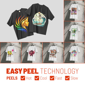
How to Prepare Art for DTF: Pro Tips for Clean, High-Impact Prints

What Is This Article About?
Quality DTF prints are 90% preparation. Mastering transparency and resolution is the only way to avoid wasted film and frustrated customers. You've likely felt the sting of a logo that looked perfect on your monitor but came out with a muddy white halo or pixelated edges. It's frustrating to waste time and materials on transfers that simply don't pop.
We're here to change that. You deserve a workflow that's as efficient as your business. This guide will show you exactly how to prepare art for dtf so every design is crisp, vibrant, and ready for professional production. You'll master the technical requirements to ensure your colors stay true and your lines stay sharp every single time.
We'll dive into the essential 300 DPI resolution standards, the truth about RGB versus CMYK, and how to build gang sheets that maximize your profit. Let's get your artwork ready for the heat press and eliminate the guesswork from your printing process.
Key Takeaways
- Lock in professional detail by ensuring every file meets the 300 DPI resolution standard for crisp, sharp transfers.
- Learn how to prepare art for dtf by mastering background transparency to eliminate unsightly white boxes around your logos.
- Bridge the gap between your screen and the final product with color management tips that keep your prints vibrant.
- Boost your efficiency and lower costs by using gang sheet layouts to fit multiple designs on a single roll.
- Use our 5-step pre-flight checklist to verify your files and guarantee high-impact results before you hit upload.
Understanding File Formats and Resolution (The Foundation)
High-impact prints start long before the ink hits the film. If your file foundation is weak, the final product will fail. Resolution is the single most critical factor in determining whether your transfer looks professional or like a DIY mistake. When you utilize Direct-to-film (DTF) printing, the hardware relies on precise data to map out every ink droplet. Low-quality files lead to wasted time and ruined garments.
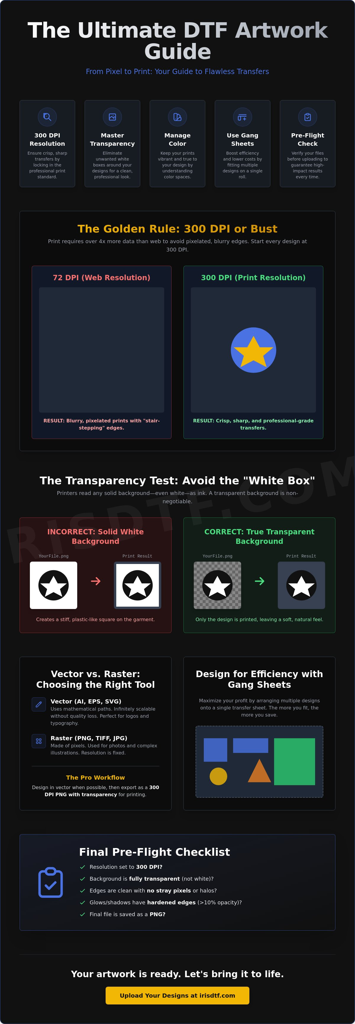
Web resolution is typically 72 DPI. It looks great on a screen because monitors use light to trick your eyes. Print resolution requires 300 DPI. That is over four times the data. Without this density, the printer produces "stair-stepping," those jagged, pixelated edges that make logos look cheap and blurry on fabric. To properly prepare art for dtf, you must start with high-resolution assets from the very first click of your design process.
PNG is the industry standard for a reason. It offers the perfect balance of file size and data retention, but its most vital feature is transparency support. Unlike JPEGs, which force a solid background, PNGs allow the printer to know exactly where the design ends and the garment begins. This prevents unwanted blocks of ink from appearing where they don't belong.
The Golden Rule: 300 DPI or Bust
Don't guess your resolution. Check it. In Photoshop, go to Image > Image Size and look at the "Resolution" field. In Canva, ensure you are exporting at the highest possible quality settings. A common mistake is upscaling a low-res image. Taking a 72 DPI thumbnail and changing the setting to 300 DPI doesn't add detail; it just stretches existing pixels. It creates a blurry mess. DPI is the density of ink droplets per inch. If that density isn't in your file, it won't be on your shirt.
Vector vs. Raster: Choosing the Right Path
Choosing the right file type is about choosing the right tool for the job. Vector files, like AI or EPS, use mathematical paths. They are perfect for typography and logos because they never lose quality, no matter how much you scale them. Raster files, like PNG or TIFF, are made of pixels. They are necessary for complex photos or detailed illustrations. To prepare art for dtf using vector software, export your final design as a 300 DPI PNG with transparency. This ensures your crisp lines and vibrant colors translate perfectly through the Iris DTF printing process. Consistency in your export settings is what separates the pros from the amateurs.
Eliminating Backgrounds and Managing Transparency
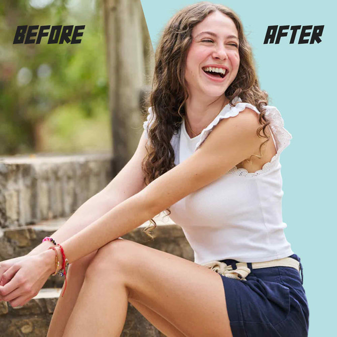
Transparency is binary. It is either there or it isn't. If you don't correctly prepare art for dtf, you will eventually face the "White Box" nightmare. This occurs when a design has a solid white background layer instead of a transparent one. The printer interprets that white as a signal to lay down a full underbase. You end up with a stiff, plastic square on your garment. It's a waste of film. It's a waste of a high-quality shirt. Precision starts with your layers.
Stray pixels are another silent killer. Automated background removal tools are notorious for leaving faint "halos" or tiny specks around your artwork. These pixels are often invisible on your monitor. The printer sees them perfectly. They catch the adhesive powder and create a speckled, dirty appearance on dark fabrics. Zoom in to 400%. Clean your edges manually. A clean file is the only way to ensure a clean print that lasts.
The Danger of the White Box Effect
Visualizing the white box is simple. Imagine your logo is a circle. If that circle sits on a white square in your software, the printer sees a square. It will print every single white pixel. This creates a heavy block of ink that ruins the hand-feel of the garment. Toggle your transparency grid in Photoshop or Canva. If you see checkers, you're safe. If you see solid white, your file isn't ready. Remember, white in your design is fine. Background white is a disaster. Mastering these technical details is easier when you follow Adobe's guide to print-ready files for your export workflow.
Handling Semi-Transparency and Glows
DTF technology isn't designed to "fade to nothing." Drop shadows and outer glows often print with a choppy, speckled texture. This happens because the ink density is too low to hold the adhesive powder. Use the 10% opacity rule. If a pixel is less than 10% opaque, it won't bond to the fabric. The result is a messy, unfinished look that peels quickly. Harden your edges. Use halftones for gradients. This "choking" process creates a reliable surface for the powder to grab. It guarantees a durable, high-impact finish. Once your transparency is perfect, you can move to production with custom DTF transfers that hit the mark every time.
Color Management: CMYK vs. RGB for DTF
Your monitor is lying to you. It uses light to create color, while your printer uses ink. This fundamental difference is why a neon green glow on your screen often turns into a muddy forest green on fabric. When you prepare art for dtf, you must account for the physical limitations of ink. Screens operate in an RGB additive model. Printers work in a CMYK subtractive model. The CMYK spectrum is significantly smaller. Some colors you see on a high-end display simply cannot be reproduced with physical ink.
The "Out of Gamut" warning in Photoshop is your first line of defense. It tells you that a specific color is impossible to print accurately. Don't ignore it. If your brand relies on a specific electric blue, you need to adjust your expectations or your file early in the process. Set your workspace to CMYK from the very beginning. It ensures what you see on the screen is much closer to the final result. For more technical details on setting up your workspace, consult this educational guide to digital file preparation. It is a reliable resource for foundational print knowledge.
Thin lines are the enemies of durability. DTF transfers require a layer of adhesive powder to bond with the garment. If a line is too thin, there isn't enough surface area for the powder to grab. The result is a detail that peels off after the first wash. We recommend a minimum stroke width of 0.018 inches to ensure a permanent bond. This step is non-negotiable for professional-grade results. Precision here saves you from customer complaints later.
Why Screen Colors Do Not Match Prints
Additive color builds light to create white. Subtractive color mixes ink to create black. They are opposites. To bridge the gap, use a physical Pantone color bridge. It shows you the RGB screen version next to the CMYK print version. Want vibrant reds? Use a mix of 100% Magenta and 100% Yellow. Need a deep, rich black? Don't just use 100% Black (K). Use a "Rich Black" by adding 40% Cyan, 40% Magenta, and 40% Yellow to your 100% Black base. This creates a professional, high-impact finish that stands out on any garment.
Managing Thin Lines and Small Text
The 2-pixel rule is your safety net. Fine-line script fonts and intricate geometric patterns often fail the powder test. If the powder doesn't stick, the ink doesn't transfer. It's that simple. If your design features delicate details, use a "stroke" or "offset path" to thicken them slightly. A tiny adjustment of 0.25 points can be the difference between a crisp logo and a design that disappears in the dryer. This small step ensures your custom DTF transfers maintain their integrity through dozens of wash cycles. High-quality prints depend on these minute technical adjustments.
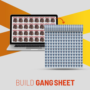
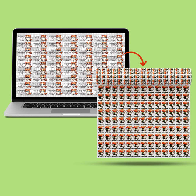
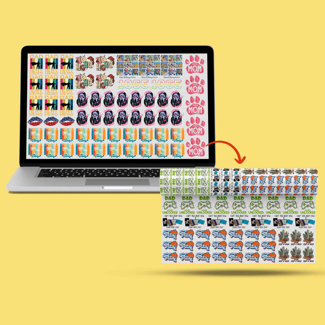
Designing for Efficiency with Gang Sheets
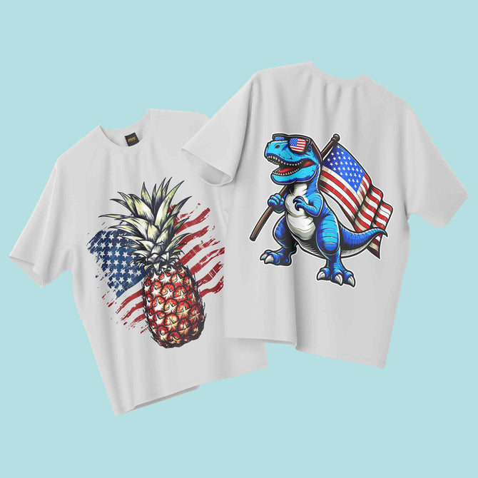
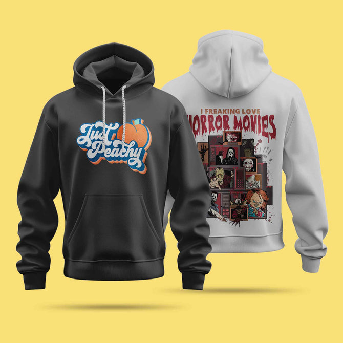
Efficiency is the engine of a profitable printing business. Gang sheets are the vehicle. A gang sheet is a single roll of transfer film packed with as many designs as possible. Instead of paying for individual transfers, you pay for the space. It is the most cost-effective way to scale your production. When you prepare art for dtf using this method, you aren't just designing; you are optimizing your overhead. You are turning raw material into high-margin products.
Think of your gang sheet as a high-stakes puzzle. Every design you add lowers your cost per unit. This is how professional shops stay competitive. It allows you to run small batches and large orders simultaneously without switching setups. It's about speed. It's about precision. From pocket logos to massive back pieces, nesting ensures no film goes to waste. You get more value for every inch of film you buy.
Maximum Space Utilization
Maximize your film. Don't leave empty gaps. Nesting is the art of fitting smaller items like neck labels or pocket logos into the negative space of larger chest prints. Rotate your designs 90 degrees if it saves an inch. Use your software's alignment tools to pack them tight. At our Richardson facility, we often see 22-inch and 24-inch widths utilized to their full potential. These sizes are the workhorses of the industry. They provide enough room for massive back pieces while leaving corners open for branding tags and sleeve prints. Every square inch is an opportunity for profit.
Safety Margins and Cutting Lines
Safety margins are non-negotiable. You need at least 0.5 inches between every logo. This isn't just a suggestion. It is a production requirement. You have to cut these designs apart manually or with a trimmer. If they are too close, you risk clipping a neighboring design and throwing money in the trash. More importantly, your heat press needs clearance.
Ghosting occurs when the heat from the press causes a nearby design to partially activate or shift. If your logos are too close, the edges of your heat platen might catch the next design in line. This creates a blurry, double-image effect that ruins the garment. A 0.5-inch margin provides the necessary buffer for a clean, single-press application. Labeling is a pro tip. Add tiny text next to your designs to keep your orders organized. Ready to streamline your workflow? Order your DTF gang sheets today and see the difference in your bottom line. Precision preparation leads to professional results.
Final Pre-Flight Checklist for Iris DTF
Your files are the blueprint for your brand's success. Even seasoned designers can overlook a single setting that ruins an entire roll of film. Before you hit the upload button, you must verify every technical detail. This final review ensures your production runs smoothly and your prints arrive exactly as envisioned. Don't leave your quality to chance. Follow this systematic approach to prepare art for dtf with total confidence.
Precision in file naming is your first step toward a faster turnaround. Use a clear, descriptive format like [BrandName_DesignName_Quantity_Size]. This simple habit eliminates confusion in our production queue and ensures your order moves straight to the press. We prioritize clarity because it drives efficiency. When your files are organized, our team can work at peak speed to meet your deadlines.
- Resolution Check: Confirm your file is exactly 300 DPI at the final print size. Stretched pixels lead to jagged edges.
- The Black Background Test: Place a temporary solid black layer behind your artwork. This reveals hidden white halos, stray pixels, or semi-transparent glows that will catch adhesive powder.
- Color Mode Verification: Ensure your workspace is set to CMYK to avoid unexpected color shifts during the printing process.
- Minimum Stroke Width: Use a digital caliper tool to verify all lines are at least 0.018 inches wide for proper bonding.
- Safety Margin Audit: Double check that every design on your gang sheet has at least 0.5 inches of clearance for safe cutting.
Pro Tips for DFW Clothing Brands
Local Richardson and Dallas creators have a distinct competitive edge. By leveraging our local facility, you can skip the shipping wait and the transit costs. Local pickup allows you to get your transfers in hand faster, which is vital for tight launch windows. If you have specific color requirements or brand standards, our production team is here to help. Communication is key. Use the notes section in our portal to flag critical details. A professional "second set of eyes" on your files can be the difference between a good print and a masterpiece. We act as your behind the scenes engine for commercial success.
Uploading Your Files for Rapid Turnaround
Our upload portal is built for speed and reliability. For the best experience, upload high-resolution PNG files directly through the interface. If your gang sheet file size exceeds standard limits, don't panic. You can provide a secure cloud link from Google Drive or WeTransfer in the order notes. This ensures we receive the full data without compression issues. We handle massive commercial demands and small scale projects with the same level of precision. Your design deserves a flawless execution. Ready to print? Upload your gang sheet to Iris DTF today! We are ready to work when you are.
Launch Your Next Collection with Confidence
You now have the technical blueprint for success. Mastering 300 DPI resolution, perfect transparency, and optimized gang sheet layouts are the pillars of professional apparel. When you prepare art for dtf using these pro tips, you eliminate the risk of blurry prints or wasted film. High-impact results are no longer a guessing game; they are a standard you can meet every single time.
Iris DTF is here to power your growth. We bring over 10 years of US DTF printing expertise to the table, utilizing professional-grade inks and high-capacity production lines. Based in Richardson, TX, we offer local DFW pickup to keep your business moving fast. Whether you are scaling a commercial brand or starting a small project, our team delivers the precision you deserve.
Order Your Custom DTF Transfers from Iris DTF today and see why top creators trust us for their production needs. Let's build something impressive together.
Frequently Asked Questions
What is the best file format for DTF transfers?
High resolution PNG files with a transparent background are the gold standard for DTF. This format preserves the sharp edges and vibrant colors needed for professional results. Ensure your file is saved at 300 DPI to avoid pixelation. This is the most reliable way to prepare art for dtf and guarantee your designs look exactly as intended on the fabric.
Can I use Canva to prepare my art for DTF printing?
You can use Canva, but you must have a Pro account to export high quality files. Standard Canva exports often lack the necessary resolution and transparency for DTF. Always select the "Transparent Background" option and set the size multiplier to the maximum during export. This ensures your file meets the 300 DPI threshold required for a clean, professional transfer.
Why did my DTF print come out blurry?
Blurry prints are almost always caused by low resolution source files. If your art was created at 72 DPI or pulled from a website, it lacks the pixel density for high impact printing. Upscaling a small image won't fix the problem; it just stretches the blur. Start with high resolution assets from the beginning to ensure every line stays crisp and sharp.
What is a gang sheet and how do I make one?
A gang sheet is a single roll of film that contains multiple designs nested together. It is the most cost effective way to print because you pay for the space rather than individual transfers. You can combine pocket logos, neck labels, and large chest prints on one sheet. This maximizes your efficiency and significantly lowers your production cost per garment.
Do I need to mirror my artwork before uploading to Iris DTF?
Do not mirror your artwork before uploading to our portal. Our specialized RIP software automatically handles the mirroring process during production. If you mirror the file yourself, your final print will appear backward on the shirt. Simply upload your designs exactly as you want them to look, and we will take care of the technical orientation for you.
What is the minimum line thickness for a DTF transfer?
The minimum recommended line thickness is 0.018 inches or approximately 2 pixels at 300 DPI. Anything thinner than this may fail to grab enough adhesive powder during the production process. Without enough powder, the fine details won't bond to the garment properly and will likely peel after the first wash. Thicken your script fonts to ensure durability.
Why are my colors different on the shirt than on my computer screen?
Monitors display colors using RGB light, while printers use CMYK ink. This shift from light to physical pigment naturally results in some color variation. Bright neon colors on a screen often look more muted in print because they fall "out of gamut." To prepare art for dtf with more accuracy, always design in a CMYK workspace and use physical color swatches.
Can I use a JPEG for DTF printing?
You should avoid using JPEGs for DTF printing. JPEGs do not support transparency, which means they will always print with a solid background, usually a white box. This ruins the look of your design on anything other than a white shirt. Stick to PNG or TIFF formats to ensure only your intended design hits the garment without any unwanted background ink.